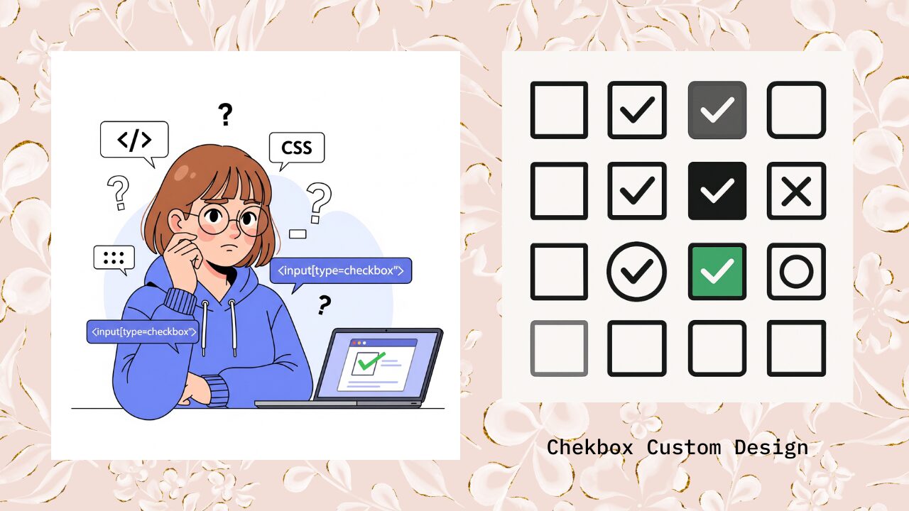
フォームを作るときに必ずといっていいほど登場する「チェックボックス」。しかし、そのまま使うと小さくて押しづらかったり、無機質でサイト全体のデザインと合わなかったりして「ちょっとダサいな…」と感じたことはありませんか?
とくに最近のWebサイトは、ボタンやフォームまわりのUIまで洗練されているのが当たり前になりつつあり、チェックボックスひとつが浮いてしまうだけで、ユーザー体験やデザインの完成度に大きな差が出てしまいます。
実際に、クライアントや上司から「もう少しおしゃれにして」「スマホでも押しやすくして」とリクエストを受ける機会も多いのではないでしょうか。でも「CSSでどうやってチェックボックスをカスタマイズすればいいの?」「appearance: noneとdisplay: noneの違いがよく分からない…」といった疑問がつきまとうのも事実です。
この記事では、そうした悩みを解消し、CSSだけでチェックボックスを自在にカスタマイズできるようになるための方法をまとめました。基本の隠し方から、おしゃれなサンプルデザイン集、さらに実務で役立つ応用テクニックまでを網羅しているので、コピペで即活用できるのはもちろん、仕組みを理解して自分好みにアレンジすることも可能です。
チェックボックスをただ「動くもの」から「見やすく、使いやすく、おしゃれなUI」に進化させたい方は、ぜひ最後まで読み進めてみてください。
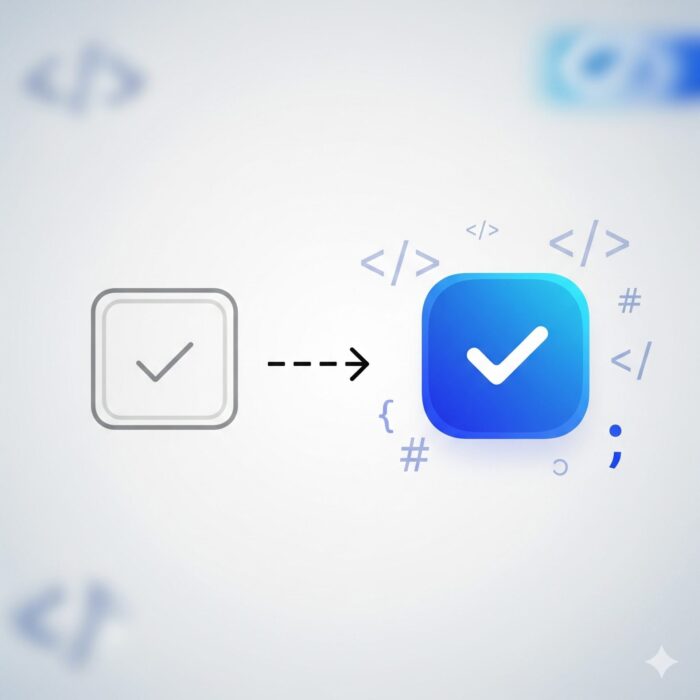
CSSだけでチェックボックスをおしゃれにカスタマイズする基本手順
チェックボックスをおしゃれにカスタマイズするには、ブラウザのデフォルトスタイルを無効化し、CSSの疑似要素を使って独自のデザインを作成する必要があります。ここでは、その基本的な手順を詳しく解説していきます。
input[type=”checkbox”]のデフォルトスタイルを非表示にする方法
なぜデフォルトスタイルを非表示にする必要があるのか
ブラウザのデフォルトのチェックボックスは、OSやブラウザによって見た目が大きく異なります。統一されたデザインを実現するためには、まずこのデフォルトスタイルを無効化することが重要です。
appearance: noneを使った最もシンプルでモダンな方法
最もシンプルで効果的な方法は、CSSのappearanceプロパティを使用することです。
input[type="checkbox"] {
  appearance: none;
  -webkit-appearance: none; /* Safari・Chrome用 */
  -moz-appearance: none;    /* Firefox用 */
}
クロスブラウザ対応のためのベンダープレフィックス
appearanceプロパティはまだ比較的新しいプロパティのため、古いブラウザでも確実に動作させるためにベンダープレフィックスを含めることを推奨します。
input[type="checkbox"] {
  /* 標準プロパティ */
  appearance: none;

  /* ベンダープレフィックス */
  -webkit-appearance: none; /* Safari・Chrome・Edge */
  -moz-appearance: none;    /* Firefox */

  /* 基本スタイルの設定 */
  width: 20px;
  height: 20px;
  border: 2px solid #ccc;
  border-radius: 4px;
  position: relative;
  outline: none;
}
::before・::after疑似要素を使った装飾の基本構造
疑似要素を使うメリット
疑似要素を使用することで、HTMLを汚すことなく純粋にCSSだけでチェックボックスのカスタマイズが可能になります。主なメリットは以下の通りです:
- HTMLの構造を変更せずにデザインを追加できる
- JavaScriptを使わずに済む
- メンテナンスが容易
- セマンティックなHTMLを保てる
label要素とinput要素の関連付けの重要性
チェックボックスをカスタマイズする際は、必ずlabel要素とinput要素をfor属性で関連付けることが必要です。これにより、アクセシビリティが向上し、ラベルテキストをクリックしてもチェックボックスが反応するようになります。
<label for="custom-checkbox">チェックボックス</label>
<input type="checkbox" id="custom-checkbox">
疑似要素を使った基本的なCSSコード例
以下は、疑似要素を使ってチェックボックス本体とチェックマークを作成する基本的なコード例です:
/* チェックボックス本体のスタイル */
input[type="checkbox"] {
  appearance: none;
  -webkit-appearance: none;
  -moz-appearance: none;
  width: 24px;
  height: 24px;
  border: 2px solid #ddd;
  border-radius: 4px;
  background-color: #fff;
  position: relative;
  cursor: pointer;
  transition: all 0.3s ease;
}

/* チェックマークの作成 */
input[type="checkbox"]::after {
  content: "";
  position: absolute;
  top: 3px;
  left: 7px;
  width: 6px;
  height: 12px;
  border: solid #fff;
  border-width: 0 2px 2px 0;
  transform: rotate(45deg);
  opacity: 0;
  transition: opacity 0.3s ease;
}

/* チェック時のスタイル */
input[type="checkbox"]:checked {
  background-color: #007bff;
  border-color: #007bff;
}

input[type="checkbox"]:checked::after {
  opacity: 1;
}

/* フォーカス時のスタイル(アクセシビリティ対応) */
input[type="checkbox"]:focus {
  outline: 2px solid #007bff;
  outline-offset: 2px;
}
実際の表示
See the Pen css-custom-checkbox-01 by watashi-xyz (@watashi-xyz) on CodePen.
appearance: noneとdisplay: noneの使い分けと注意点
appearance: noneが推奨される理由
チェックボックスのカスタマイズにおいて、appearance: noneとdisplay: noneは似たような効果をもたらしますが、アクセシビリティの観点から大きな違いがあります。
appearance: noneを使用した場合
- 要素は DOM に残り、スクリーンリーダーが認識できる
- キーボード操作(Tabキー、Spaceキー)が正常に動作する
checked属性の状態変化を適切に検知できる
display: noneが非推奨である理由
display: noneを使用した場合の問題点:
- スクリーンリーダーが要素を完全に無視してしまう
- キーボードナビゲーションから除外される
- アクセシビリティツールが正しく動作しない
スクリーンリーダー対応のベストプラクティス
アクセシビリティを考慮したチェックボックスのカスタマイズでは、以下の点を必ず守りましょう:
/* 推奨:appearance: noneを使用 */
input[type="checkbox"] {
  appearance: none;
  -webkit-appearance: none;
  -moz-appearance: none;
  /* デザインを追加 */
  width: 20px;
  height: 20px;
  border: 2px solid #666;
  border-radius: 3px;
}

/* 非推奨:display: noneは使わない */
input[type="checkbox"] {
  /* display: none; ← アクセシビリティの問題あり */
}
また、視覚的にチェックボックスを隠しつつアクセシビリティを保つ場合は、以下のような方法を使用します:
/* 視覚的に隠すがスクリーンリーダーには認識される方法 */
.visually-hidden {
  position: absolute;
  width: 1px;
  height: 1px;
  padding: 0;
  margin: -1px;
  overflow: hidden;
  clip: rect(0, 0, 0, 0);
  white-space: nowrap;
  border: 0;
}
このように、appearance: noneを使用することで、デザインの自由度を保ちながら、アクセシビリティに配慮したチェックボックスを作成することができます。
すぐに使える!おしゃれなチェックボックスデザイン集【コピペOK】
ここでは、実際のプロジェクトですぐに使える、おしゃれで実用的なチェックボックスデザインを多数ご紹介します。すべてコピー&ペーストで使用可能で、必要に応じてカスタマイズも簡単に行えます。
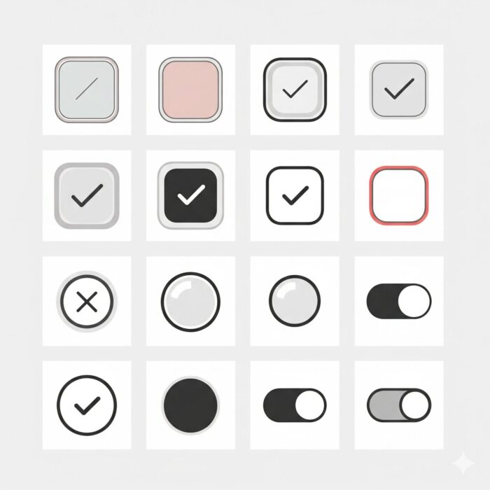
四角・丸型・角丸デザインのCSSサンプルと形状変更テクニック
1. スタンダード四角型チェックボックス
最もベーシックで使いやすい四角型のデザインです。どんなサイトにも馴染みます。
<label class="square-checkbox">
  <input type="checkbox">
  <span class="checkmark"></span>
  四角型チェックボックス
</label>
.square-checkbox {
  display: flex;
  align-items: center;
  cursor: pointer;
  font-size: 16px;
  user-select: none;
}

.square-checkbox input[type="checkbox"] {
  appearance: none;
  -webkit-appearance: none;
  -moz-appearance: none;
  width: 20px;
  height: 20px;
  border: 2px solid #ddd;
  border-radius: 4px;
  background-color: #fff;
  margin-right: 12px;
  position: relative;
  transition: all 0.3s ease;
}

.square-checkbox input[type="checkbox"]::after {
  content: "";
  position: absolute;
  top: -1px;
  left: 6px;
  width: 6px;
  height: 12px;
  border: solid #fff;
  border-width: 0 2px 2px 0;
  transform: rotate(45deg);
  opacity: 0;
  transition: opacity 0.3s ease;
}

.square-checkbox input[type="checkbox"]:checked {
  background-color: #007bff;
  border-color: #007bff;
}

.square-checkbox input[type="checkbox"]:checked::after {
  opacity: 1;
}

.square-checkbox input[type="checkbox"]:focus {
  outline: 2px solid #007bff;
  outline-offset: 2px;
}
実際の表示
See the Pen css-custom-checkbox-02 by watashi-xyz (@watashi-xyz) on CodePen.
2. 角丸チェックボックス
やわらかい印象を与える角丸デザインです。モダンなWebサイトに最適です。
<label class="rounded-checkbox">
  <input type="checkbox">
  <span class="checkmark"></span>
  角丸チェックボックス
</label>
.rounded-checkbox {
  display: flex;
  align-items: center;
  cursor: pointer;
  font-size: 16px;
  user-select: none;
}

.rounded-checkbox input[type="checkbox"] {
  appearance: none;
  -webkit-appearance: none;
  -moz-appearance: none;
  width: 22px;
  height: 22px;
  border: 2px solid #e1e5e9;
  border-radius: 8px; /* 角丸のポイント */
  background-color: #fff;
  margin-right: 12px;
  position: relative;
  transition: all 0.3s cubic-bezier(0.25, 0.1, 0.25, 1);
}

.rounded-checkbox input[type="checkbox"]::after {
  content: "";
  position: absolute;
  top: 3px;
  left: 7px;
  width: 6px;
  height: 10px;
  border: solid #fff;
  border-width: 0 2px 2px 0;
  transform: rotate(45deg);
  opacity: 0;
  transition: all 0.3s cubic-bezier(0.25, 0.1, 0.25, 1);
}

.rounded-checkbox input[type="checkbox"]:checked {
  background-color: #28a745;
  border-color: #28a745;
  transform: scale(1.05);
}

.rounded-checkbox input[type="checkbox"]:checked::after {
  opacity: 1;
}

.rounded-checkbox input[type="checkbox"]:hover {
  border-color: #28a745;
  box-shadow: 0 0 0 3px rgba(40, 167, 69, 0.1);
}
実際の表示
See the Pen css-custom-checkbox-03 by watashi-xyz (@watashi-xyz) on CodePen.
3. 丸型(ラジオボタン風)チェックボックス
border-radius: 50%を使用した完全な円形デザインです。
<label class="circle-checkbox">
  <input type="checkbox">
  <span class="checkmark"></span>
  丸型チェックボックス
</label>
.circle-checkbox {
  display: flex;
  align-items: center;
  cursor: pointer;
  font-size: 16px;
  user-select: none;
}

.circle-checkbox input[type="checkbox"] {
  appearance: none;
  -webkit-appearance: none;
  -moz-appearance: none;
  width: 24px;
  height: 24px;
  border: 3px solid #ddd;
  border-radius: 50%; /* 完全な円形 */
  background-color: #fff;
  margin-right: 12px;
  position: relative;
  transition: all 0.3s ease;
}

.circle-checkbox input[type="checkbox"]::after {
  content: "";
  position: absolute;
  top: 50%;
  left: 50%;
  width: 10px;
  height: 10px;
  border-radius: 50%;
  background-color: #fff;
  transform: translate(-50%, -50%) scale(0);
  transition: transform 0.3s ease;
}

.circle-checkbox input[type="checkbox"]:checked {
  background-color: #dc3545;
  border-color: #dc3545;
}

.circle-checkbox input[type="checkbox"]:checked::after {
  transform: translate(-50%, -50%) scale(1);
}

.circle-checkbox input[type="checkbox"]:focus {
  outline: 2px solid #dc3545;
  outline-offset: 2px;
}
実際の表示
See the Pen css-custom-checkbox-04 by watashi-xyz (@watashi-xyz) on CodePen.
ボタン風・トグル風・タイル風などユニークなデザイン例
1. ボタン風チェックボックス
チェックボックスをボタンのように見せるデザインです。フォーム全体がスタイリッシュになります。
<label class="button-checkbox">
  <input type="checkbox">
  <span class="button-text">選択する</span>
</label>
.button-checkbox {
  display: inline-block;
  cursor: pointer;
}

.button-checkbox input[type="checkbox"] {
  display: none; /* この場合のみdisplay: noneを使用 */
}

.button-checkbox .button-text {
  display: inline-block;
  padding: 12px 24px;
  background-color: #f8f9fa;
  border: 2px solid #dee2e6;
  border-radius: 6px;
  color: #6c757d;
  font-weight: 500;
  transition: all 0.3s ease;
  user-select: none;
}

.button-checkbox input[type="checkbox"]:checked + .button-text {
  background-color: #007bff;
  border-color: #007bff;
  color: #fff;
  transform: translateY(-1px);
  box-shadow: 0 4px 8px rgba(0, 123, 255, 0.3);
}

.button-checkbox:hover .button-text {
  border-color: #007bff;
  background-color: #e3f2fd;
}

.button-checkbox input[type="checkbox"]:focus + .button-text {
  outline: 2px solid #007bff;
  outline-offset: 2px;
}
実際の表示
See the Pen css-custom-checkbox-04 by watashi-xyz (@watashi-xyz) on CodePen.
2. トグルスイッチ風チェックボックス
iOS風のトグルスイッチデザインです。ON/OFFが直感的に分かりやすいのが特徴です。
<label class="toggle-switch">
  <input type="checkbox">
  <span class="slider"></span>
  <span class="label-text">通知を受け取る</span>
</label>
.toggle-switch {
  display: flex;
  align-items: center;
  cursor: pointer;
  user-select: none;
  font-size: 16px;
}

.toggle-switch input[type="checkbox"] {
  display: none;
}

.toggle-switch .slider {
  position: relative;
  width: 50px;
  height: 26px;
  background-color: #ccc;
  border-radius: 26px;
  margin-right: 12px;
  transition: background-color 0.3s ease;
}

.toggle-switch .slider::before {
  content: "";
  position: absolute;
  top: 2px;
  left: 2px;
  width: 22px;
  height: 22px;
  background-color: #fff;
  border-radius: 50%;
  transition: transform 0.3s ease;
  box-shadow: 0 2px 4px rgba(0, 0, 0, 0.2);
}

.toggle-switch input[type="checkbox"]:checked + .slider {
  background-color: #4CAF50;
}

.toggle-switch input[type="checkbox"]:checked + .slider::before {
  transform: translateX(24px);
}

.toggle-switch input[type="checkbox"]:focus + .slider {
  outline: 2px solid #4CAF50;
  outline-offset: 2px;
}

.toggle-switch .label-text {
  font-weight: 500;
  color: #333;
}
実際の表示
See the Pen Untitled by watashi-xyz (@watashi-xyz) on CodePen.
3. タイル風チェックボックス
カード型のデザインで、選択肢を視覚的に分かりやすく表現できます。
<label class="tile-checkbox">
  <input type="checkbox">
  <div class="tile-content">
    <div class="tile-icon">📧</div>
    <div class="tile-title">メール通知</div>
    <div class="tile-description">新着メールをお知らせします</div>
  </div>
</label>
.tile-checkbox {
  display: block;
  cursor: pointer;
  margin-bottom: 16px;
}

.tile-checkbox input[type="checkbox"] {
  display: none;
}

.tile-checkbox .tile-content {
  padding: 20px;
  border: 2px solid #e9ecef;
  border-radius: 12px;
  background-color: #fff;
  transition: all 0.3s ease;
  position: relative;
}

.tile-checkbox .tile-content::after {
  content: "✓";
  position: absolute;
  top: 12px;
  right: 12px;
  width: 24px;
  height: 24px;
  background-color: #28a745;
  color: #fff;
  border-radius: 50%;
  display: flex;
  align-items: center;
  justify-content: center;
  font-size: 14px;
  font-weight: bold;
  opacity: 0;
  transform: scale(0);
  transition: all 0.3s ease;
}

.tile-checkbox .tile-icon {
  font-size: 32px;
  margin-bottom: 12px;
}

.tile-checkbox .tile-title {
  font-size: 18px;
  font-weight: 600;
  color: #333;
  margin-bottom: 8px;
}

.tile-checkbox .tile-description {
  font-size: 14px;
  color: #6c757d;
  line-height: 1.4;
}

.tile-checkbox input[type="checkbox"]:checked + .tile-content {
  border-color: #28a745;
  background-color: #f8fff9;
  box-shadow: 0 4px 12px rgba(40, 167, 69, 0.15);
}

.tile-checkbox input[type="checkbox"]:checked + .tile-content::after {
  opacity: 1;
  transform: scale(1);
}

.tile-checkbox:hover .tile-content {
  border-color: #28a745;
  box-shadow: 0 2px 8px rgba(0, 0, 0, 0.1);
}
実際の表示
See the Pen Untitled by watashi-xyz (@watashi-xyz) on CodePen.
チェック時のアニメーション・ON/OFFの色・アイコン切り替えパターン
1. スケールアニメーション付きチェックボックス
チェックが入る瞬間にチェックマークが拡大するアニメーションです。
<label class="scale-animation-checkbox">
  <input type="checkbox">
  アニメーション付きチェックボックス
</label>
.scale-animation-checkbox {
  display: flex;
  align-items: center;
  cursor: pointer;
  font-size: 16px;
  user-select: none;
}

.scale-animation-checkbox input[type="checkbox"] {
  appearance: none;
  -webkit-appearance: none;
  -moz-appearance: none;
  width: 24px;
  height: 24px;
  border: 2px solid #ddd;
  border-radius: 6px;
  background-color: #fff;
  margin-right: 12px;
  position: relative;
  transition: all 0.3s cubic-bezier(0.68, -0.55, 0.265, 1.55);
}

.scale-animation-checkbox input[type="checkbox"]::after {
  content: "";
  position: absolute;
  top: 3px;
  left: 8px;
  width: 6px;
  height: 12px;
  border: solid #fff;
  border-width: 0 3px 3px 0;
  transform: rotate(45deg) scale(0);
  transition: transform 0.4s cubic-bezier(0.68, -0.55, 0.265, 1.55);
}

.scale-animation-checkbox input[type="checkbox"]:checked {
  background-color: #ff6b6b;
  border-color: #ff6b6b;
  transform: scale(1.1);
}

.scale-animation-checkbox input[type="checkbox"]:checked::after {
  transform: rotate(45deg) scale(1);
}
実際の表示
See the Pen Untitled by watashi-xyz (@watashi-xyz) on CodePen.
2. 色変化とアイコン切り替えパターン
チェック状態によって背景色とアイコンが変化するパターンです。
<label class="icon-switch-checkbox">
  <input type="checkbox">
  <span class="icon-container">
    <span class="icon-unchecked">❤️</span>
    <span class="icon-checked">💚</span>
  </span>
  お気に入りに追加
</label>
.icon-switch-checkbox {
  display: flex;
  align-items: center;
  cursor: pointer;
  font-size: 16px;
  user-select: none;
}

.icon-switch-checkbox input[type="checkbox"] {
  display: none;
}

.icon-switch-checkbox .icon-container {
  position: relative;
  width: 32px;
  height: 32px;
  border: 2px solid #ddd;
  border-radius: 8px;
  background-color: #fff;
  margin-right: 12px;
  display: flex;
  align-items: center;
  justify-content: center;
  transition: all 0.3s ease;
  overflow: hidden;
}

.icon-switch-checkbox .icon-unchecked,
.icon-switch-checkbox .icon-checked {
  position: absolute;
  font-size: 18px;
  transition: all 0.3s ease;
}

.icon-switch-checkbox .icon-unchecked {
  opacity: 1;
  transform: scale(1);
}

.icon-switch-checkbox .icon-checked {
  opacity: 0;
  transform: scale(0);
}

.icon-switch-checkbox input[type="checkbox"]:checked + .icon-container {
  background-color: #e8f5e8;
  border-color: #28a745;
}

.icon-switch-checkbox input[type="checkbox"]:checked + .icon-container .icon-unchecked {
  opacity: 0;
  transform: scale(0);
}

.icon-switch-checkbox input[type="checkbox"]:checked + .icon-container .icon-checked {
  opacity: 1;
  transform: scale(1);
}
実際の表示
See the Pen Untitled by watashi-xyz (@watashi-xyz) on CodePen.
3. 波紋エフェクト付きチェックボックス
マテリアルデザイン風の波紋エフェクトを追加したパターンです。
<label class="ripple-checkbox">
  <input type="checkbox">
  <span class="ripple-container">
    <span class="ripple-effect"></span>
  </span>
  波紋エフェクト付き
</label>
.ripple-checkbox input[type="checkbox"] {
  display: none;
}

.ripple-checkbox .ripple-container {
  position: relative;
  width: 24px;
  height: 24px;
  margin-right: 12px;
  overflow: hidden;
}

.ripple-checkbox .ripple-container::before {
  content: "";
  position: absolute;
  top: 0;
  left: 0;
  width: 24px;
  height: 24px;
  border: 2px solid #666;
  border-radius: 4px;
  background-color: #fff;
  transition: all 0.3s ease;
  z-index: 1;
}

.ripple-checkbox .ripple-container::after {
  content: "";
  position: absolute;
  top: 4px;
  left: 8px;
  width: 6px;
  height: 12px;
  border: solid #fff;
  border-width: 0 2px 2px 0;
  transform: rotate(45deg);
  opacity: 0;
  transition: opacity 0.3s ease;
  z-index: 2;
}

.ripple-checkbox .ripple-effect {
  position: absolute;
  top: 50%;
  left: 50%;
  width: 0;
  height: 0;
  background-color: rgba(33, 150, 243, 0.3);
  border-radius: 50%;
  transform: translate(-50%, -50%);
  transition: all 0.3s ease;
}

.ripple-checkbox input[type="checkbox"]:checked + .ripple-container::before {
  background-color: #2196f3;
  border-color: #2196f3;
}

.ripple-checkbox input[type="checkbox"]:checked + .ripple-container::after {
  opacity: 1;
}

.ripple-checkbox input[type="checkbox"]:checked + .ripple-container .ripple-effect {
  width: 48px;
  height: 48px;
  animation: ripple-animation 0.6s ease-out;
}

@keyframes ripple-animation {
  0% {
    width: 0;
    height: 0;
    opacity: 0.8;
  }
  100% {
    width: 48px;
    height: 48px;
    opacity: 0;
  }
}
実際の表示
See the Pen Untitled by watashi-xyz (@watashi-xyz) on CodePen.
これらのデザインはすべてコピー&ペーストですぐに使用でき、色やサイズ、アニメーション速度などは簡単にカスタマイズできます。プロジェクトの要件に応じて適切なデザインを選んで活用してください。
実務で使える応用テクニックと注意点
実際のプロジェクトでチェックボックスを使用する際は、デザインだけでなく、使いやすさやアクセシビリティ、マルチブラウザ対応などの技術的な課題も考慮する必要があります。ここでは、実務で役立つ応用テクニックと重要な注意点を解説します。
チェックボックスのサイズ調整とレスポンシブ対応(PC・スマホ両対応)
widthとheightを使ったサイズ指定
最も直感的なサイズ調整方法は、widthとheightプロパティを使用することです。
/* 小サイズ(16px) */
.checkbox-small {
  width: 16px;
  height: 16px;
}

/* 中サイズ(24px) */
.checkbox-medium {
  width: 24px;
  height: 24px;
}

/* 大サイズ(32px) */
.checkbox-large {
  width: 32px;
  height: 32px;
}
transform: scale()を使ったシンプルで便利なサイズ調整
transform: scale()を使用すると、既存のデザインを保ったまま比例的にサイズを変更できるため、非常に便利です。
/* 基本サイズのチェックボックス */
.base-checkbox {
  width: 20px;
  height: 20px;
  border: 2px solid #ddd;
  border-radius: 4px;
}

/* scale()を使った各サイズバリエーション */
.checkbox-scale-small {
  transform: scale(0.8); /* 80%サイズ */
}

.checkbox-scale-large {
  transform: scale(1.5); /* 150%サイズ */
}

.checkbox-scale-extra-large {
  transform: scale(2); /* 200%サイズ */
}
レスポンシブ対応のベストプラクティス
デバイスに応じてチェックボックスのサイズを適切に調整することで、ユーザビリティが大幅に向上します。
.responsive-checkbox {
  width: 18px;
  height: 18px;
  border: 2px solid #ddd;
  border-radius: 3px;
  transition: all 0.3s ease;
}

/* タブレット向け(768px以上) */
@media (min-width: 768px) {
  .responsive-checkbox {
    width: 22px;
    height: 22px;
    border-radius: 4px;
  }
}

/* デスクトップ向け(1024px以上) */
@media (min-width: 1024px) {
  .responsive-checkbox {
    width: 20px;
    height: 20px;
  }
}

/* モバイル専用の大きめサイズ(767px以下) */
@media (max-width: 767px) {
  .responsive-checkbox {
    width: 24px;
    height: 24px;
    /* タップしやすさを考慮 */
  }
}
モバイル端末でのタップしやすさの考慮
モバイルユーザビリティを向上させるため、Appleの「Human Interface Guidelines」やGoogleの「Material Design」では、タップターゲットのサイズを最低48px以上にすることを推奨しています。
.mobile-friendly-checkbox {
  /* チェックボックス本体は小さくても */
  width: 20px;
  height: 20px;
  border: 2px solid #ddd;
  border-radius: 4px;
}

/* ラベル全体のタップ領域を広く確保 */
.mobile-friendly-checkbox-label {
  display: flex;
  align-items: center;
  min-height: 48px; /* 推奨タップサイズ */
  padding: 12px 16px;
  cursor: pointer;
  user-select: none;
}

/* スマートフォン用の調整 */
@media (max-width: 767px) {
  .mobile-friendly-checkbox-label {
    min-height: 52px; /* さらに余裕を持たせる */
    padding: 16px;
    font-size: 16px; /* iOS Safariでのズームを防ぐ */
  }

  .mobile-friendly-checkbox {
    width: 24px;
    height: 24px;
    margin-right: 16px;
  }
}
BootstrapやTailwind CSSに組み込みやすいカスタマイズ例
Bootstrap 5との組み合わせ
Bootstrapのクラス名と競合しないよう、独自のプレフィックスを使用したカスタマイズ例です。
<div class="form-check custom-form-check">
  <input class="form-check-input custom-checkbox-bs" type="checkbox" id="bootstrap-checkbox">
  <label class="form-check-label" for="bootstrap-checkbox">
    Bootstrap対応チェックボックス
  </label>
</div>
/* Bootstrapのデフォルトスタイルをオーバーライド */
.custom-checkbox-bs.form-check-input {
  appearance: none;
  -webkit-appearance: none;
  -moz-appearance: none;
  width: 1.25rem;
  height: 1.25rem;
  border: 2px solid var(--bs-secondary);
  border-radius: 0.375rem;
  background-color: var(--bs-body-bg);
  background-repeat: no-repeat;
  background-position: center;
  background-size: contain;
  transition: all 0.3s ease;
}

.custom-checkbox-bs.form-check-input:checked {
  background-color: var(--bs-primary);
  border-color: var(--bs-primary);
  background-image: url("data:image/svg+xml,%3csvg xmlns='http://www.w3.org/2000/svg' viewBox='0 0 20 20'%3e%3cpath fill='none' stroke='%23fff' stroke-linecap='round' stroke-linejoin='round' stroke-width='3' d='m6 10 3 3 6-6'/%3e%3c/svg%3e");
}

.custom-checkbox-bs.form-check-input:focus {
  border-color: var(--bs-primary);
  box-shadow: 0 0 0 0.25rem rgba(var(--bs-primary-rgb), 0.25);
}

/* Bootstrapのカラーバリエーションとの連携 */
.custom-form-check.text-success .custom-checkbox-bs:checked {
  background-color: var(--bs-success);
  border-color: var(--bs-success);
}

.custom-form-check.text-danger .custom-checkbox-bs:checked {
  background-color: var(--bs-danger);
  border-color: var(--bs-danger);
}
実際の表示
See the Pen Untitled by watashi-xyz (@watashi-xyz) on CodePen.
Tailwind CSSとの組み合わせ
Tailwind CSSのユーティリティクラスと組み合わせやすい設計例です。
<label class="flex items-center space-x-3 cursor-pointer">
  <input type="checkbox" class="tailwind-checkbox">
  <span class="text-gray-700 select-none">Tailwind CSS対応チェックボックス</span>
</label>
.tailwind-checkbox {
  @apply appearance-none w-5 h-5 border-2 border-gray-300 rounded bg-white;
  @apply transition-all duration-300 ease-in-out;
  @apply focus:outline-none focus:ring-2 focus:ring-blue-500 focus:ring-offset-2;
  @apply hover:border-blue-500;
}

.tailwind-checkbox::after {
  @apply content-[''] absolute;
  top: 1px;
  left: 4px;
  width: 6px;
  height: 10px;
  border: solid white;
  border-width: 0 2px 2px 0;
  transform: rotate(45deg);
  opacity: 0;
  @apply transition-opacity duration-300;
}

.tailwind-checkbox:checked {
  @apply bg-blue-500 border-blue-500;
}

.tailwind-checkbox:checked::after {
  opacity: 1;
}

/* ダークモード対応 */
@media (prefers-color-scheme: dark) {
  .tailwind-checkbox {
    @apply border-gray-600 bg-gray-800;
  }

  .tailwind-checkbox:checked {
    @apply bg-blue-600 border-blue-600;
  }
}
実際の表示
See the Pen Untitled by watashi-xyz (@watashi-xyz) on CodePen.
フレームワークのカラー変数と組み合わせた効率的なスタイル管理
CSS変数(カスタムプロパティ)を使用することで、フレームワークのテーマと連動したチェックボックスを作成できます。
:root {
  --checkbox-primary: #007bff;
  --checkbox-success: #28a745;
  --checkbox-warning: #ffc107;
  --checkbox-danger: #dc3545;
  --checkbox-border: #dee2e6;
  --checkbox-bg: #ffffff;
}

.themed-checkbox {
  appearance: none;
  -webkit-appearance: none;
  -moz-appearance: none;
  width: 20px;
  height: 20px;
  border: 2px solid var(--checkbox-border);
  border-radius: 4px;
  background-color: var(--checkbox-bg);
  position: relative;
  transition: all 0.3s ease;
}

.themed-checkbox::after {
  content: "";
  position: absolute;
  top: 2px;
  left: 6px;
  width: 6px;
  height: 12px;
  border: solid var(--checkbox-bg);
  border-width: 0 2px 2px 0;
  transform: rotate(45deg);
  opacity: 0;
  transition: opacity 0.3s ease;
}

/* カラーバリエーション */
.themed-checkbox.primary:checked {
  background-color: var(--checkbox-primary);
  border-color: var(--checkbox-primary);
}

.themed-checkbox.success:checked {
  background-color: var(--checkbox-success);
  border-color: var(--checkbox-success);
}

.themed-checkbox.warning:checked {
  background-color: var(--checkbox-warning);
  border-color: var(--checkbox-warning);
}

.themed-checkbox.danger:checked {
  background-color: var(--checkbox-danger);
  border-color: var(--checkbox-danger);
}

.themed-checkbox:checked::after {
  opacity: 1;
}
マルチブラウザ対応とアクセシビリティへの配慮
主要ブラウザでの表示確認の重要性
チェックボックスのカスタマイズでは、以下のブラウザでの動作確認が必須です:
- Chrome(最新版+2世代前まで) – 最も使用率の高いブラウザ
- Safari(最新版+1世代前) – iOS端末で重要
- Firefox(最新版+2世代前まで) – 独自のレンダリングエンジン
- Edge(最新版+1世代前) – Windows環境で重要
/* 包括的なクロスブラウザ対応 */
.cross-browser-checkbox {
  /* 標準プロパティ */
  appearance: none;

  /* ベンダープレフィックス */
  -webkit-appearance: none; /* Safari, Chrome, Edge */
  -moz-appearance: none;    /* Firefox */

  /* 基本スタイル */
  width: 20px;
  height: 20px;
  border: 2px solid #ddd;
  border-radius: 4px;
  background-color: #fff;
  position: relative;

  /* アニメーション(IE11は除く) */
  transition: all 0.3s ease;
}

/* Internet Explorer 11対応(必要に応じて) */
@media screen and (-ms-high-contrast: active), (-ms-high-contrast: none) {
  .cross-browser-checkbox {
    /* IE11用のフォールバック */
    transition: none; /* IE11はtransitionが不安定 */
  }
}
キーボード操作への対応
アクセシビリティの重要な要素として、キーボードだけでの操作に対応する必要があります。
.keyboard-friendly-checkbox {
  appearance: none;
  -webkit-appearance: none;
  -moz-appearance: none;
  width: 22px;
  height: 22px;
  border: 2px solid #ddd;
  border-radius: 4px;
  background-color: #fff;
  position: relative;
  transition: all 0.3s ease;
}

/* フォーカス状態のスタイル */
.keyboard-friendly-checkbox:focus {
  outline: 2px solid #007bff;
  outline-offset: 2px;
  border-color: #007bff;
}

/* フォーカス時の視認性向上 */
.keyboard-friendly-checkbox:focus-visible {
  outline: 3px solid #007bff;
  outline-offset: 3px;
  box-shadow: 0 0 0 2px #ffffff, 0 0 0 5px #007bff;
}

/* ハイコントラストモード対応 */
@media (prefers-contrast: high) {
  .keyboard-friendly-checkbox {
    border-width: 3px;
    border-color: #000000;
  }

  .keyboard-friendly-checkbox:focus {
    outline-width: 4px;
    outline-color: #000000;
  }
}
label要素とfor属性の必須性
スクリーンリーダーユーザーのために、label要素とfor属性による関連付けは必須です。
<!-- 推奨:明示的な関連付け -->
<input type="checkbox" id="accessibility-checkbox" class="accessible-checkbox">
<label for="accessibility-checkbox">アクセシブルなチェックボックス</label>

<!-- 代替:暗黙的な関連付け -->
<label class="accessible-checkbox-label">
  <input type="checkbox" class="accessible-checkbox">
  アクセシブルなチェックボックス
</label>
WCAGの観点から重要なポイント
WCAG(Web Content Accessibility Guidelines)に準拠するための重要なポイントを解説します。
色コントラスト比の確保
.wcag-compliant-checkbox {
  appearance: none;
  -webkit-appearance: none;
  -moz-appearance: none;
  width: 24px;
  height: 24px;
  /* コントラスト比4.5:1以上を確保 */
  border: 2px solid #666666; /* 十分なコントラスト */
  border-radius: 4px;
  background-color: #ffffff;
  position: relative;
}

.wcag-compliant-checkbox:checked {
  /* 十分なコントラスト比を持つ色を選択 */
  background-color: #0056b3; /* WCAG AA準拠 */
  border-color: #0056b3;
}

/* ハイコントラストモードでの調整 */
@media (prefers-contrast: high) {
  .wcag-compliant-checkbox {
    border-color: #000000;
    background-color: #ffffff;
  }

  .wcag-compliant-checkbox:checked {
    background-color: #000000;
    border-color: #000000;
  }
}
縮小表示時の視認性
/* 縮小表示時も視認性を保つ */
@media (max-resolution: 150dpi) {
  .wcag-compliant-checkbox {
    border-width: 3px; /* 低解像度でも見やすく */
  }
}

/* Windows High Contrast Mode対応 */
@media (-ms-high-contrast: active) {
  .wcag-compliant-checkbox {
    border: 3px solid windowText;
    background-color: window;
  }

  .wcag-compliant-checkbox:checked {
    background-color: highlight;
  }
}
スクリーンリーダーサポート
<fieldset>
  <legend>通知設定</legend>

  <div class="checkbox-group">
    <input type="checkbox" id="email-notifications" class="accessible-checkbox"
           aria-describedby="email-help">
    <label for="email-notifications">メール通知</label>
    <div id="email-help" class="help-text">
      新着メールが届いた時に通知します
    </div>
  </div>

  <div class="checkbox-group">
    <input type="checkbox" id="push-notifications" class="accessible-checkbox"
           aria-describedby="push-help">
    <label for="push-notifications">プッシュ通知</label>
    <div id="push-help" class="help-text">
      ブラウザ経由でリアルタイム通知を受け取ります
    </div>
  </div>
</fieldset>
.help-text {
  font-size: 14px;
  color: #666;
  margin-top: 4px;
  line-height: 1.4;
}

.checkbox-group {
  margin-bottom: 16px;
}

/* スクリーンリーダー専用テキスト */
.sr-only {
  position: absolute;
  width: 1px;
  height: 1px;
  padding: 0;
  margin: -1px;
  overflow: hidden;
  clip: rect(0, 0, 0, 0);
  white-space: nowrap;
  border: 0;
}
これらの応用テクニックと注意点を実装することで、美しいだけでなく、使いやすく、アクセシブルなチェックボックスを作成することができます。特に実務では、デザインの美しさよりも機能性とアクセシビリティを優先することが重要です。
よくある質問(FAQ)

-
チェックボックスにチェックマークが表示されないのはなぜですか?
-
チェックマークが表示されない原因は主に以下の4つです。
原因1: 疑似要素の位置指定ミス
/* ❌ 間違い:position指定が不適切 */
input[type="checkbox"]::after {
  content: "";
  /* positionが指定されていない */
  top: 3px;
  left: 6px;
}

/* ✅ 正解:適切なposition指定 */
input[type="checkbox"] {
  position: relative; /* 親要素にrelativeが必要 */
}

input[type="checkbox"]::after {
  content: "";
  position: absolute; /* absoluteで配置 */
  top: 3px;
  left: 6px;
}
原因2: z-indexの問題
/* ❌ 間違い:チェックマークが背景の下に隠れている */
input[type="checkbox"]::after {
  content: "";
  position: absolute;
  z-index: -1; /* 負の値だと隠れる */
}

/* ✅ 正解:適切なz-index */
input[type="checkbox"]::after {
  content: "";
  position: absolute;
  z-index: 1; /* 正の値または省略 */
}
原因3: contentプロパティの記述漏れ
/* ❌ 間違い:contentが指定されていない */
input[type="checkbox"]::after {
  position: absolute;
  /* content: "";が抜けている */
}

/* ✅ 正解:contentは必須 */
input[type="checkbox"]::after {
  content: ""; /* 空文字列でも必要 */
  position: absolute;
}
原因4: :checked疑似クラスでの表示制御ミス
/* ❌ 間違い:checked時に表示されない */
input[type="checkbox"]::after {
  opacity: 1; /* 常に表示されてしまう */
}

/* ✅ 正解:適切な表示制御 */
input[type="checkbox"]::after {
  opacity: 0; /* 初期状態は非表示 */
  transition: opacity 0.3s ease;
}

input[type="checkbox"]:checked::after {
  opacity: 1; /* チェック時のみ表示 */
}
-
デザインしたチェックボックスにchecked属性を付与しても見た目が変わらない
-
この問題は、
:checked疑似クラスの指定方法やCSSの詳細度が原因です。原因1: :checked疑似クラスの記述ミス
/* ❌ 間違い:疑似クラスの記述が不正確 */
input[type="checkbox"].checked {
  background-color: #007bff; /* .checkedクラスでは動作しない */
}

input[type="checkbox"]:check {
  background-color: #007bff; /* :checkは存在しない */
}

/* ✅ 正解:正しい疑似クラス */
input[type="checkbox"]:checked {
  background-color: #007bff; /* :checkedが正解 */
}
原因2: CSS詳細度の問題
/* ❌ 間違い:詳細度が低い */
:checked {
  background-color: #007bff; /* 詳細度が低すぎる */
}

/* 他のスタイルに負けてしまう例 */
.my-form input[type="checkbox"] {
  background-color: #fff; /* こちらの方が詳細度が高い */
}

/* ✅ 正解:適切な詳細度 */
.my-form input[type="checkbox"]:checked {
  background-color: #007bff !important; /* 確実に適用 */
}

/* または、より具体的なセレクタを使用 */
.my-form input[type="checkbox"]:checked {
  background-color: #007bff;
}
原因3: HTMLとCSSの不一致
<!-- HTML側 -->
<input type="checkbox" class="custom-checkbox" checked>

<!-- ❌ 間違い:クラス名が一致しない -->
/* ❌ CSS側:クラス名が一致しない */ .custom-check-box:checked { background-color: #007bff; } /* ✅ 正解:クラス名を一致させる */ .custom-checkbox:checked { background-color: #007bff; }デバッグ方法
ブラウザの開発者ツールを使って確認してください:
/* デバッグ用:チェック状態を強制的に可視化 */
input[type="checkbox"]:checked {
  background-color: red !important; /* 一時的に目立つ色にする */
  border: 5px solid yellow !important; /* 境界線も分かりやすく */
}
-
チェックボックスとラベルの間のスペースを調整するには?
-
スペースの調整方法はHTMLの構造によって異なります。
パターン1: input要素とlabel要素が並列の場合
<input type="checkbox" id="cb1" class="custom-checkbox">
<label for="cb1">ラベルテキスト</label>
/* ✅ margin-rightでスペース調整 */ .custom-checkbox { margin-right: 8px; /* お好みの値に調整 */ } /* または margin-leftでラベル側を調整 */ label[for="cb1"] { margin-left: 12px; }パターン2: label要素の中にinput要素がある場合
<label class="checkbox-label">
  <input type="checkbox" class="custom-checkbox">
  <span class="label-text">ラベルテキスト</span>
</label>
/* ✅ Flexboxを使った調整 */ .checkbox-label { display: flex; align-items: center; gap: 12px; /* 最も簡単な方法 */ } /* または従来の方法 */ .checkbox-label .custom-checkbox { margin-right: 12px; } .checkbox-label .label-text { margin-left: 0; /* 必要に応じて微調整 */ }パターン3: 縦方向のスペース調整
/* 複数のチェックボックスがある場合 */
.checkbox-group {
  margin-bottom: 16px; /* 各チェックボックス間のスペース */
}

.checkbox-group:last-child {
  margin-bottom: 0; /* 最後の要素のマージンは不要 */
}

/* またはFlexboxで一括管理 */
.checkbox-container {
  display: flex;
  flex-direction: column;
  gap: 16px; /* 縦方向のスペースを統一 */
}
-
スマートフォンでチェックボックスが小さくて押しにくいです
-
モバイルフレンドリーなチェックボックスにするための対策をご紹介します。
解決策1: チェックボックス自体を大きくする
/* スマートフォン向けのサイズ調整 */
@media (max-width: 767px) {
  .mobile-checkbox {
    width: 28px;  /* PCより大きめに */
    height: 28px;
    border-width: 3px; /* 境界線も太く */
  }
}
解決策2: ラベル全体をタップエリアにする
.mobile-checkbox-label {
  display: block;
  padding: 16px; /* タップしやすい十分な余白 */
  min-height: 48px; /* Appleの推奨サイズ */
  cursor: pointer;
}

/* タップ時の視覚的フィードバック */
.mobile-checkbox-label:active {
  background-color: rgba(0, 0, 0, 0.05);
  border-radius: 8px;
}
解決策3: ホバーエフェクトをタッチデバイスで無効化
.custom-checkbox:hover {
  border-color: #007bff;
  box-shadow: 0 0 0 3px rgba(0, 123, 255, 0.1);
}

/* タッチデバイスではホバーエフェクトを無効化 */
@media (hover: none) {
  .custom-checkbox:hover {
    border-color: initial;
    box-shadow: none;
  }
}
-
チェックボックスの色やデザインを変更したいのですが、CSSが効かない
-
CSSが効かない場合の確認ポイントと解決策をご紹介します。
確認ポイント1: appearance: noneが適用されているか
/* ✅ 必須:デフォルトスタイルの無効化 */
input[type="checkbox"] {
  appearance: none;
  -webkit-appearance: none; /* Safari用 */
  -moz-appearance: none;    /* Firefox用 */
}
確認ポイント2: CSSセレクタが正確か
/* ❌ 間違い:タイプセレクタが不正確 */
input[type="check"] {
  background-color: red; /* type="check"は存在しない */
}

/* ✅ 正解:正しいタイプセレクタ */
input[type="checkbox"] {
  background-color: red;
}
確認ポイント3: ブラウザのキャッシュ
/* デバッグ時:強制的に適用されるスタイル */
input[type="checkbox"] {
  background-color: red !important;
  width: 50px !important;
  height: 50px !important;
}
キャッシュクリアの方法:
- Chrome/Edge: Ctrl+Shift+R(Windows)、Cmd+Shift+R(Mac)
- Firefox: Ctrl+F5(Windows)、Cmd+Shift+R(Mac)
- Safari: Cmd+Option+R
確認ポイント4: CSSファイルの読み込み順序
<!-- ❌ 間違い:フレームワークが後に読み込まれて上書きされる -->
<link rel="stylesheet" href="custom.css">
<link rel="stylesheet" href="bootstrap.css">

<!-- ✅ 正解:カスタムCSSを最後に読み込む -->
<link rel="stylesheet" href="bootstrap.css">
<link rel="stylesheet" href="custom.css">
-
チェックボックスにアニメーションを追加したいけど、うまく動かない
-
アニメーションが動かない場合の原因と解決策です。
原因1: transitionプロパティの指定ミス
/* ❌ 間違い:transitionの対象が不明確 */
input[type="checkbox"] {
  transition: 0.3s; /* 何をアニメーションするかが不明 */
}

/* ✅ 正解:具体的なプロパティを指定 */
input[type="checkbox"] {
  transition: background-color 0.3s ease, border-color 0.3s ease;
}

/* または全てのプロパティをアニメーション */
input[type="checkbox"] {
  transition: all 0.3s ease;
}
原因2: アニメーション対象プロパティの問題
/* ❌ 間違い:displayプロパティはアニメーションできない */
input[type="checkbox"]::after {
  display: none;
  transition: display 0.3s ease; /* 効果がない */
}

input[type="checkbox"]:checked::after {
  display: block;
}

/* ✅ 正解:opacityやtransformを使用 */
input[type="checkbox"]::after {
  opacity: 0;
  transform: scale(0);
  transition: opacity 0.3s ease, transform 0.3s ease;
}

input[type="checkbox"]:checked::after {
  opacity: 1;
  transform: scale(1);
}
原因3: will-changeプロパティによるパフォーマンス向上
/* より滑らかなアニメーションのために */
input[type="checkbox"] {
  will-change: background-color, border-color;
  transition: all 0.3s cubic-bezier(0.4, 0, 0.2, 1);
}

input[type="checkbox"]::after {
  will-change: transform, opacity;
  transition: transform 0.3s cubic-bezier(0.4, 0, 0.2, 1),
              opacity 0.3s cubic-bezier(0.4, 0, 0.2, 1);
}
まとめ
この記事では、CSSだけでチェックボックスをおしゃれにカスタマイズするための基本から応用までを解説しました。
これらのテクニックを組み合わせれば、単なるチェックボックスを、サイト全体のデザイン性を高める重要なUI要素に変えることができます。ぜひ、この記事で紹介したコードを参考に、あなたのWebサイトのフォームをアップデートしてみてください。