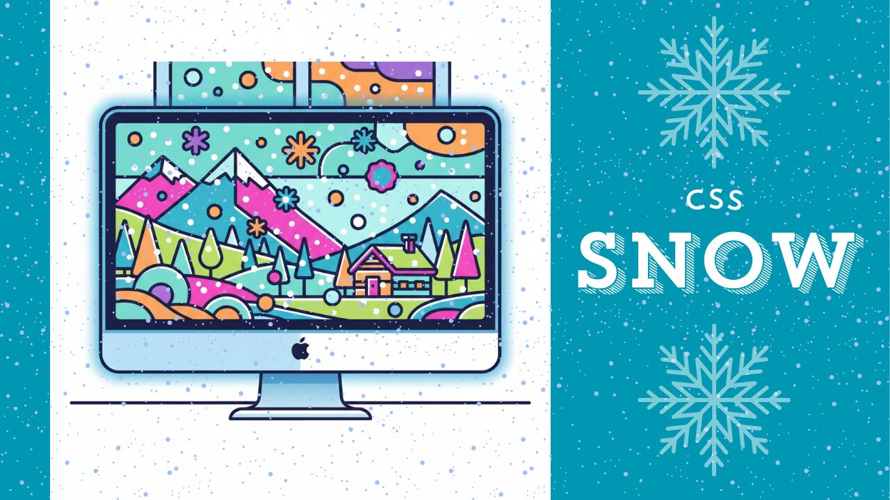
「冬のLPに雪を降らせたいけど、どのコードを真似すればいいか分からない」「Particles.jsは便利だけど、もっと軽くてシンプルにCSSだけで済ませたい」──そんなお悩みはありませんか。
いざ「css アニメーション 雪」で検索してみると、断片的なコードやデモは見つかるものの、「そのまま案件で使えるレベル」でまとまっている情報は意外と少ないはずです。しかも、雪の量や速度を調整したり、スマホでもカクつかせずに動かしたりとなると、一気にハードルが上がってしまいます。
本記事では、CSSアニメーションの基礎さえ押さえていれば、コピペから始めて実案件レベルまで一気に持っていける「雪アニメーションの実装パターン」を体系的に整理しています。
雪がただ落ちるだけでなく、「ひらひら舞う」「キラキラ光る」「紙吹雪風に散る」といった表現の違いや、Particles.jsなどのJavaScript実装と比べたときのメリット・デメリットも、現場目線で分かりやすく解説します。
さらに、実際に使うことを前提に「CSS変数でパラメータ管理」「transform/opacity中心で軽量化」「複数レイヤーで奥行きを出す」など、デザイナーの意図を再現しつつパフォーマンスも両立させるテクニックも紹介します。
「とりあえず動いた」ではなく、「クライアントに出しても恥ずかしくない雪アニメーション」をサクッと仕上げたい方に向けた内容です。
格安ドメイン取得サービス─ムームードメイン─
CSSだけで雪を降らせる基本実装
CSSアニメーションで雪を降らせる実装は、JavaScriptを一切使わずに実現できます。@keyframesとanimationプロパティを組み合わせることで、軽量かつ滑らかな降雪エフェクトを作成できます。
コピペで即使える雪アニメーションの完全コードサンプル
まずは基本となるシンプルな雪のアニメーションを実装してみましょう。以下のコードをコピペするだけで、すぐに雪が降り始めます。
<div class="snow-container">
  <div class="snow"></div>
  <div class="snow"></div>
  <div class="snow"></div>
  <div class="snow"></div>
  <div class="snow"></div>
  <div class="snow"></div>
  <div class="snow"></div>
  <div class="snow"></div>
  <div class="snow"></div>
  <div class="snow"></div>
</div>
.snow-container {
position: fixed;
top: 0;
left: 0;
width: 100%;
height: 100%;
pointer-events: none;
overflow: hidden;
z-index: 9999;
}
.snow {
position: absolute;
top: -10px;
background: white;
border-radius: 50%;
width: 5px;
height: 5px;
opacity: 0.8;
animation: fall linear infinite;
}
@keyframes fall {
0% {
transform: translateY(0) translateX(0);
}
100% {
transform: translateY(100vh) translateX(50px);
}
}
/* 各雪に異なる位置と速度を設定 */
.snow:nth-child(1) { left: 10%; animation-duration: 8s; }
.snow:nth-child(2) { left: 20%; animation-duration: 10s; width: 7px; height: 7px; }
.snow:nth-child(3) { left: 30%; animation-duration: 7s; width: 4px; height: 4px; }
.snow:nth-child(4) { left: 40%; animation-duration: 12s; }
.snow:nth-child(5) { left: 50%; animation-duration: 9s; width: 6px; height: 6px; }
.snow:nth-child(6) { left: 60%; animation-duration: 11s; }
.snow:nth-child(7) { left: 70%; animation-duration: 8s; width: 5px; height: 5px; }
.snow:nth-child(8) { left: 80%; animation-duration: 10s; width: 7px; height: 7px; }
.snow:nth-child(9) { left: 90%; animation-duration: 9s; width: 4px; height: 4px; }
.snow:nth-child(10) { left: 95%; animation-duration: 11s; }実際の表示
See the Pen css-snow-01 by watashi-xyz (@watashi-xyz) on CodePen.
コードの解説
.snow-containerは画面全体を覆う固定配置のコンテナです。pointer-events: none;により、雪がクリックなどのユーザー操作を妨げないようにしています。.snowは個々の雪の要素で、border-radius: 50%;で円形にしています。@keyframes fallでは、transformを使って上から下へ落下する動きを定義しています。topやleftではなくtransformを使うことで、GPUアクセラレーションが効き、スマホでも滑らかに動作します。nth-childセレクタで各雪に異なる横位置(left)、落下速度(animation-duration)、サイズ(width/height)を設定し、自然なバラつきを表現しています。
雪の量・速度・サイズをCSS変数で調整する方法
実案件では、クライアントの要望に応じて雪の量や速度を微調整する必要があります。CSS変数(カスタムプロパティ)を使えば、後から簡単にカスタマイズできます。
:root {
  --snow-color: rgba(255, 255, 255, 0.8);
  --snow-size: 5px;
  --fall-duration: 10s;
  --fall-distance: 100vh;
}

.snow {
  position: absolute;
  top: -10px;
  background: var(--snow-color);
  border-radius: 50%;
  width: var(--snow-size);
  height: var(--snow-size);
  animation: fall var(--fall-duration) linear infinite;
}

@keyframes fall {
  0% {
    transform: translateY(0) translateX(0);
    opacity: 0;
  }
  10% {
    opacity: 1;
  }
  90% {
    opacity: 1;
  }
  100% {
    transform: translateY(var(--fall-distance)) translateX(50px);
    opacity: 0;
  }
}
調整のポイント
-snow-color:雪の色と透明度を変更できます。背景が暗い場合はrgba(255, 255, 255, 0.9)のように不透明度を上げましょう。-snow-size:雪の大きさを一括で変更できます。8pxにすると大粒の雪になります。-fall-duration:数値を小さくすると速く、大きくするとゆっくり落ちます。15sにすると穏やかな降雪になります。-fall-distance:落下距離を調整できます。通常は100vh(画面の高さ)で十分です。
この書き方なら、:rootの変数を変えるだけで全体の雰囲気を一気に調整できるため、メンテナンス性が高まります。
animation-delayを使ったランダムな降雪演出のテクニック
すべての雪が同時に落ち始めると不自然に見えます。animation-delayを使って、各雪の開始タイミングをずらすことで、よりリアルな降雪を表現できます。
.snow:nth-child(1) {
  left: 10%;
  animation-duration: 8s;
  animation-delay: 0s;
}

.snow:nth-child(2) {
  left: 20%;
  animation-duration: 10s;
  animation-delay: 2s;
  width: 7px;
  height: 7px;
}

.snow:nth-child(3) {
  left: 30%;
  animation-duration: 7s;
  animation-delay: 4s;
  width: 4px;
  height: 4px;
}

.snow:nth-child(4) {
  left: 40%;
  animation-duration: 12s;
  animation-delay: 1s;
}

.snow:nth-child(5) {
  left: 50%;
  animation-duration: 9s;
  animation-delay: 5s;
  width: 6px;
  height: 6px;
}

.snow:nth-child(6) {
  left: 60%;
  animation-duration: 11s;
  animation-delay: 3s;
}

.snow:nth-child(7) {
  left: 70%;
  animation-duration: 8s;
  animation-delay: 6s;
}

.snow:nth-child(8) {
  left: 80%;
  animation-duration: 10s;
  animation-delay: 2.5s;
  width: 7px;
  height: 7px;
}

.snow:nth-child(9) {
  left: 90%;
  animation-duration: 9s;
  animation-delay: 4.5s;
  width: 4px;
  height: 4px;
}

.snow:nth-child(10) {
  left: 95%;
  animation-duration: 11s;
  animation-delay: 1.5s;
}
より効率的な書き方:
雪の数が多い場合は、Sassなどのプリプロセッサを使うと効率的です。以下はSassの例です:
@for $i from 1 through 20 {
  .snow:nth-child(#{$i}) {
    left: random(100) * 1%;
    animation-duration: (random(5) + 7) * 1s;
    animation-delay: random(10) * 0.5s;
    width: (random(3) + 4) * 1px;
    height: (random(3) + 4) * 1px;
  }
}このコードをコンパイルすると、20個の雪それぞれに異なる位置・速度・遅延・サイズが自動的に設定されます。手動で書くよりも圧倒的に効率的で、自然なランダム感を出せます。
animation-delayを活用することで、雪が連続的に降り続ける自然な演出が実現できます。実案件では、雪の数を30〜50個程度に増やすと、より豊かな降雪表現になります。
雪の結晶・紙吹雪・キラキラなど多彩な表現
シンプルな丸い雪だけでなく、CSS擬似要素やSVG、アニメーションの工夫を加えることで、雪の結晶や紙吹雪、キラキラと舞う演出など、多彩な表現が可能です。デザインの要望に応じて使い分けましょう。
CSS擬似要素やSVGで雪の結晶を作る方法
丸い雪よりも本格的な「雪の結晶」を表現したい場合は、CSS擬似要素を活用する方法と、SVGを背景画像として使う方法があります。
擬似要素で雪の結晶を作る方法
<div class="snow-container">
  <div class="snowflake"></div>
  <div class="snowflake"></div>
  <div class="snowflake"></div>
  <div class="snowflake"></div>
  <div class="snowflake"></div>
  <div class="snowflake"></div>
  <div class="snowflake"></div>
  <div class="snowflake"></div>
  <div class="snowflake"></div>
  <div class="snowflake"></div>
</div>
.snowflake {
position: absolute;
top: -10px;
color: white;
font-size: 20px;
opacity: 0.8;
animation: fall 10s linear infinite;
}
.snowflake::before,
.snowflake::after {
content: "❅";
position: absolute;
}
.snowflake::before {
transform: rotate(60deg);
}
.snowflake::after {
transform: rotate(-60deg);
}
@keyframes fall {
0% {
transform: translateY(0) rotate(0deg);
}
100% {
transform: translateY(100vh) rotate(360deg);
}
}
/* 各雪に異なる位置と速度を設定 */
.snowflake:nth-child(1) { left: 10%; animation-duration: 8s; }
.snowflake:nth-child(2) { left: 20%; animation-duration: 10s; width: 7px; height: 7px; }
.snowflake:nth-child(3) { left: 30%; animation-duration: 7s; width: 4px; height: 4px; }
.snowflake:nth-child(4) { left: 40%; animation-duration: 12s; }
.snowflake:nth-child(5) { left: 50%; animation-duration: 9s; width: 6px; height: 6px; }
.snowflake:nth-child(6) { left: 60%; animation-duration: 11s; }
.snowflake:nth-child(7) { left: 70%; animation-duration: 8s; width: 5px; height: 5px; }
.snowflake:nth-child(8) { left: 80%; animation-duration: 10s; width: 7px; height: 7px; }
.snowflake:nth-child(9) { left: 90%; animation-duration: 9s; width: 4px; height: 4px; }
.snowflake:nth-child(10) { left: 95%; animation-duration: 11s; }実際の表示
See the Pen css-snow-2 by watashi-xyz (@watashi-xyz) on CodePen.
この方法では、Unicode文字「❅」(雪の結晶記号)を使用しています。::beforeと::afterで回転させることで、より複雑な結晶模様を重ねることもできます。
SVGを使った本格的な雪の結晶
より細かいデザインの雪の結晶を表現したい場合は、SVGを背景画像として使用するのがおすすめです。
<div class="snow-container">
  <div class="snowflake-svg"></div>
  <div class="snowflake-svg"></div>
  <div class="snowflake-svg"></div>
  <div class="snowflake-svg"></div>
  <div class="snowflake-svg"></div>
  <div class="snowflake-svg"></div>
  <div class="snowflake-svg"></div>
  <div class="snowflake-svg"></div>
  <div class="snowflake-svg"></div>
  <div class="snowflake-svg"></div>
</div>
body {
background: black;
}
.snowflake-svg {
position: absolute;
top: -10px;
width: 30px;
height: 30px;
background-image: url('data:image/svg+xml;utf8,<svg xmlns="http://www.w3.org/2000/svg" viewBox="0 0 24 24" fill="white"><path d="M12 0L13 8L12 16L11 8L12 0Z"/><path d="M12 24L13 16L12 8L11 16L12 24Z"/><path d="M0 12L8 13L16 12L8 11L0 12Z"/><path d="M24 12L16 13L8 12L16 11L24 12Z"/><path d="M3 3L9 9L15 15L9 9L3 3Z"/><path d="M21 21L15 15L9 9L15 15L21 21Z"/><path d="M21 3L15 9L9 15L15 9L21 3Z"/><path d="M3 21L9 15L15 9L9 15L3 21Z"/></svg>');
background-size: contain;
background-repeat: no-repeat;
opacity: 0.9;
animation: fall-rotate 12s linear infinite;
}
@keyframes fall-rotate {
0% {
transform: translateY(0) rotate(0deg);
opacity: 0;
}
10% {
opacity: 1;
}
90% {
opacity: 1;
}
100% {
transform: translateY(100vh) rotate(360deg);
opacity: 0;
}
}
/* 各雪に異なる位置と速度を設定 */
.snowflake-svg:nth-child(1) { left: 10%; animation-duration: 8s; }
.snowflake-svg:nth-child(2) { left: 20%; animation-duration: 10s; width: 7px; height: 7px; }
.snowflake-svg:nth-child(3) { left: 30%; animation-duration: 7s; width: 4px; height: 4px; }
.snowflake-svg:nth-child(4) { left: 40%; animation-duration: 12s; }
.snowflake-svg:nth-child(5) { left: 50%; animation-duration: 9s; width: 6px; height: 6px; }
.snowflake-svg:nth-child(6) { left: 60%; animation-duration: 11s; }
.snowflake-svg:nth-child(7) { left: 70%; animation-duration: 8s; width: 5px; height: 5px; }
.snowflake-svg:nth-child(8) { left: 80%; animation-duration: 10s; width: 7px; height: 7px; }
.snowflake-svg:nth-child(9) { left: 90%; animation-duration: 9s; width: 4px; height: 4px; }
.snowflake-svg:nth-child(10) { left: 95%; animation-duration: 11s; }実際の表示
See the Pen Untitled by watashi-xyz (@watashi-xyz) on CodePen.
SVGをdata URIとして埋め込むことで、外部ファイルを読み込まずに済みます。この方法なら、HTTPリクエストを増やさずに複雑なデザインを表現できるため、パフォーマンス面でも優れています。
紙吹雪アニメーションとの違いと応用コード例
雪のコードを少し調整するだけで、お祝いやキャンペーンに使える「紙吹雪(コンフェッティ)」アニメーションに変換できます。主な違いは、色をカラフルにすることと、回転を強調することです。
<div class="snow-container">
  <div class="confetti"></div>
  <div class="confetti"></div>
  <div class="confetti"></div>
  <div class="confetti"></div>
  <div class="confetti"></div>
  <div class="confetti"></div>
  <div class="confetti"></div>
  <div class="confetti"></div>
</div>
.confetti {
position: absolute;
top: -10px;
width: 10px;
height: 10px;
animation: confetti-fall 4s ease-in infinite;
}
/* カラフルな色をランダムに設定 */
.confetti:nth-child(1) { background: #ff6b6b; left: 10%; animation-delay: 0s; }
.confetti:nth-child(2) { background: #4ecdc4; left: 20%; animation-delay: 0.3s; }
.confetti:nth-child(3) { background: #ffe66d; left: 30%; animation-delay: 0.6s; }
.confetti:nth-child(4) { background: #95e1d3; left: 40%; animation-delay: 0.9s; }
.confetti:nth-child(5) { background: #f38181; left: 50%; animation-delay: 1.2s; }
.confetti:nth-child(6) { background: #aa96da; left: 60%; animation-delay: 0.4s; }
.confetti:nth-child(7) { background: #fcbad3; left: 70%; animation-delay: 0.7s; }
.confetti:nth-child(8) { background: #a8e6cf; left: 80%; animation-delay: 1s; }
@keyframes confetti-fall {
0% {
transform: translateY(0) rotate(0deg) translateX(0);
opacity: 1;
}
100% {
transform: translateY(100vh) rotate(720deg) translateX(100px);
opacity: 0;
}
}実際の表示
See the Pen css-snow-04 by watashi-xyz (@watashi-xyz) on CodePen.
雪と紙吹雪の主な違い
| 要素 | 雪 | 紙吹雪 |
|---|---|---|
| 色 | 白・青系の単色 | カラフルな多色 |
| 形 | 円形・結晶形 | 長方形・正方形 |
| 回転 | 緩やか(360deg程度) | 激しい(720deg以上) |
| 速度 | ゆっくり(8〜12秒) | 速い(3〜5秒) |
| 用途 | 冬・クリスマス演出 | お祝い・達成時の演出 |
紙吹雪は長方形にすることで、よりリアルな演出になります:
.confetti {
  width: 8px;
  height: 12px;
  border-radius: 2px; /* 角を少し丸める */
}
キラキラやひらひら舞う動きを@keyframesで実現する方法
単純な落下だけでなく、左右に揺れながら落ちる「ひらひら」した動きを加えることで、より自然で魅力的なアニメーションになります。
左右に揺れながら落ちる雪
<div class="snow-container">
  <div class="snow-flutter"></div>
  <div class="snow-flutter"></div>
  <div class="snow-flutter"></div>
  <div class="snow-flutter"></div>
  <div class="snow-flutter"></div>
  <div class="snow-flutter"></div>
  <div class="snow-flutter"></div>
  <div class="snow-flutter"></div>
  <div class="snow-flutter"></div>
</div>
body {
background-color: black;
}
.snow-flutter:nth-child(1) { left: 42%; animation-delay: .4s; }
.snow-flutter:nth-child(2) { left: 44%; animation-delay: .6s; }
.snow-flutter:nth-child(3) { left: 46%; animation-delay: .5s; }
.snow-flutter:nth-child(4) { left: 48%; animation-delay: .7s; }
.snow-flutter:nth-child(5) { left: 50%; animation-delay: .1s; }
.snow-flutter:nth-child(6) { left: 52%; animation-delay: .2s; }
.snow-flutter:nth-child(7) { left: 54%; animation-delay: .9s; }
.snow-flutter:nth-child(8) { left: 56%; animation-delay: .8s; }
.snow-flutter:nth-child(9) { left: 58%; animation-delay: .3s; }
.snow-flutter {
position: absolute;
top: -10px;
background: white;
border-radius: 50%;
width: 6px;
height: 6px;
opacity: 0.8;
animation: flutter 10s ease-in-out infinite;
}
@keyframes flutter {
0% {
transform: translateY(0) translateX(0) rotate(0deg);
opacity: 0;
}
10% {
opacity: 1;
}
25% {
transform: translateY(25vh) translateX(-30px) rotate(90deg);
}
50% {
transform: translateY(50vh) translateX(30px) rotate(180deg);
}
75% {
transform: translateY(75vh) translateX(-20px) rotate(270deg);
}
100% {
transform: translateY(100vh) translateX(10px) rotate(360deg);
opacity: 0;
}
}実際の表示
See the Pen css-snow-04 by watashi-xyz (@watashi-xyz) on CodePen.
このflutterアニメーションでは、落下の各段階で左右に揺れる動きを設定しています。ease-in-outのイージング関数を使うことで、より自然な動きになります。
キラキラ光る演出を加える
雪が光りながら落ちるエフェクトを追加すると、より幻想的な雰囲気になります。
<div class="snow-container">
  <div class="snow-sparkle"></div>
  <div class="snow-sparkle"></div>
  <div class="snow-sparkle"></div>
  <div class="snow-sparkle"></div>
  <div class="snow-sparkle"></div>
  <div class="snow-sparkle"></div>
  <div class="snow-sparkle"></div>
  <div class="snow-sparkle"></div>
  <div class="snow-sparkle"></div>
</div>
body {
background-color: black;
}
.snow-sparkle {
position: absolute;
top: -10px;
background: radial-gradient(circle, white 0%, transparent 70%);
border-radius: 50%;
width: 8px;
height: 8px;
box-shadow: 0 0 10px rgba(255, 255, 255, 0.8);
animation: sparkle-fall 12s linear infinite;
}
.snow-sparkle:nth-child(1) { left: 10%; animation-duration: 8s; }
.snow-sparkle:nth-child(2) { left: 20%; animation-duration: 10s; }
.snow-sparkle:nth-child(3) { left: 30%; animation-duration: 7s; }
.snow-sparkle:nth-child(4) { left: 40%; animation-duration: 12s; }
.snow-sparkle:nth-child(5) { left: 50%; animation-duration: 9s; }
.snow-sparkle:nth-child(6) { left: 60%; animation-duration: 11s; }
.snow-sparkle:nth-child(7) { left: 70%; animation-duration: 8s; }
.snow-sparkle:nth-child(8) { left: 80%; animation-duration: 10s; }
.snow-sparkle:nth-child(9) { left: 90%; animation-duration: 9s; }
@keyframes sparkle-fall {
0%, 100% {
transform: translateY(0) scale(0.5);
opacity: 0;
}
10% {
transform: translateY(10vh) scale(1);
opacity: 1;
filter: brightness(1.5);
}
50% {
transform: translateY(50vh) scale(0.8);
opacity: 0.8;
filter: brightness(1);
}
90% {
transform: translateY(90vh) scale(1.2);
opacity: 0.5;
filter: brightness(0.8);
}
100% {
transform: translateY(100vh) scale(0.5);
opacity: 0;
}
}
実際の表示
See the Pen css-snow-06 by watashi-xyz (@watashi-xyz) on CodePen.
ポイント
radial-gradientで中心が明るいグラデーションを作成し、光の広がりを表現box-shadowで発光エフェクトを追加scale()で大きさを変化させ、遠近感を演出filter: brightness()で明るさを変化させ、キラキラ感を強調
複数のアニメーションを組み合わせる応用テクニック:
<div class="snow-container">
  <div class="snow-advanced"></div>
</div>
body {
background-color: black;
}
.snow-advanced {
position: absolute;
top: -10px;
left: 50%;
background: white;
border-radius: 50%;
width: 5px;
height: 5px;
opacity: 0.9;
animation:
fall-sway 15s linear infinite,
sparkle-pulse 2s ease-in-out infinite;
}
@keyframes fall-sway {
0% { transform: translate(0, 0); }
25% { transform: translate(50px, 25vh); } /* 水平移動を組み込む */
50% { transform: translate(0, 50vh); } /* 水平移動を組み込む */
75% { transform: translate(50px, 75vh); } /* 水平移動を組み込む */
100% { transform: translate(0, 100vh); }
}
@keyframes sparkle-pulse {
0%, 100% { opacity: 0.7; filter: brightness(1); }
50% { opacity: 1; filter: brightness(1.5); }
}
実際の表示
See the Pen css-snow-07 by watashi-xyz (@watashi-xyz) on CodePen.
この方法では、複数のアニメーションを同時に適用することで、縦の落下、横の揺れ、明滅の3つの動きを独立して制御できます。それぞれのanimation-durationを変えることで、より複雑で自然な動きを実現できます。
実案件で使える最適化・応用テクニック
実際のWebサイトに雪のアニメーションを実装する際は、パフォーマンスとユーザー体験を考慮した最適化が不可欠です。ここでは、スマホでも快適に動作する実装方法と、より高度な演出テクニックを解説します。
スマホでも滑らかに動作するパフォーマンス最適化(transform/opacity活用)
CSSアニメーションのパフォーマンスを左右する最大のポイントは、どのプロパティをアニメーションさせるかです。プロパティによって、ブラウザの処理負荷が大きく異なります。
避けるべきプロパティ(リフローが発生)
/* ❌ 悪い例:top/leftを使った実装 */
@keyframes fall-bad {
  0% { top: 0; left: 0; }
  100% { top: 100vh; left: 50px; }
}top、left、width、heightなどのプロパティをアニメーションさせると、**リフロー(レイアウト再計算)**が発生し、ブラウザの処理負荷が非常に高くなります。特にスマホでは顕著にカクつきます。
推奨される実装(GPUアクセラレーション)
/* ✅ 良い例:transformを使った実装 */
@keyframes fall-good {
  0% { transform: translate3d(0, 0, 0); }
  100% { transform: translate3d(50px, 100vh, 0); }
}

.snow-optimized {
  position: absolute;
  top: -10px;
  left: 10%;
  background: white;
  border-radius: 50%;
  width: 5px;
  height: 5px;
  opacity: 0.8;
  will-change: transform, opacity;
  animation: fall-good 10s linear infinite;
}
最適化のポイント
transformとopacityのみをアニメーション:これらのプロパティはGPUアクセラレーションが効き、リフローを発生させません。translate3d()を使用:translateY()ではなくtranslate3d()を使うことで、明示的にGPUレイヤーを作成します。will-changeプロパティ:ブラウザに「このプロパティがアニメーションする」と事前に伝えることで、最適化の準備をさせます。ただし、多用しすぎるとメモリを消費するため、アニメーションする要素にのみ指定しましょう。
要素数の最適化
/* デバイスに応じて雪の数を調整 */
@media (max-width: 768px) {
  /* スマホでは雪の数を減らす */
  .snow:nth-child(n+11) {
    display: none;
  }
}

@media (prefers-reduced-motion: reduce) {
  /* アクセシビリティ:アニメーションを無効化するユーザーへの配慮 */
  .snow {
    animation: none;
    display: none;
  }
}スマホでは雪の要素数を10〜15個程度に抑えることで、スムーズな動作を維持できます。また、prefers-reduced-motionメディアクエリを使うことで、動きに敏感なユーザーへの配慮も忘れずに実装しましょう。
パフォーマンス測定のチェックリスト
- Chrome DevToolsの「Performance」タブでFPSを確認(60fps維持が理想)
- モバイル実機でのスクロール時の動作確認
will-changeの使いすぎによるメモリ消費をチェック- 要素数を段階的に増やして、パフォーマンスの閾値を確認
複数レイヤーで立体感を出すパララックス雪アニメーション
「手前の雪は大きく速く」「奥の雪は小さく遅く」動かすことで、奥行きのある立体的な降雪表現が可能です。この技法をパララックス(視差効果)と呼びます。
/* 奥のレイヤー(遠景) */
.snow-layer-back {
  position: absolute;
  background: rgba(255, 255, 255, 0.4);
  border-radius: 50%;
  width: 3px;
  height: 3px;
  animation: fall-slow 15s linear infinite;
  filter: blur(1px);
}

/* 中間のレイヤー */
.snow-layer-middle {
  position: absolute;
  background: rgba(255, 255, 255, 0.7);
  border-radius: 50%;
  width: 5px;
  height: 5px;
  animation: fall-medium 10s linear infinite;
}

/* 手前のレイヤー(近景) */
.snow-layer-front {
  position: absolute;
  background: rgba(255, 255, 255, 0.9);
  border-radius: 50%;
  width: 8px;
  height: 8px;
  animation: fall-fast 7s linear infinite;
  filter: blur(0.5px);
}

@keyframes fall-slow {
  0% { transform: translate3d(0, 0, 0); opacity: 0; }
  10% { opacity: 0.4; }
  90% { opacity: 0.4; }
  100% { transform: translate3d(20px, 100vh, 0); opacity: 0; }
}

@keyframes fall-medium {
  0% { transform: translate3d(0, 0, 0); opacity: 0; }
  10% { opacity: 0.7; }
  90% { opacity: 0.7; }
  100% { transform: translate3d(40px, 100vh, 0); opacity: 0; }
}

@keyframes fall-fast {
  0% { transform: translate3d(0, 0, 0); opacity: 0; }
  10% { opacity: 0.9; }
  90% { opacity: 0.9; }
  100% { transform: translate3d(80px, 100vh, 0); opacity: 0; }
}
<div class="snow-container">
  <!-- 奥のレイヤー(遠景) -->
  <div class="snow-layer-back" style="left: 5%;"></div>
  <div class="snow-layer-back" style="left: 25%;"></div>
  <div class="snow-layer-back" style="left: 45%;"></div>
  <div class="snow-layer-back" style="left: 65%;"></div>
  <div class="snow-layer-back" style="left: 85%;"></div>

  <!-- 中間のレイヤー -->
  <div class="snow-layer-middle" style="left: 15%;"></div>
  <div class="snow-layer-middle" style="left: 35%;"></div>
  <div class="snow-layer-middle" style="left: 55%;"></div>
  <div class="snow-layer-middle" style="left: 75%;"></div>

  <!-- 手前のレイヤー(近景) -->
  <div class="snow-layer-front" style="left: 10%;"></div>
  <div class="snow-layer-front" style="left: 30%;"></div>
  <div class="snow-layer-front" style="left: 50%;"></div>
  <div class="snow-layer-front" style="left: 70%;"></div>
  <div class="snow-layer-front" style="left: 90%;"></div>
</div>
実際の表示
See the Pen css-snow-08 by watashi-xyz (@watashi-xyz) on CodePen.
立体感を出すための重要な要素
| レイヤー | サイズ | 速度 | 不透明度 | ぼかし | 横移動距離 |
|---|---|---|---|---|---|
| 奥(遠景) | 小(3px) | 遅い(15s) | 低い(0.4) | 強い(1px) | 短い(20px) |
| 中間 | 中(5px) | 中間(10s) | 中間(0.7) | なし | 中間(40px) |
| 手前(近景) | 大(8px) | 速い(7s) | 高い(0.9) | 軽い(0.5px) | 長い(80px) |
このように、サイズ、速度、不透明度、ぼかしを段階的に変えることで、リアルな奥行き感が生まれます。手前の雪にわずかなぼかしを加えることで、カメラのピント効果も再現できます。
Particles.jsなどJavaScript版との比較と導入メリット・デメリット
雪のアニメーションには、CSSだけでなくJavaScriptライブラリを使う選択肢もあります。代表的なのが「Particles.js」や「tsParticles」です。それぞれのメリット・デメリットを理解して、プロジェクトに最適な方法を選びましょう。
実装方法の比較表
| 項目 | CSS版 | JavaScript版(Particles.js等) |
|---|---|---|
| 実装の手軽さ | ◎ コピペだけで実装可能 | △ ライブラリの読み込みと設定が必要 |
| パフォーマンス | ◎ 軽量でGPU最適化しやすい | △ 要素数が多いと重くなる可能性 |
| カスタマイズ性 | ○ CSSの知識で調整可能 | ◎ 細かい制御が可能 |
| インタラクティブ性 | × マウス追従などは不可 | ◎ クリック・マウスオーバー対応可能 |
| メンテナンス性 | ◎ 依存関係なし | △ ライブラリのバージョン管理が必要 |
| ファイルサイズ | ◎ CSSのみ(数KB) | △ ライブラリ込み(30〜100KB) |
| 表現の複雑さ | △ 基本的な動きが中心 | ◎ 物理演算や相互作用も可能 |
| ブラウザ対応 | ◎ モダンブラウザ全て | ○ IE11は追加設定が必要 |
CSS版が適しているケース
- シンプルな降雪演出で十分な場合
- ページの読み込み速度を最優先したい場合
- 外部ライブラリへの依存を避けたい場合
- モバイルファーストで軽量さが重要な場合
- 静的サイトジェネレーターを使用している場合
JavaScript版が適しているケース
- マウスカーソルに反応する雪を実装したい場合
- 雪の要素数を動的に変更したい場合
- 複雑な物理演算(風の影響、重力変化など)を実装したい場合
- ユーザーアクションに応じて雪の動きを変えたい場合
- 他のJavaScript機能と連携させたい場合
CSS版の実装例(推奨)
/* 軽量でメンテナンスしやすい */
.snow {
  position: absolute;
  background: white;
  border-radius: 50%;
  animation: fall 10s linear infinite;
}
Particles.js版の実装例(参考):
// ライブラリの読み込みと設定が必要
particlesJS('snow-container', {
  particles: {
    number: { value: 100 },
    color: { value: '#ffffff' },
    shape: { type: 'circle' },
    opacity: { value: 0.8 },
    size: { value: 3 },
    move: {
      enable: true,
      speed: 2,
      direction: 'bottom',
      straight: false
    }
  },
  interactivity: {
    events: {
      onhover: { enable: true, mode: 'repulse' }
    }
  }
});
実務での推奨アプローチ:
- まずCSS版で実装し、クライアントに確認
- インタラクティブ性が必要と判明したら、JavaScript版を検討
- パフォーマンステストを実施し、問題があればCSS版に戻す
多くの場合、CSS版で十分な演出が可能です。「JavaScriptを使えば高度なことができる」という理由だけで採用すると、不要な複雑さとパフォーマンス低下を招く可能性があります。シンプルな実装から始めて、必要に応じて段階的に高度化するのが、実案件での賢いアプローチです。
よくある質問(FAQ)
-
雪のアニメーションが重くてスマホでカクつきます。対策は?
-
カクつきの主な原因は、リフローを発生させるプロパティのアニメーションや、要素数が多すぎることです。以下の対策を順に試してください。
対策1:transformとopacityのみを使う
/* ❌ 避けるべき実装 */ @keyframes fall-heavy { 0% { top: 0; left: 0; } 100% { top: 100vh; left: 50px; } } /* ✅ 推奨される実装 */ @keyframes fall-light { 0% { transform: translate3d(0, 0, 0); opacity: 0; } 10% { opacity: 1; } 90% { opacity: 1; } 100% { transform: translate3d(50px, 100vh, 0); opacity: 0; } }top、leftではなくtransformを使うことで、GPUアクセラレーションが効き、大幅にパフォーマンスが向上します。対策2:スマホでは要素数を減らす
/* デスクトップ:30個の雪 */
.snow {
  display: block;
}

/* スマホ:10個に制限 */
@media (max-width: 768px) {
  .snow:nth-child(n+11) {
    display: none;
  }
}

/* ローエンドスマホ:5個に制限 */
@media (max-width: 480px) {
  .snow:nth-child(n+6) {
    display: none;
  }
}
デバイスの性能に応じて要素数を調整することで、幅広い端末で快適に動作します。
対策3:will-changeプロパティを適切に使う
.snow { will-change: transform, opacity; animation: fall 10s linear infinite; } /* アニメーション終了後はwill-changeを解除(メモリ節約) */ .snow.animation-ended { will-change: auto; }will-changeは、ブラウザに「このプロパティがアニメーションする」と事前通知することで最適化を促します。ただし、多用しすぎるとメモリを消費するため、アニメーション中のみ指定しましょう。対策4:アニメーションの精度を下げる
/* 細かいキーフレームは処理が重い */
@keyframes fall-detailed {
  0% { transform: translateY(0); }
  10% { transform: translateY(10vh); }
  20% { transform: translateY(20vh); }
  /* ...中略... */
  100% { transform: translateY(100vh); }
}

/* シンプルなキーフレームは軽い */
@keyframes fall-simple {
  0% { transform: translate3d(0, 0, 0); }
  100% { transform: translate3d(50px, 100vh, 0); }
}
キーフレームの段階が多いほど計算量が増えます。シンプルな開始点と終了点だけの定義で十分な場合が多いです。
対策5:アニメーションの一時停止オプションを提供
/* ユーザーがアニメーションを無効化できるボタンを用意 */
.snow-container.paused .snow {
  animation-play-state: paused;
}

/* アクセシビリティ対応 */
@media (prefers-reduced-motion: reduce) {
  .snow {
    animation: none;
    display: none;
  }
}
バッテリー節約やアクセシビリティの観点から、アニメーションを停止できる選択肢を提供するのがベストプラクティスです。
-
雪を特定の画像(バナー)の上だけに降らせたい場合は?
-
overflow: hiddenを持つコンテナで雪の範囲を制限することで、特定のエリアだけに雪を降らせることができます。実装方法:
<div class="banner">
  <div class="snow-container-local">
    <div class="snow"></div>
    <div class="snow"></div>
    <div class="snow"></div>
    <div class="snow"></div>
    <div class="snow"></div>
  </div>
  <img src="https://picsum.photos/500/80/" alt="キャンペーンバナー">
  <div class="banner-content">
    <h2>冬のセールキャンペーン</h2>
    <p>12月31日まで</p>
  </div>
</div>
body { background-color: black; } .banner { position: relative; width: 100%; height: 200px; overflow: hidden; /* 重要:これで雪がバナー外に出ない */ background: #1a1a2e; } .snow-container-local { position: absolute; top: 0; left: 0; width: 100%; height: 100%; pointer-events: none; /* バナーのクリック操作を妨げない */ z-index: 10; /* コンテンツの上に表示 */ } .snow-container-local .snow { position: absolute; top: -10px; background: white; border-radius: 50%; width: 5px; height: 5px; opacity: 0.8; animation: fall-local 8s linear infinite; } @keyframes fall-local { 0% { transform: translate3d(0, 0, 0); opacity: 0; } 10% { opacity: 0.8; } 90% { opacity: 0.8; } 100% { /* 100vhではなく、コンテナの高さ(400px)に合わせる */ transform: translate3d(30px, 410px, 0); opacity: 0; } } /* 各雪の位置と速度を設定 */ .snow-container-local .snow:nth-child(1) { left: 10%; animation-delay: 0s; } .snow-container-local .snow:nth-child(2) { left: 30%; animation-delay: 1s; animation-duration: 10s; } .snow-container-local .snow:nth-child(3) { left: 50%; animation-delay: 2s; animation-duration: 9s; } .snow-container-local .snow:nth-child(4) { left: 70%; animation-delay: 0.5s; animation-duration: 11s; } .snow-container-local .snow:nth-child(5) { left: 90%; animation-delay: 1.5s; animation-duration: 8s; }実際の表示
See the Pen Untitled by watashi-xyz (@watashi-xyz) on CodePen.
ポイント
- 親要素に
position: relativeとoverflow: hiddenを設定:これにより、雪がバナーの外に出なくなります。 - 雪のコンテナに
pointer-events: noneを設定:雪がバナーのボタンやリンクのクリックを妨げないようにします。 - 落下距離を調整:
100vhではなく、コンテナの実際の高さに合わせた値(例:410px)を指定します。 - z-indexで重なり順を制御:雪を背景画像の上、テキストコンテンツの下など、適切な位置に配置します。
複数のバナーに異なる雪を降らせる場合:
/* 各バナーで雪の色やスタイルを変える */ .banner-winter .snow { background: white; } .banner-christmas .snow { background: linear-gradient(135deg, #ff6b6b 0%, #feca57 100%); } .banner-newyear .snow { background: gold; box-shadow: 0 0 5px rgba(255, 215, 0, 0.8); } - 親要素に
-
雪が降る時間を指定して途中で止めたい場合は?
-
JavaScriptとCSSを組み合わせることで、特定の時間だけ雪を降らせることができます。
方法1:animation-iteration-countで回数を制限
.snow { position: absolute; background: white; border-radius: 50%; width: 5px; height: 5px; opacity: 0.8; animation: fall 10s linear 3; /* 3回だけ繰り返す(30秒で終了) */ } @keyframes fall { 0% { transform: translate3d(0, 0, 0); opacity: 0; } 10% { opacity: 0.8; } 90% { opacity: 0.8; } 100% { transform: translate3d(50px, 100vh, 0); opacity: 0; } }animation-iteration-countを数値で指定することで、アニメーションの繰り返し回数を制限できます。方法2:JavaScriptで動的に制御
<button id="toggle-snow">雪を降らせる</button>
<div class="snow-container" id="snow-container">
  <!-- 雪の要素 -->
</div>
.snow-container { position: fixed; top: 0; left: 0; width: 100%; height: 100%; pointer-events: none; opacity: 0; transition: opacity 1s ease; } .snow-container.active { opacity: 1; } .snow-container.active .snow { animation: fall 10s linear infinite; } .snow { position: absolute; background: white; border-radius: 50%; width: 5px; height: 5px; }const toggleButton = document.getElementById('toggle-snow'); const snowContainer = document.getElementById('snow-container'); let snowTimeout; toggleButton.addEventListener('click', () => { // 雪を開始 snowContainer.classList.add('active'); // 10秒後に自動停止 snowTimeout = setTimeout(() => { snowContainer.classList.remove('active'); }, 10000); });方法3:特定の時間帯だけ雪を表示
// ページ読み込み時に現在時刻をチェック
function checkSnowTime() {
  const now = new Date();
  const hour = now.getHours();
  const day = now.getDate();
  const month = now.getMonth() + 1; // 0-11なので+1

  // 12月1日〜25日の間だけ雪を表示
  if (month === 12 && day >= 1 && day <= 25) {
    document.querySelector('.snow-container').classList.add('active');
  }
}

// ページ読み込み時に実行
window.addEventListener('DOMContentLoaded', checkSnowTime);
方法4:スクロール位置に応じて表示/非表示
// 特定のセクションに入ったら雪を降らせる
const snowContainer = document.querySelector('.snow-container');
const targetSection = document.querySelector('.winter-section');

const observer = new IntersectionObserver((entries) => {
  entries.forEach(entry => {
    if (entry.isIntersecting) {
      snowContainer.classList.add('active');
    } else {
      snowContainer.classList.remove('active');
    }
  });
}, { threshold: 0.3 });

observer.observe(targetSection);
フェードイン・フェードアウト付きの実装:
.snow-container {
  opacity: 0;
  transition: opacity 2s ease-in-out;
}

.snow-container.active {
  opacity: 1;
}

.snow-container.fade-out {
  opacity: 0;
}
function startSnowWithDuration(duration) { const container = document.querySelector('.snow-container'); // フェードインで開始 container.classList.add('active'); // 指定時間後にフェードアウト開始 setTimeout(() => { container.classList.add('fade-out'); // フェードアウト完了後にactiveクラスも削除 setTimeout(() => { container.classList.remove('active', 'fade-out'); }, 2000); // transition時間と合わせる }, duration); } // 30秒間だけ雪を降らせる startSnowWithDuration(30000);この方法なら、雪が唐突に消えず、自然にフェードアウトするため、ユーザー体験が向上します。
まとめ
CSSだけで実装できる雪のアニメーションは、JavaScriptを使わずに軽量で美しい冬の演出を実現できる優れた手法です。この記事では、基本的な実装から応用テクニック、パフォーマンス最適化まで、実務で即使える知識を網羅的に解説してきました。
CSSアニメーションの最大の魅力は、外部ライブラリに依存せず、数十行のコードだけで本格的な演出が実現できる手軽さにあります。ページの読み込み速度を維持しながら、訪問者に印象的な体験を提供できるのは大きなメリットです。
実装する際は、まずシンプルな円形の雪から始めて、クライアントの反応を見ながら段階的にカスタマイズしていくアプローチがおすすめです。雪の結晶や紙吹雪への応用、パララックス効果の追加など、基本を押さえておけば様々なバリエーションに対応できます。
あわせて読みたい


