WebサイトやアプリのUIにおいて「タブ切り替え」は欠かせない存在です。複数の情報をスッキリ整理し、ユーザーが欲しい情報にすぐアクセスできる便利なナビゲーションとして使われています。しかし実際に実装する段階になると、「JavaScriptで制御しなければならないのでは?」「CSSだけでおしゃれなアニメーションをつけるのは難しいのでは?」と感じる方も多いのではないでしょうか。特に、滑らかに切り替わるアニメーションをつけながら、レスポンシブ対応やアクセシビリティまで考慮するとなると、一気にハードルが高くなったように思えてしまいます。
そこで今回の記事では、CSSだけで実現できるタブ切り替えアニメーションにフォーカスします。ラジオボタンやチェックボックスを用いた工夫や、transition・transformプロパティを使った表現など、初心者でも理解しやすい基本から、すぐに使える実装例までをわかりやすく紹介します。さらに、レスポンシブやアクセシビリティの面も押さえているので、単なるデザインの工夫にとどまらず、実用的に使える構築方法を学べます。
この記事を読むことで、CSSだけで「見やすくて」「動きが心地いい」タブ切り替えを実装できるようになります。コピー&ペーストで使えるコード例も盛り込んでいるので、制作中のプロジェクトにすぐ取り入れることが可能です。
誰でも手軽に「見た目も使い勝手も良い」タブ切り替えを実装できるようになるので、ぜひ最後までチェックしてみてください。
あなたのサイトのURL、そろそろスリムにしませんか?
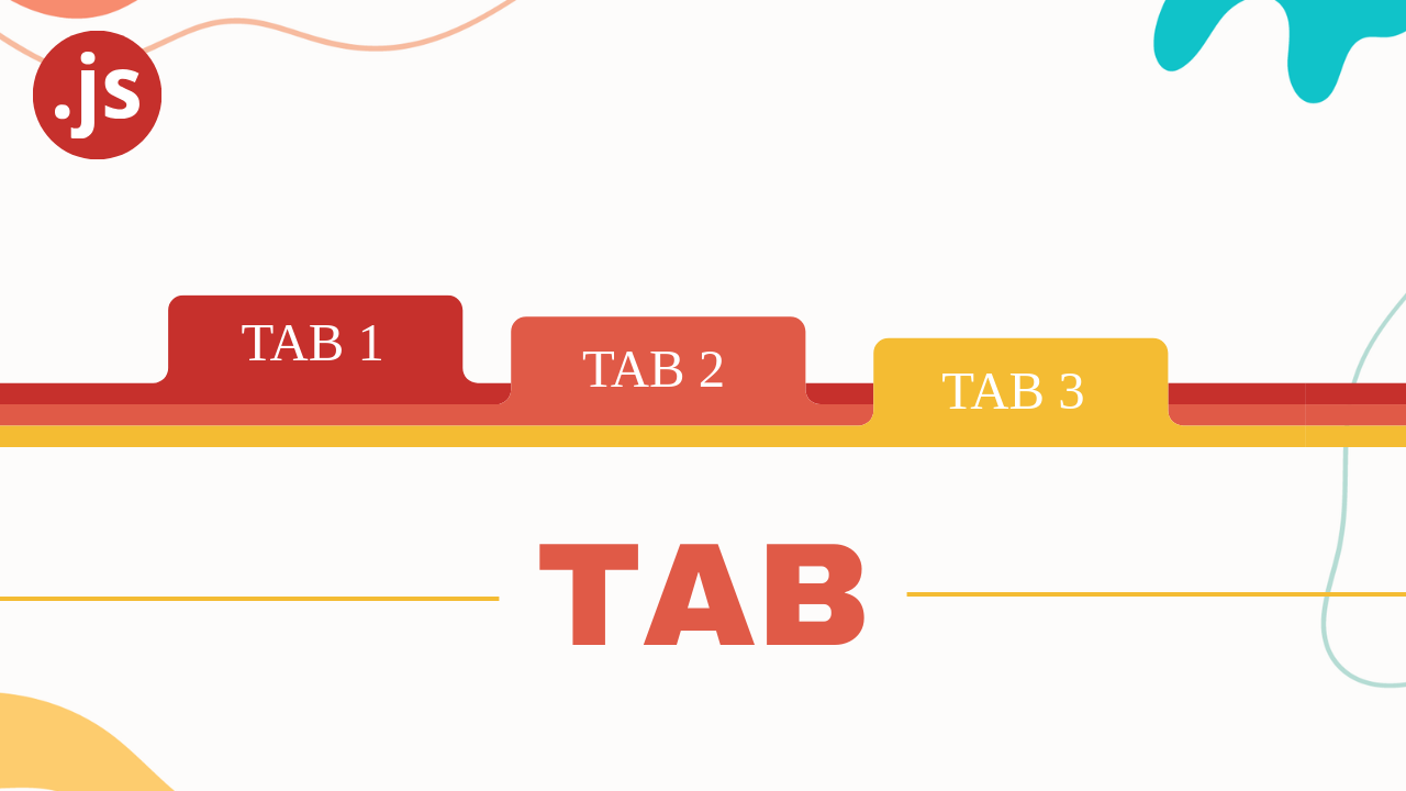
CSSだけで実現!おしゃれなタブ切り替えアニメーション入門
Webサイトでよく見かけるタブ切り替え機能。実はJavaScriptを使わなくても、CSSだけで美しいアニメーション付きのタブUIを実装できることをご存知でしょうか。この記事では、css タブ 切り替え アニメーションの実装方法を、基礎から応用まで徹底的に解説します。
CSSのみで作成するタブ切り替えの基本構造と仕組み
なぜCSSだけで実装するのか?
JavaScriptを使わずにCSSだけでタブ切り替えを実装することには、以下のような明確なメリットがあります。
パフォーマンスの向上: JavaScriptファイルの読み込みや実行が不要になるため、ページの読み込み速度が向上します。特にモバイル環境では、この差が顕著に現れます。
保守性の向上: CSSだけで完結するため、コードの見通しが良く、後から修正や拡張をする際も簡単です。JavaScriptとCSSの複雑な依存関係を気にする必要がありません。
軽量化: 外部ライブラリやJavaScriptコードが不要になることで、サイト全体のファイルサイズを削減できます。
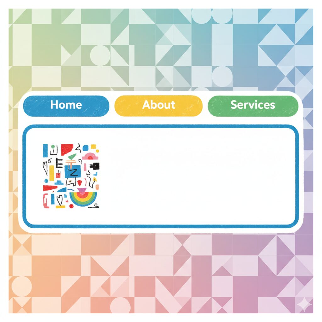
HTMLの基本構造
CSSのみでタブ切り替えを実現するには、input要素とlabel要素を組み合わせた構造を使います。input要素の:checked擬似クラス(疑似クラスとは、要素の特定の状態を示すCSSのセレクタです)を利用することで、クリックされたタブを判別し、対応するコンテンツを表示します。
<div class="tab-container">
  <!-- タブの切り替えを制御するラジオボタン(非表示) -->
  <input type="radio" name="tab" id="tab1" checked>
  <input type="radio" name="tab" id="tab2">
  <input type="radio" name="tab" id="tab3">

  <!-- タブのボタン部分 -->
  <div class="tab-buttons">
    <label for="tab1">タブ1</label>
    <label for="tab2">タブ2</label>
    <label for="tab3">タブ3</label>
  </div>

  <!-- タブのコンテンツ部分 -->
  <div class="tab-contents">
    <div class="tab-content" id="content1">
      <p>タブ1のコンテンツ</p>
    </div>
    <div class="tab-content" id="content2">
      <p>タブ2のコンテンツ</p>
    </div>
    <div class="tab-content" id="content3">
      <p>タブ3のコンテンツ</p>
    </div>
  </div>
</div>
この構造では、input要素が実際の状態管理を担当し、label要素がユーザーがクリックするボタンとして機能します。labelのfor属性とinputのid属性を対応させることで、ボタンをクリックしたときに対応するinputが選択される仕組みです。
最小限のCSS実装
次に、タブの表示・非表示を制御する基本的なCSSを見ていきましょう。
/* ラジオボタンを非表示にする */
.tab-container input[type="radio"] {
  display: none;
}

/* タブボタンの基本スタイル */
.tab-buttons {
  display: flex;
  border-bottom: 2px solid #e0e0e0;
}

.tab-buttons label {
  padding: 12px 24px;
  cursor: pointer;
  background-color: #f5f5f5;
  border: 1px solid #e0e0e0;
  border-bottom: none;
  margin-right: 4px;
  transition: background-color 0.3s ease;
}

.tab-buttons label:hover {
  background-color: #e8e8e8;
}

/* タブコンテンツはデフォルトで非表示 */
.tab-content {
  display: none;
  padding: 20px;
}

/* チェックされたタブに対応するコンテンツのみ表示 */
#tab1:checked ~ .tab-contents #content1,
#tab2:checked ~ .tab-contents #content2,
#tab3:checked ~ .tab-contents #content3 {
  display: block;
}

/* アクティブなタブのスタイル */
#tab1:checked ~ .tab-buttons label[for="tab1"],
#tab2:checked ~ .tab-buttons label[for="tab2"],
#tab3:checked ~ .tab-buttons label[for="tab3"] {
  background-color: #fff;
  border-bottom: 2px solid #fff;
  margin-bottom: -2px;
}
このコードのポイントは、:checked擬似クラスと隣接セレクタ(~)を組み合わせることで、選択されたタブに応じて表示を切り替えている点です。
実際の表示
See the Pen css-tab-unit-01 by watashi-xyz (@watashi-xyz) on CodePen.
通信無制限なのに工事不要!【SoftbankAir】
ラジオボタン・チェックボックスを使った純CSSタブの実装方法
ラジオボタンの:checked擬似クラスを活用する仕組み
CSSタブ切り替えの核心は、ラジオボタンの:checked擬似クラスにあります。ラジオボタンは同じname属性を持つグループ内で1つしか選択できないという特性があり、これがタブの「1つだけ選択される」という動作と完璧にマッチします。
仕組みを簡単に説明すると、以下のような流れになります。
- ユーザーが
labelをクリック labelのfor属性により、対応するinputがチェック状態になる- CSSの
:checked擬似クラスが有効になる - 隣接セレクタ(
~や+)を使って、関連する要素のスタイルを変更する
実装コード(コメント付き)
<div class="tab-container">
  <!-- 状態管理用のラジオボタン -->
  <input type="radio" name="tab" id="tab1" checked>
  <input type="radio" name="tab" id="tab2">
  <input type="radio" name="tab" id="tab3">

  <!-- クリック可能なタブボタン -->
  <div class="tab-buttons">
    <label for="tab1">プロフィール</label>
    <label for="tab2">サービス</label>
    <label for="tab3">お問い合わせ</label>
  </div>

  <!-- 各タブのコンテンツ -->
  <div class="tab-contents">
    <div class="tab-content" id="content1">
      <h3>プロフィール</h3>
      <p>ここにプロフィール情報が表示されます。</p>
    </div>
    <div class="tab-content" id="content2">
      <h3>サービス</h3>
      <p>提供しているサービスの詳細です。</p>
    </div>
    <div class="tab-content" id="content3">
      <h3>お問い合わせ</h3>
      <p>お問い合わせフォームがここに表示されます。</p>
    </div>
  </div>
</div>
/* コンテナの基本設定 */
.tab-container {
max-width: 800px;
margin: 40px auto;
font-family: "Segoe UI", Tahoma, sans-serif;
}
/* ラジオボタンを画面から隠す(accessibility対応のためdisplay:noneを使用) */
.tab-container input[type="radio"] {
position: absolute;
opacity: 0;
pointer-events: none;
}
/* タブボタンエリアの設定 */
.tab-buttons {
display: flex;
gap: 4px;
border-bottom: 3px solid #2196f3;
}
/* 各タブボタンのデザイン */
.tab-buttons label {
padding: 14px 28px;
cursor: pointer;
background-color: #f0f0f0;
color: #666;
border-radius: 8px 8px 0 0;
font-weight: 500;
transition: all 0.3s ease;
user-select: none;
}
/* タブボタンのホバー効果 */
.tab-buttons label:hover {
background-color: #e3f2fd;
color: #2196f3;
}
/* アクティブなタブボタンのスタイル(重要!) */
#tab1:checked ~ .tab-buttons label[for="tab1"],
#tab2:checked ~ .tab-buttons label[for="tab2"],
#tab3:checked ~ .tab-buttons label[for="tab3"] {
background-color: #2196f3;
color: white;
box-shadow: 0 -2px 8px rgba(33, 150, 243, 0.3);
}
/* コンテンツエリアの設定 */
.tab-contents {
background-color: white;
border: 1px solid #ddd;
border-top: none;
position: relative;
min-height: 200px;
}
/* すべてのコンテンツをデフォルトで非表示 */
.tab-content {
display: none;
padding: 30px;
animation: fadeIn 0.4s ease;
}
/* チェックされたタブに対応するコンテンツだけを表示 */
#tab1:checked ~ .tab-contents #content1,
#tab2:checked ~ .tab-contents #content2,
#tab3:checked ~ .tab-contents #content3 {
display: block;
}
実際の表示
See the Pen css-tab-unit-02 by watashi-xyz (@watashi-xyz) on CodePen.
まずは無料体験・説明会に参加を♪【Winスクール】
transition・transformで「ふわっと」切り替えるアニメーションの基礎
タブの切り替えにアニメーションを加えることで、ユーザー体験が大きく向上します。ここでは、CSSのtransitionとtransformプロパティを使った2つの基本的なアニメーション手法を解説します。
opacityとtransitionで実現するフェードインアニメーション
最もシンプルで汎用性が高いのが、透明度を変化させるフェードイン効果です。opacityプロパティとtransitionプロパティを組み合わせることで実現できます。
<div class="tab-container">
  <!-- 状態管理用のラジオボタン -->
  <input type="radio" name="tab" id="tab1" checked>
  <input type="radio" name="tab" id="tab2">
  <input type="radio" name="tab" id="tab3">

  <!-- クリック可能なタブボタン -->
  <div class="tab-buttons">
    <label for="tab1">プロフィール</label>
    <label for="tab2">サービス</label>
    <label for="tab3">お問い合わせ</label>
  </div>

  <!-- 各タブのコンテンツ -->
  <div class="tab-contents">
    <div class="tab-content" id="content1">
      <h3>プロフィール</h3>
      <p>ここにプロフィール情報が表示されます。</p>
    </div>
    <div class="tab-content" id="content2">
      <h3>サービス</h3>
      <p>提供しているサービスの詳細です。</p>
    </div>
    <div class="tab-content" id="content3">
      <h3>お問い合わせ</h3>
      <p>お問い合わせフォームがここに表示されます。</p>
    </div>
  </div>
</div>
/* コンテナの基本設定 */
.tab-container {
max-width: 800px;
margin: 40px auto;
font-family: "Segoe UI", Tahoma, sans-serif;
}
/* ラジオボタンを画面から隠す(accessibility対応のためdisplay:noneを使用) */
.tab-container input[type="radio"] {
position: absolute;
opacity: 0;
pointer-events: none;
}
/* タブボタンエリアの設定 */
.tab-buttons {
display: flex;
gap: 4px;
border-bottom: 3px solid #2196f3;
}
/* 各タブボタンのデザイン */
.tab-buttons label {
padding: 14px 28px;
cursor: pointer;
background-color: #f0f0f0;
color: #666;
border-radius: 8px 8px 0 0;
font-weight: 500;
transition: all 0.3s ease;
user-select: none;
}
/* タブボタンのホバー効果 */
.tab-buttons label:hover {
background-color: #e3f2fd;
color: #2196f3;
}
/* アクティブなタブボタンのスタイル(重要!) */
#tab1:checked ~ .tab-buttons label[for="tab1"],
#tab2:checked ~ .tab-buttons label[for="tab2"],
#tab3:checked ~ .tab-buttons label[for="tab3"] {
background-color: #2196f3;
color: white;
box-shadow: 0 -2px 8px rgba(33, 150, 243, 0.3);
}
/* コンテンツエリアの設定 */
.tab-contents {
background-color: white;
border: 1px solid #ddd;
border-top: none;
position: relative;
min-height: 200px;
}
/* コンテンツの初期状態 */
.tab-content {
display: none;
opacity: 0;
transition: opacity 0.5s ease-in-out;
}
/* 表示状態のコンテンツ */
#tab1:checked ~ .tab-contents #content1,
#tab2:checked ~ .tab-contents #content2,
#tab3:checked ~ .tab-contents #content3 {
display: block;
/* displayの変化に少し遅延を加えることで、アニメーションが確実に動作する */
animation: fadeIn 0.5s ease-in-out forwards;
}
/* フェードインアニメーションの定義 */
@keyframes fadeIn {
from {
opacity: 0;
}
to {
opacity: 1;
}
}
このコードでは、@keyframesを使ってフェードインのアニメーションを定義しています。opacityが0から1に変化することで、コンテンツがふわっと現れる効果が生まれます。
実際の表示
See the Pen Untitled by watashi-xyz (@watashi-xyz) on CodePen.
transformを使ったスライドアニメーション
次に、コンテンツが横方向にスライドして切り替わるアニメーションを実装します。transform: translateX()プロパティを使うことで、要素を移動させることができます。
<div class="tab-container">
  <!-- 状態管理用のラジオボタン -->
  <input type="radio" name="tab" id="tab1" checked>
  <input type="radio" name="tab" id="tab2">
  <input type="radio" name="tab" id="tab3">

  <!-- クリック可能なタブボタン -->
  <div class="tab-buttons">
    <label for="tab1">プロフィール</label>
    <label for="tab2">サービス</label>
    <label for="tab3">お問い合わせ</label>
  </div>

  <!-- 各タブのコンテンツ -->
  <div class="tab-contents">
    <div class="tab-content" id="content1">
      <h3>プロフィール</h3>
      <p>ここにプロフィール情報が表示されます。</p>
    </div>
    <div class="tab-content" id="content2">
      <h3>サービス</h3>
      <p>提供しているサービスの詳細です。</p>
    </div>
    <div class="tab-content" id="content3">
      <h3>お問い合わせ</h3>
      <p>お問い合わせフォームがここに表示されます。</p>
    </div>
  </div>
</div>
/* コンテナの基本設定 */
.tab-container {
max-width: 800px;
margin: 40px auto;
font-family: "Segoe UI", Tahoma, sans-serif;
}
/* ラジオボタンを画面から隠す(accessibility対応のためdisplay:noneを使用) */
.tab-container input[type="radio"] {
position: absolute;
opacity: 0;
pointer-events: none;
}
/* タブボタンエリアの設定 */
.tab-buttons {
display: flex;
gap: 4px;
border-bottom: 3px solid #2196f3;
}
/* 各タブボタンのデザイン */
.tab-buttons label {
padding: 14px 28px;
cursor: pointer;
background-color: #f0f0f0;
color: #666;
border-radius: 8px 8px 0 0;
font-weight: 500;
transition: all 0.3s ease;
user-select: none;
}
/* タブボタンのホバー効果 */
.tab-buttons label:hover {
background-color: #e3f2fd;
color: #2196f3;
}
/* アクティブなタブボタンのスタイル(重要!) */
#tab1:checked ~ .tab-buttons label[for="tab1"],
#tab2:checked ~ .tab-buttons label[for="tab2"],
#tab3:checked ~ .tab-buttons label[for="tab3"] {
background-color: #2196f3;
color: white;
box-shadow: 0 -2px 8px rgba(33, 150, 243, 0.3);
}
/* コンテンツエリアの設定 */
.tab-contents {
background-color: white;
border: 1px solid #ddd;
border-top: none;
position: relative;
min-height: 200px;
}
/* コンテンツエリアの設定 */
.tab-contents {
position: relative;
overflow: hidden; /* はみ出た部分を隠す */
background-color: white;
}
/* すべてのコンテンツを絶対配置 */
.tab-content {
position: absolute;
top: 0;
left: 0;
width: 100%;
padding: 30px;
opacity: 0;
transform: translateX(100%); /* 右側に配置 */
transition: all 0.4s cubic-bezier(0.4, 0, 0.2, 1);
}
/* アクティブなコンテンツを中央に配置 */
#tab1:checked ~ .tab-contents #content1,
#tab2:checked ~ .tab-contents #content2,
#tab3:checked ~ .tab-contents #content3 {
opacity: 1;
transform: translateX(0); /* 中央に移動 */
position: relative; /* 高さを確保するため */
}
この実装では、非アクティブなコンテンツは画面外(右側)に配置され、アクティブになると中央にスライドしてくる動きを実現しています。cubic-bezier(0.4, 0, 0.2, 1)というイージング関数(アニメーションの加速・減速を制御する関数)を使うことで、より自然で心地よい動きを演出できます。
実際の表示
See the Pen css-tab-unit-04 by watashi-xyz (@watashi-xyz) on CodePen.
左からスライドインするバリエーション
/* 左側からスライドイン */
.tab-content {
  opacity: 0;
  transform: translateX(-50px);
  transition: all 0.5s ease;
}

#tab1:checked ~ .tab-contents #content1,
#tab2:checked ~ .tab-contents #content2,
#tab3:checked ~ .tab-contents #content3 {
  opacity: 1;
  transform: translateX(0);
}
このように、translateX()の値を変えるだけで、スライドの方向を簡単に変更できます。サイトのデザインやコンテンツの性質に合わせて、最適なアニメーションを選択しましょう。
【コピペOK】おしゃれなタブ切り替えアニメーション実装例5選
ここからは、実際にプロジェクトで使える実装パターンを紹介します。
コンテンツが「ふわっと」切り替わるフェードイン
最もシンプルで汎用性が高い、フェードイン・フェードアウト効果の実装です。コンテンツが柔らかく切り替わるため、どんなデザインにも馴染みます。
<div class="fade-tab-container">
  <input type="radio" name="fade-tab" id="fade-tab1" checked>
  <input type="radio" name="fade-tab" id="fade-tab2">
  <input type="radio" name="fade-tab" id="fade-tab3">

  <div class="fade-tab-buttons">
    <label for="fade-tab1">概要</label>
    <label for="fade-tab2">特徴</label>
    <label for="fade-tab3">詳細</label>
  </div>

  <div class="fade-tab-contents">
    <div class="fade-tab-content" id="fade-content1">
      <h3>概要</h3>
      <p>このタブはフェードインアニメーションで切り替わります。透明度と縦方向の移動を組み合わせることで、自然で心地よい切り替え効果を実現しています。</p>
    </div>
    <div class="fade-tab-content" id="fade-content2">
      <h3>特徴</h3>
      <p>シンプルで汎用性が高く、どんなデザインにも適用できます。アニメーション時間は0.6秒に設定されており、ユーザーにストレスを与えない絶妙なタイミングです。</p>
    </div>
    <div class="fade-tab-content" id="fade-content3">
      <h3>詳細</h3>
      <p>CSS Animationを使用しているため、JavaScriptは一切不要です。パフォーマンスも良好で、モバイルデバイスでもスムーズに動作します。</p>
    </div>
  </div>
</div>
* {
margin: 0;
padding: 0;
box-sizing: border-box;
}
body {
font-family: "Segoe UI", Tahoma, Geneva, Verdana, sans-serif;
background-color: #f8f9fa;
padding: 40px 20px;
}
.fade-tab-container {
max-width: 900px;
margin: 0 auto;
background: white;
border-radius: 12px;
box-shadow: 0 4px 6px rgba(0, 0, 0, 0.07);
overflow: hidden;
}
/* ラジオボタンを隠す */
.fade-tab-container input[type="radio"] {
position: absolute;
opacity: 0;
pointer-events: none;
}
/* タブボタンエリア */
.fade-tab-buttons {
display: flex;
background-color: #f8f9fa;
border-bottom: 2px solid #dee2e6;
}
.fade-tab-buttons label {
flex: 1;
padding: 18px 20px;
text-align: center;
cursor: pointer;
color: #6c757d;
font-weight: 500;
transition: all 0.3s ease;
position: relative;
}
.fade-tab-buttons label:hover {
background-color: #e9ecef;
color: #495057;
}
/* アクティブなタブ */
#fade-tab1:checked ~ .fade-tab-buttons label[for="fade-tab1"],
#fade-tab2:checked ~ .fade-tab-buttons label[for="fade-tab2"],
#fade-tab3:checked ~ .fade-tab-buttons label[for="fade-tab3"] {
color: #0d6efd;
background-color: white;
}
/* アクティブタブの下線 */
#fade-tab1:checked ~ .fade-tab-buttons label[for="fade-tab1"]::after,
#fade-tab2:checked ~ .fade-tab-buttons label[for="fade-tab2"]::after,
#fade-tab3:checked ~ .fade-tab-buttons label[for="fade-tab3"]::after {
content: "";
position: absolute;
bottom: -2px;
left: 0;
right: 0;
height: 2px;
background-color: #0d6efd;
}
/* コンテンツエリア */
.fade-tab-contents {
position: relative;
min-height: 300px;
}
.fade-tab-content {
display: none;
padding: 40px;
animation: fadeInContent 0.6s ease;
}
/* フェードインアニメーション */
@keyframes fadeInContent {
from {
opacity: 0;
transform: translateY(10px);
}
to {
opacity: 1;
transform: translateY(0);
}
}
/* アクティブなコンテンツを表示 */
#fade-tab1:checked ~ .fade-tab-contents #fade-content1,
#fade-tab2:checked ~ .fade-tab-contents #fade-content2,
#fade-tab3:checked ~ .fade-tab-contents #fade-content3 {
display: block;
}
.fade-tab-content h3 {
color: #212529;
margin-bottom: 16px;
font-size: 24px;
}
.fade-tab-content p {
color: #6c757d;
line-height: 1.8;
font-size: 16px;
}
実際の表示
See the Pen css-tab-unit-05 by watashi-xyz (@watashi-xyz) on CodePen.
まずは無料体験・説明会に参加を♪【Winスクール】
タブに応じてコンテンツが「スライド」するアニメーション
コンテンツが横方向にスライドして切り替わるダイナミックな効果です。方向性のある動きが、ユーザーに分かりやすいナビゲーション体験を提供します。
<div class="fade-tab-container">
  <input type="radio" name="fade-tab" id="fade-tab1" checked>
  <input type="radio" name="fade-tab" id="fade-tab2">
  <input type="radio" name="fade-tab" id="fade-tab3">

  <div class="fade-tab-buttons">
    <label for="fade-tab1">概要</label>
    <label for="fade-tab2">特徴</label>
    <label for="fade-tab3">詳細</label>
  </div>

  <div class="fade-tab-contents">
    <div class="fade-tab-content" id="fade-content1">
      <h3>概要</h3>
      <p>このタブはフェードインアニメーションで切り替わります。透明度と縦方向の移動を組み合わせることで、自然で心地よい切り替え効果を実現しています。</p>
    </div>
    <div class="fade-tab-content" id="fade-content2">
      <h3>特徴</h3>
      <p>シンプルで汎用性が高く、どんなデザインにも適用できます。アニメーション時間は0.6秒に設定されており、ユーザーにストレスを与えない絶妙なタイミングです。</p>
    </div>
    <div class="fade-tab-content" id="fade-content3">
      <h3>詳細</h3>
      <p>CSS Animationを使用しているため、JavaScriptは一切不要です。パフォーマンスも良好で、モバイルデバイスでもスムーズに動作します。</p>
    </div>
  </div>
</div>
* {
margin: 0;
padding: 0;
box-sizing: border-box;
}
body {
font-family: "Segoe UI", Tahoma, Geneva, Verdana, sans-serif;
background-color: #f8f9fa;
padding: 40px 20px;
}
.fade-tab-container {
max-width: 900px;
margin: 0 auto;
background: white;
border-radius: 12px;
box-shadow: 0 4px 6px rgba(0, 0, 0, 0.07);
overflow: hidden;
}
/* ラジオボタンを隠す */
.fade-tab-container input[type="radio"] {
position: absolute;
opacity: 0;
pointer-events: none;
}
/* タブボタンエリア */
.fade-tab-buttons {
display: flex;
background-color: #f8f9fa;
border-bottom: 2px solid #dee2e6;
}
.fade-tab-buttons label {
flex: 1;
padding: 18px 20px;
text-align: center;
cursor: pointer;
color: #6c757d;
font-weight: 500;
transition: all 0.3s ease;
position: relative;
}
.fade-tab-buttons label:hover {
background-color: #e9ecef;
color: #495057;
}
/* アクティブなタブ */
#fade-tab1:checked ~ .fade-tab-buttons label[for="fade-tab1"],
#fade-tab2:checked ~ .fade-tab-buttons label[for="fade-tab2"],
#fade-tab3:checked ~ .fade-tab-buttons label[for="fade-tab3"] {
color: #0d6efd;
background-color: white;
}
/* アクティブタブの下線 */
#fade-tab1:checked ~ .fade-tab-buttons label[for="fade-tab1"]::after,
#fade-tab2:checked ~ .fade-tab-buttons label[for="fade-tab2"]::after,
#fade-tab3:checked ~ .fade-tab-buttons label[for="fade-tab3"]::after {
content: "";
position: absolute;
bottom: -2px;
left: 0;
right: 0;
height: 2px;
background-color: #0d6efd;
}
/* コンテンツエリア */
.fade-tab-contents {
position: relative;
min-height: 300px;
}
.fade-tab-content {
display: none;
padding: 40px;
animation: fadeInContent 0.6s ease;
}
/* フェードインアニメーション */
@keyframes fadeInContent {
from {
opacity: 0;
transform: translateY(10px);
}
to {
opacity: 1;
transform: translateY(0);
}
}
/* アクティブなコンテンツを表示 */
#fade-tab1:checked ~ .fade-tab-contents #fade-content1,
#fade-tab2:checked ~ .fade-tab-contents #fade-content2,
#fade-tab3:checked ~ .fade-tab-contents #fade-content3 {
display: block;
}
.fade-tab-content h3 {
color: #212529;
margin-bottom: 16px;
font-size: 24px;
}
.fade-tab-content p {
color: #6c757d;
line-height: 1.8;
font-size: 16px;
}
実際の表示
See the Pen Untitled by watashi-xyz (@watashi-xyz) on CodePen.
Audibleプレミアムプラン30日間無料体験
ボタンに下線が伸びて切り替わるUI
タブ切り替え時に下線がスムーズに移動するモダンなデザインです。Material DesignやGoogle系のUIでよく見られる洗練されたスタイルを実現します。
<div class="underline-tab-container">
  <input type="radio" name="underline-tab" id="underline-tab1" checked>
  <input type="radio" name="underline-tab" id="underline-tab2">
  <input type="radio" name="underline-tab" id="underline-tab3">
  <input type="radio" name="underline-tab" id="underline-tab4">

  <div class="underline-tab-buttons">
    <label for="underline-tab1">ホーム</label>
    <label for="underline-tab2">サービス</label>
    <label for="underline-tab3">料金</label>
    <label for="underline-tab4">お問い合わせ</label>
  </div>

  <div class="underline-tab-contents">
    <div class="underline-tab-content" id="underline-content1">
      <h3>ホーム</h3>
      <p>アンダーラインが滑らかに移動するタブUIです。Material Designのガイドラインに準拠したモダンなデザインで、ビジネスサイトやダッシュボードに最適です。</p>
    </div>
    <div class="underline-tab-content" id="underline-content2">
      <h3>サービス</h3>
      <p>下線の位置は、タブの幅に合わせて自動的に計算されます。タブの数を変更しても、適切に動作するよう設計されています。</p>
    </div>
    <div class="underline-tab-content" id="underline-content3">
      <h3>料金</h3>
      <p>cubic-bezierイージングにより、下線の動きは加速と減速が自然に制御されています。この滑らかなアニメーションが、洗練された印象を与えます。</p>
    </div>
    <div class="underline-tab-content" id="underline-content4">
      <h3>お問い合わせ</h3>
      <p>コンテンツはフェードインアニメーションで表示されます。下線の移動と組み合わせることで、一貫性のある動きを実現しています。</p>
    </div>
  </div>
</div>
* {
margin: 0;
padding: 0;
box-sizing: border-box;
}
body {
font-family: "Segoe UI", Tahoma, Geneva, Verdana, sans-serif;
background-color: #f5f5f5;
padding: 60px 20px;
}
.underline-tab-container {
max-width: 800px;
margin: 0 auto;
background: white;
border-radius: 8px;
box-shadow: 0 2px 8px rgba(0, 0, 0, 0.1);
}
.underline-tab-container input[type="radio"] {
position: absolute;
opacity: 0;
pointer-events: none;
}
.underline-tab-buttons {
display: flex;
position: relative;
border-bottom: 2px solid #e0e0e0;
}
.underline-tab-buttons label {
flex: 1;
padding: 20px 24px;
text-align: center;
cursor: pointer;
color: #757575;
font-weight: 500;
font-size: 15px;
transition: color 0.3s ease;
position: relative;
z-index: 2;
}
.underline-tab-buttons label:hover {
color: #1976d2;
background-color: rgba(25, 118, 210, 0.04);
}
/* アクティブなタブの文字色 */
#underline-tab1:checked ~ .underline-tab-buttons label[for="underline-tab1"],
#underline-tab2:checked ~ .underline-tab-buttons label[for="underline-tab2"],
#underline-tab3:checked ~ .underline-tab-buttons label[for="underline-tab3"],
#underline-tab4:checked ~ .underline-tab-buttons label[for="underline-tab4"] {
color: #1976d2;
}
/* スライドする下線のベース */
.underline-tab-buttons::after {
content: "";
position: absolute;
bottom: -2px;
left: 0;
width: 25%;
height: 3px;
background: linear-gradient(90deg, #1976d2, #42a5f5);
border-radius: 3px 3px 0 0;
transition: all 0.4s cubic-bezier(0.4, 0, 0.2, 1);
z-index: 3;
}
/* 各タブがアクティブになったときの下線位置 */
#underline-tab1:checked ~ .underline-tab-buttons::after {
left: 0;
}
#underline-tab2:checked ~ .underline-tab-buttons::after {
left: 25%;
}
#underline-tab3:checked ~ .underline-tab-buttons::after {
left: 50%;
}
#underline-tab4:checked ~ .underline-tab-buttons::after {
left: 75%;
}
.underline-tab-contents {
position: relative;
min-height: 280px;
}
.underline-tab-content {
display: none;
padding: 32px;
animation: fadeInUp 0.5s ease;
}
@keyframes fadeInUp {
from {
opacity: 0;
transform: translateY(20px);
}
to {
opacity: 1;
transform: translateY(0);
}
}
#underline-tab1:checked ~ .underline-tab-contents #underline-content1,
#underline-tab2:checked ~ .underline-tab-contents #underline-content2,
#underline-tab3:checked ~ .underline-tab-contents #underline-content3,
#underline-tab4:checked ~ .underline-tab-contents #underline-content4 {
display: block;
}
.underline-tab-content h3 {
color: #212121;
margin-bottom: 16px;
font-size: 22px;
}
.underline-tab-content p {
color: #616161;
line-height: 1.7;
font-size: 15px;
}
実際の表示
See the Pen css-tab-unit-06 by watashi-xyz (@watashi-xyz) on CodePen.
◆◇◆ 【衝撃価格】VPS512MBプラン!1時間1.3円【ConoHa】 ◆◇◆
レスポンシブ対応!スマホでも見やすいタブデザイン
デバイスの画面サイズに応じてレイアウトが最適化される、完全レスポンシブ対応のタブUIです。PC・タブレット・スマートフォンすべてで快適に利用できます。
<div class="responsive-tab-container">
  <input type="radio" name="resp-tab" id="resp-tab1" checked>
  <input type="radio" name="resp-tab" id="resp-tab2">
  <input type="radio" name="resp-tab" id="resp-tab3">

  <div class="responsive-tab-buttons">
    <label for="resp-tab1">📱 モバイル</label>
    <label for="resp-tab2">💻 デスクトップ</label>
    <label for="resp-tab3">⚡ 最適化</label>
  </div>

  <div class="responsive-tab-contents">
    <div class="responsive-tab-content" id="resp-content1">
      <h3>モバイルファースト設計</h3>
      <p>スマートフォンでは、タブが縦に並ぶレイアウトに自動的に切り替わります。これにより、小さな画面でもタップしやすく、使いやすいUIを実現しています。</p>
      <ul class="feature-list">
        <li>480px以下で縦並びレイアウト</li>
        <li>タップ領域を十分に確保</li>
        <li>読みやすいフォントサイズ</li>
      </ul>
    </div>
    <div class="responsive-tab-content" id="resp-content2">
      <h3>デスクトップ体験</h3>
      <p>大画面では、タブが横に並んだ伝統的なレイアウトで表示されます。広い画面スペースを活用し、情報を効率的に配置しています。</p>
      <ul class="feature-list">
        <li>768px以上で横並びレイアウト</li>
        <li>グリッドシステムによる柔軟な配置</li>
        <li>ホバーエフェクトでインタラクティブに</li>
      </ul>
    </div>
    <div class="responsive-tab-content" id="resp-content3">
      <h3>パフォーマンス最適化</h3>
      <p>メディアクエリを使用した条件分岐により、各デバイスに最適なスタイルのみが適用されます。不要なCSSは読み込まれないため、高速な表示を実現しています。</p>
      <ul class="feature-list">
        <li>CSS Gridによる効率的なレイアウト</li>
        <li>ハードウェアアクセラレーション対応</li>
        <li>JavaScriptゼロの軽量実装</li>
      </ul>
    </div>
  </div>
</div>
* {
margin: 0;
padding: 0;
box-sizing: border-box;
}
body {
font-family: "Segoe UI", Tahoma, Geneva, Verdana, sans-serif;
background: linear-gradient(to bottom, #e3f2fd, #bbdefb);
padding: 20px;
min-height: 100vh;
}
.responsive-tab-container {
max-width: 1000px;
margin: 0 auto;
background: white;
border-radius: 12px;
box-shadow: 0 8px 32px rgba(0, 0, 0, 0.1);
overflow: hidden;
}
.responsive-tab-container input[type="radio"] {
position: absolute;
opacity: 0;
pointer-events: none;
}
.responsive-tab-buttons {
display: grid;
grid-template-columns: repeat(3, 1fr);
background-color: #f5f5f5;
gap: 1px;
background: #e0e0e0;
}
.responsive-tab-buttons label {
padding: 20px 16px;
text-align: center;
cursor: pointer;
background: white;
color: #616161;
font-weight: 600;
font-size: 15px;
transition: all 0.3s ease;
display: flex;
align-items: center;
justify-content: center;
min-height: 60px;
}
.responsive-tab-buttons label:hover {
background-color: #f5f5f5;
color: #1976d2;
}
#resp-tab1:checked ~ .responsive-tab-buttons label[for="resp-tab1"],
#resp-tab2:checked ~ .responsive-tab-buttons label[for="resp-tab2"],
#resp-tab3:checked ~ .responsive-tab-buttons label[for="resp-tab3"] {
background: linear-gradient(135deg, #1976d2, #42a5f5);
color: white;
}
.responsive-tab-contents {
padding: 32px;
min-height: 300px;
}
.responsive-tab-content {
display: none;
animation: fadeScale 0.5s ease;
}
@keyframes fadeScale {
from {
opacity: 0;
transform: scale(0.95);
}
to {
opacity: 1;
transform: scale(1);
}
}
#resp-tab1:checked ~ .responsive-tab-contents #resp-content1,
#resp-tab2:checked ~ .responsive-tab-contents #resp-content2,
#resp-tab3:checked ~ .responsive-tab-contents #resp-content3 {
display: block;
}
.responsive-tab-content h3 {
color: #212121;
margin-bottom: 20px;
font-size: 26px;
}
.responsive-tab-content p {
color: #616161;
line-height: 1.8;
font-size: 16px;
margin-bottom: 16px;
}
.feature-list {
list-style: none;
margin-top: 20px;
}
.feature-list li {
padding: 12px 0;
padding-left: 28px;
position: relative;
color: #424242;
}
.feature-list li::before {
content: "✓";
position: absolute;
left: 0;
color: #1976d2;
font-weight: bold;
font-size: 18px;
}
/* タブレット向けレイアウト */
@media (max-width: 768px) {
.responsive-tab-buttons {
grid-template-columns: repeat(3, 1fr);
}
.responsive-tab-buttons label {
font-size: 14px;
padding: 16px 12px;
min-height: 56px;
}
.responsive-tab-contents {
padding: 24px;
}
.responsive-tab-content h3 {
font-size: 22px;
}
.responsive-tab-content p {
font-size: 15px;
}
}
/* スマートフォン向けレイアウト */
@media (max-width: 480px) {
body {
padding: 10px;
}
.responsive-tab-container {
border-radius: 8px;
}
.responsive-tab-buttons {
grid-template-columns: 1fr;
gap: 0;
}
.responsive-tab-buttons label {
padding: 16px;
font-size: 15px;
min-height: 50px;
border-bottom: 1px solid #e0e0e0;
}
.responsive-tab-buttons label:last-child {
border-bottom: none;
}
.responsive-tab-contents {
padding: 20px 16px;
min-height: 250px;
}
.responsive-tab-content h3 {
font-size: 20px;
margin-bottom: 16px;
}
.responsive-tab-content p {
font-size: 14px;
line-height: 1.7;
}
.feature-list li {
font-size: 14px;
padding: 10px 0;
padding-left: 24px;
}
}
実際の表示
See the Pen css-tab-unit-07 by watashi-xyz (@watashi-xyz) on CodePen.
国内シェアNo.1のエックスサーバーが提供するVPSサーバー『XServer VPS』
ラジオボタンを活用した純粋なCSS実装
JavaScriptを一切使用しない、完全なる純粋CSS実装の決定版です。カスタマイズしやすい構造で、あらゆるプロジェクトに対応できます。
<div class="pure-css-tab-container">
  <input type="radio" name="pure-tab" id="pure-tab1" checked>
  <input type="radio" name="pure-tab" id="pure-tab2">
  <input type="radio" name="pure-tab" id="pure-tab3">
  <input type="radio" name="pure-tab" id="pure-tab4">

  <div class="pure-tab-header">
    <label for="pure-tab1">基本構造</label>
    <label for="pure-tab2">スタイリング</label>
    <label for="pure-tab3">アニメーション</label>
    <label for="pure-tab4">カスタマイズ</label>
  </div>

  <div class="pure-tab-body">
    <div class="pure-tab-panel" id="pure-panel1">
      <h3>📐 基本構造の解説</h3>
      <p>純粋なCSS実装では、<span class="highlight">input[type="radio"]</span>と<span class="highlight">:checked擬似クラス</span>を組み合わせることで、JavaScriptを使わずにタブ切り替えを実現します。</p>
      <p>HTMLの構造は非常にシンプルで、ラジオボタン、ラベル、コンテンツの3要素で構成されています。この構造により、メンテナンス性が高く、拡張も容易です。</p>
      <div class="code-example">
        <input type="radio" name="tab" id="tab1" checked><br>
        <label for="tab1">タブ1</label><br>
        <div class="content">コンテンツ</div>
      </div>
    </div>

    <div class="pure-tab-panel" id="pure-panel2">
      <h3>🎨 スタイリングテクニック</h3>
      <p>タブのデザインは、<span class="highlight">:checked</span>擬似クラスと<span class="highlight">隣接セレクタ(~)</span>を活用することで実現します。これにより、選択状態に応じたスタイルの切り替えが可能になります。</p>
      <p>グラデーション、シャドウ、トランジションを組み合わせることで、モダンで洗練されたUIを作成できます。</p>
      <div class="code-example">
        #tab1:checked ~ .header label[for="tab1"] {<br>
          background-color: white;<br>
          color: #4facfe;<br>
          box-shadow: 0 6px 20px rgba(0,0,0,0.15);<br>
        }
      </div>
    </div>

    <div class="pure-tab-panel" id="pure-panel3">
      <h3>✨ アニメーション実装</h3>
      <p>CSS Animationと@keyframesを使用することで、滑らかなタブ切り替えアニメーションを実装できます。<span class="highlight">cubic-bezier()</span>イージング関数により、自然で心地よい動きを実現しています。</p>
      <p>フェードイン、スライド、スケールなど、様々なアニメーションパターンを組み合わせることで、独自のモーション設計が可能です。</p>
      <div class="code-example">
        @keyframes slideUpFade {<br>
          from {<br>
            opacity: 0;<br>
            transform: translateY(30px);<br>
          }<br>
          to {<br>
            opacity: 1;<br>
            transform: translateY(0);<br>
          }<br>
        }
      </div>
    </div>

    <div class="pure-tab-panel" id="pure-panel4">
      <h3>🔧 カスタマイズガイド</h3>
      <p>このコードは完全にカスタマイズ可能です。色、サイズ、アニメーション速度など、すべての要素をプロジェクトのニーズに合わせて調整できます。</p>
      <p><span class="highlight">CSS変数(カスタムプロパティ)</span>を使用すれば、さらに柔軟なテーマ変更が可能になります。ダークモード対応も簡単に実装できます。</p>
      <div class="code-example">
        :root {<br>
          --primary-color: #4facfe;<br>
          --animation-duration: 0.6s;<br>
          --border-radius: 16px;<br>
        }<br>
        <br>
        /* ダークモード対応 */<br>
        @media (prefers-color-scheme: dark) {<br>
          :root {<br>
            --primary-color: #64b5f6;<br>
          }<br>
        }
      </div>
    </div>
  </div>
</div>
* {
margin: 0;
padding: 0;
box-sizing: border-box;
}
body {
font-family: -apple-system, BlinkMacSystemFont, "Segoe UI", Roboto, sans-serif;
background: linear-gradient(135deg, #f5f7fa 0%, #c3cfe2 100%);
padding: 40px 20px;
min-height: 100vh;
}
.pure-css-tab-container {
max-width: 950px;
margin: 0 auto;
background: white;
border-radius: 16px;
box-shadow: 0 10px 40px rgba(0, 0, 0, 0.15);
overflow: hidden;
}
/* ラジオボタンを完全に隠す */
.pure-css-tab-container input[type="radio"] {
position: absolute;
opacity: 0;
width: 0;
height: 0;
pointer-events: none;
}
/* タブヘッダーの設定 */
.pure-tab-header {
background: linear-gradient(to right, #4facfe 0%, #00f2fe 100%);
padding: 8px;
display: flex;
gap: 8px;
}
.pure-tab-header label {
flex: 1;
padding: 16px 24px;
text-align: center;
cursor: pointer;
color: white;
font-weight: 600;
font-size: 15px;
border-radius: 10px;
transition: all 0.3s cubic-bezier(0.4, 0, 0.2, 1);
position: relative;
user-select: none;
}
.pure-tab-header label:hover {
background-color: rgba(255, 255, 255, 0.15);
transform: translateY(-2px);
}
/* アクティブなタブボタン */
#pure-tab1:checked ~ .pure-tab-header label[for="pure-tab1"],
#pure-tab2:checked ~ .pure-tab-header label[for="pure-tab2"],
#pure-tab3:checked ~ .pure-tab-header label[for="pure-tab3"],
#pure-tab4:checked ~ .pure-tab-header label[for="pure-tab4"] {
background-color: white;
color: #4facfe;
box-shadow: 0 6px 20px rgba(79, 172, 254, 0.3);
transform: translateY(-2px);
}
/* アクティブタブのアイコン表示 */
#pure-tab1:checked ~ .pure-tab-header label[for="pure-tab1"]::before,
#pure-tab2:checked ~ .pure-tab-header label[for="pure-tab2"]::before,
#pure-tab3:checked ~ .pure-tab-header label[for="pure-tab3"]::before,
#pure-tab4:checked ~ .pure-tab-header label[for="pure-tab4"]::before {
content: "●";
position: absolute;
left: 10px;
font-size: 10px;
animation: pulse 1.5s infinite;
}
@keyframes pulse {
0%,
100% {
opacity: 1;
}
50% {
opacity: 0.5;
}
}
/* コンテンツエリア */
.pure-tab-body {
position: relative;
min-height: 400px;
padding: 40px;
background-color: #fafafa;
}
.pure-tab-panel {
display: none;
animation: slideUpFade 0.6s cubic-bezier(0.4, 0, 0.2, 1);
}
@keyframes slideUpFade {
from {
opacity: 0;
transform: translateY(30px);
}
to {
opacity: 1;
transform: translateY(0);
}
}
/* 選択されたタブのコンテンツを表示 */
#pure-tab1:checked ~ .pure-tab-body #pure-panel1,
#pure-tab2:checked ~ .pure-tab-body #pure-panel2,
#pure-tab3:checked ~ .pure-tab-body #pure-panel3,
#pure-tab4:checked ~ .pure-tab-body #pure-panel4 {
display: block;
}
.pure-tab-panel h3 {
color: #2c3e50;
font-size: 28px;
margin-bottom: 20px;
font-weight: 700;
}
.pure-tab-panel p {
color: #546e7a;
line-height: 1.8;
font-size: 16px;
margin-bottom: 20px;
}
.code-example {
background-color: #263238;
color: #aed581;
padding: 20px;
border-radius: 8px;
font-family: "Courier New", monospace;
font-size: 14px;
line-height: 1.6;
margin-top: 20px;
overflow-x: auto;
}
.highlight {
background: linear-gradient(120deg, #ffd54f 0%, #ffeb3b 100%);
padding: 4px 8px;
border-radius: 4px;
font-weight: 600;
color: #333;
}
/* Focus状態のアクセシビリティ対応 */
.pure-css-tab-container input[type="radio"]:focus + .pure-tab-header label,
.pure-css-tab-container input[type="radio"]:focus ~ .pure-tab-header label {
outline: 3px solid #4facfe;
outline-offset: 2px;
}
実際の表示
See the Pen css-tab-unit-08 by watashi-xyz (@watashi-xyz) on CodePen.
以上、コピペ可能なタブ切り替えアニメーション実装例を紹介しました。それぞれ異なる特徴を持っているため、プロジェクトの要件やデザインに応じて最適なものを選択してください。
すべてのコードは純粋なCSSで実装されており、JavaScriptは一切必要ありません。そのため、パフォーマンスが良く、保守性も高いのが特徴です。カラーやサイズ、アニメーション速度などは、プロジェクトに合わせて自由にカスタマイズできます。

レスポンシブ&アクセシビリティ最適化テクニック
美しいタブUIを作成したら、次はすべてのユーザーが快適に利用できるよう、レスポンシブ対応とアクセシビリティの最適化を行いましょう。このセクションでは、css タブ 切り替え アニメーションを実装する際に知っておくべき重要なテクニックを解説します。
レスポンシブ対応でスマホ・タブレットでも美しく表示させる方法
Flexboxを使った柔軟なタブレイアウト
Flexbox(フレキシブルボックスレイアウト)は、タブボタンを柔軟に配置する際に非常に有用です。画面サイズに応じてタブが自動的に伸縮し、常に美しいレイアウトを保ちます。
/* Flexboxによる基本的なタブレイアウト */
.tab-buttons {
  display: flex;
  flex-wrap: wrap; /* 画面幅が足りない場合は折り返す */
  gap: 8px; /* タブ間のスペース */
}

.tab-buttons label {
  flex: 1 1 auto; /* 伸縮可能で、最小幅は自動 */
  min-width: 120px; /* 最小幅を設定して可読性を確保 */
  padding: 16px;
  text-align: center;
}

/* タブが多い場合の対応 */
.tab-buttons.many-tabs label {
  flex: 0 1 auto; /* 伸びず、縮む、幅は自動 */
  white-space: nowrap; /* テキストを1行に保つ */
}
Flexboxのflexプロパティを調整することで、タブの数や内容に応じた最適な配置を実現できます。
CSS Gridによる高度なレイアウト制御
より複雑なレイアウトが必要な場合は、CSS Gridが強力な選択肢となります。特に、タブとコンテンツを組み合わせた複雑なUIに適しています。
/* CSS Gridによるタブコンテナ */
.tab-container {
  display: grid;
  grid-template-columns: repeat(auto-fit, minmax(150px, 1fr));
  grid-template-rows: auto 1fr;
  gap: 0;
}

/* タブボタンをグリッドの最初の行に配置 */
.tab-buttons {
  grid-column: 1 / -1; /* 全幅を使用 */
  display: grid;
  grid-template-columns: repeat(auto-fit, minmax(120px, 1fr));
  gap: 2px;
  background-color: #e0e0e0;
}

/* コンテンツエリアをグリッドの2行目に配置 */
.tab-contents {
  grid-column: 1 / -1;
  grid-row: 2;
}
auto-fitとminmax()を組み合わせることで、画面サイズに応じて自動的に列数が調整されるレスポンシブグリッドを作成できます。
メディアクエリによるブレイクポイント設定
デバイスごとに最適なレイアウトを提供するには、メディアクエリを使ったブレイクポイントの設定が不可欠です。
/* デスクトップ(デフォルト) */
.tab-buttons {
  display: flex;
  flex-direction: row;
}

.tab-buttons label {
  padding: 18px 32px;
  font-size: 16px;
}

.tab-contents {
  padding: 40px;
}

/* タブレット(768px以下) */
@media (max-width: 768px) {
  .tab-buttons label {
    padding: 16px 24px;
    font-size: 15px;
  }

  .tab-contents {
    padding: 30px 24px;
  }

  /* タブのテキストを短縮表示 */
  .tab-buttons label .full-text {
    display: none;
  }

  .tab-buttons label .short-text {
    display: inline;
  }
}

/* スマートフォン(480px以下) */
@media (max-width: 480px) {
  .tab-buttons {
    flex-direction: column; /* 縦並びに変更 */
  }

  .tab-buttons label {
    width: 100%;
    padding: 14px 20px;
    font-size: 15px;
    text-align: left; /* 左揃えに変更 */
  }

  .tab-contents {
    padding: 24px 16px;
  }

  /* スマホではアニメーションを短縮 */
  .tab-content {
    animation-duration: 0.3s;
  }
}

/* 小型スマートフォン(360px以下) */
@media (max-width: 360px) {
  .tab-buttons label {
    padding: 12px 16px;
    font-size: 14px;
  }

  .tab-contents {
    padding: 20px 12px;
  }
}
ブレイクポイント選定のポイント:
- 768px: タブレットとデスクトップの境界
- 480px: スマートフォンとタブレットの境界
- 360px: 小型スマートフォン向け
これらの値は一般的なガイドラインですが、実際のコンテンツとデザインに応じて調整することが重要です。
タッチデバイス向けの最適化
スマートフォンやタブレットでは、指でのタップ操作を考慮した設計が必要です。
/* タップ領域を十分に確保 */
.tab-buttons label {
  min-height: 44px; /* iOS Human Interface Guidelinesの推奨値 */
  padding: 12px 20px;
  cursor: pointer;
  /* タップ時のハイライトを調整 */
  -webkit-tap-highlight-color: rgba(0, 0, 0, 0.1);
}

/* タッチデバイスでのホバー効果を無効化 */
@media (hover: none) and (pointer: coarse) {
  .tab-buttons label:hover {
    /* ホバー効果を通常状態と同じにする */
    background-color: inherit;
    transform: none;
  }

  /* 代わりにアクティブ状態を強化 */
  .tab-buttons label:active {
    transform: scale(0.97);
    opacity: 0.8;
  }
}

/* スクロール可能なタブの実装 */
@media (max-width: 768px) {
  .tab-buttons {
    overflow-x: auto;
    -webkit-overflow-scrolling: touch; /* iOSでスムーズスクロール */
    scrollbar-width: none; /* Firefoxでスクロールバーを隠す */
  }

  .tab-buttons::-webkit-scrollbar {
    display: none; /* ChromeとSafariでスクロールバーを隠す */
  }

  .tab-buttons label {
    flex-shrink: 0; /* タブが縮まないようにする */
  }
}
UXとアクセシビリティを考慮したタブアニメーション設計のポイント
適切なアニメーション速度の選択
アニメーションの速度は、ユーザー体験に大きく影響します。速すぎると唐突に感じられ、遅すぎるとストレスになります。
/* 推奨されるアニメーション速度 */
.tab-content {
  /* 短い距離の移動:0.2秒〜0.3秒 */
  transition: opacity 0.25s ease;
}

.tab-content.slide {
  /* 中距離の移動:0.3秒〜0.5秒 */
  transition: transform 0.4s cubic-bezier(0.4, 0, 0.2, 1);
}

.tab-content.complex {
  /* 複雑なアニメーション:0.5秒〜0.6秒 */
  animation: complexTransition 0.5s ease-out;
}

/* 1秒以上のアニメーションは避ける */
アニメーション速度のガイドライン:
- 0.15秒〜0.25秒: 小さな変化(色の変更、透明度)
- 0.25秒〜0.4秒: 中程度の変化(位置移動、フェード)
- 0.4秒〜0.6秒: 大きな変化(スライド、複雑な変形)
prefers-reduced-motionへの対応
モーション(動き)に敏感なユーザーのために、アニメーションを減らすオプションを提供することが重要です。
prefers-reduced-motionとは
prefers-reduced-motionは、ユーザーのデバイス設定を読み取り、「視覚的な揺れや動きを最小限に抑えたい」というユーザーの意思に沿って、Webサイトの表示を切り替えるための仕組みです。
これにより、洗練されたアニメーションを動きに敏感なユーザーに対しては自動的にオフにしたり、シンプルなフェードに置き換えたりすることが可能になり、アクセシビリティ(使いやすさ)が向上します。
この設定はブラウザ設定ではなく、Windows、macOS、iOS、AndroidなどのOSのアクセシビリティ設定(例:iOSの「視差効果を減らす」)と連動しています。
/* デフォルトのアニメーション */
.tab-content {
  animation: slideAndFade 0.5s ease;
}

@keyframes slideAndFade {
  from {
    opacity: 0;
    transform: translateX(30px);
  }
  to {
    opacity: 1;
    transform: translateX(0);
  }
}

/* モーションを減らす設定が有効な場合 */
@media (prefers-reduced-motion: reduce) {
  .tab-content {
    animation: simpleFade 0.2s ease; /* シンプルで短いアニメーションに */
  }

  @keyframes simpleFade {
    from {
      opacity: 0;
    }
    to {
      opacity: 1;
    }
  }

  /* またはアニメーションを完全に無効化 */
  * {
    animation-duration: 0.01ms !important;
    transition-duration: 0.01ms !important;
  }
}
この対応により、前庭障害や視覚過敏を持つユーザーにも快適な体験を提供できます。
操作中のフィードバック
ユーザーがタブを操作している間、適切なフィードバックを提供することで、操作感を向上させます。
/* ホバー時のフィードバック */
.tab-buttons label {
  transition: all 0.2s ease;
}

.tab-buttons label:hover {
  background-color: rgba(0, 0, 0, 0.05);
  transform: translateY(-2px);
}

/* フォーカス時のフィードバック(キーボード操作) */
.tab-container input[type="radio"]:focus-visible ~ .tab-buttons label {
  outline: 3px solid #4facfe;
  outline-offset: 2px;
}

/* アクティブ(クリック中)のフィードバック */
.tab-buttons label:active {
  transform: scale(0.98);
  transition-duration: 0.1s;
}

/* ローディング状態の表現 */
.tab-content.loading {
  position: relative;
  pointer-events: none; /* 切り替え中はクリック不可 */
  opacity: 0.6;
}

.tab-content.loading::after {
  content: '';
  position: absolute;
  top: 50%;
  left: 50%;
  width: 40px;
  height: 40px;
  margin: -20px 0 0 -20px;
  border: 3px solid #f3f3f3;
  border-top: 3px solid #4facfe;
  border-radius: 50%;
  animation: spin 0.8s linear infinite;
}

@keyframes spin {
  0% { transform: rotate(0deg); }
  100% { transform: rotate(360deg); }
}
連続操作への配慮
ユーザーが複数のタブを素早く切り替える場合を考慮した設計が必要です。
/* アニメーションをスキップ可能にする */
.tab-content {
  animation: fadeIn 0.4s ease;
  /* will-changeでアニメーションのパフォーマンスを向上 */
  will-change: opacity, transform;
}

/* 短時間に複数回切り替えた場合の対応 */
.tab-content {
  /* animation-fill-modeでアニメーション終了後の状態を保持 */
  animation-fill-mode: both;
}

/* 切り替え中の重複を防ぐ */
.tab-contents {
  position: relative;
  /* isolation: isolate で新しいスタッキングコンテキストを作成 */
  isolation: isolate;
}
コストパフォーマンスに優れた高性能なレンタルサーバー
【Hostinger】
アクセシビリティ対応!キーボード操作・ARIA属性の実装方法
アクセシビリティは、すべてのユーザーがウェブコンテンツを利用できるようにするための重要な要素です。css タブ 切り替え アニメーションにおいても、適切な実装が求められます。
キーボード操作の実装
マウスだけでなく、キーボードでもタブを操作できるようにすることが重要です。
<!-- キーボード操作に対応したHTML構造 -->
<div class="accessible-tab-container">
  <!-- ラジオボタンはキーボードナビゲーションに対応 -->
  <input type="radio" name="accessible-tab" id="a-tab1" checked>
  <input type="radio" name="accessible-tab" id="a-tab2">
  <input type="radio" name="accessible-tab" id="a-tab3">

  <div class="tab-buttons" role="tablist" aria-label="コンテンツナビゲーション">
    <label for="a-tab1" role="tab" aria-controls="a-panel1" tabindex="0">
      タブ1
    </label>
    <label for="a-tab2" role="tab" aria-controls="a-panel2" tabindex="-1">
      タブ2
    </label>
    <label for="a-tab3" role="tab" aria-controls="a-panel3" tabindex="-1">
      タブ3
    </label>
  </div>

  <div class="tab-contents">
    <div id="a-panel1" role="tabpanel" aria-labelledby="a-tab1" tabindex="0">
      <p>タブ1のコンテンツ</p>
    </div>
    <div id="a-panel2" role="tabpanel" aria-labelledby="a-tab2" tabindex="0" hidden>
      <p>タブ2のコンテンツ</p>
    </div>
    <div id="a-panel3" role="tabpanel" aria-labelledby="a-tab3" tabindex="0" hidden>
      <p>タブ3のコンテンツ</p>
    </div>
  </div>
</div>
/* キーボードフォーカスの視覚化 */
.tab-buttons label {
  position: relative;
}

/* フォーカス時のアウトライン(デフォルトブラウザのものより見やすく) */
.tab-buttons label:focus {
  outline: none; /* デフォルトを削除 */
}

.tab-buttons label:focus-visible {
  outline: 3px solid #4facfe;
  outline-offset: 2px;
  border-radius: 4px;
  z-index: 10;
}

/* Tabキーでのナビゲーションを分かりやすく */
.tab-buttons label:focus-visible::before {
  content: '';
  position: absolute;
  inset: -4px;
  border: 2px solid #4facfe;
  border-radius: 6px;
  animation: focusPulse 2s infinite;
}

@keyframes focusPulse {
  0%, 100% {
    opacity: 1;
  }
  50% {
    opacity: 0.6;
  }
}
キーボード操作のベストプラクティス:
- Tabキー: 次のタブにフォーカス移動
- Shift + Tab: 前のタブにフォーカス移動
- 矢印キー: タブ間の移動(オプション)
- Enterキー/スペースキー: フォーカスしたタブを選択
ARIA属性の適切な使用
ARIA(Accessible Rich Internet Applications)属性は、スクリーンリーダーなどの支援技術がコンテンツを正しく解釈するための情報を提供します。
<!-- 完全なARIA対応のタブUI -->
<div class="tab-widget">
  <!-- 隠されたラジオボタン(状態管理用) -->
  <input type="radio" name="tab" id="tab1" checked aria-hidden="true">
  <input type="radio" name="tab" id="tab2" aria-hidden="true">
  <input type="radio" name="tab" id="tab3" aria-hidden="true">

  <!-- role="tablist": タブのリストであることを示す -->
  <div class="tab-list" role="tablist" aria-label="製品情報タブ">
    <!-- role="tab": タブボタンであることを示す -->
    <!-- aria-selected: 選択状態を示す -->
    <!-- aria-controls: 対応するパネルのIDを指定 -->
    <label
      for="tab1"
      role="tab"
      aria-selected="true"
      aria-controls="panel1"
      id="tab-label1"
      tabindex="0">
      概要
    </label>
    <label
      for="tab2"
      role="tab"
      aria-selected="false"
      aria-controls="panel2"
      id="tab-label2"
      tabindex="-1">
      仕様
    </label>
    <label
      for="tab3"
      role="tab"
      aria-selected="false"
      aria-controls="panel3"
      id="tab-label3"
      tabindex="-1">
      レビュー
    </label>
  </div>

  <div class="tab-panels">
    <!-- role="tabpanel": タブパネルであることを示す -->
    <!-- aria-labelledby: 対応するタブのIDを指定 -->
    <!-- tabindex="0": キーボードでフォーカス可能にする -->
    <div
      id="panel1"
      role="tabpanel"
      aria-labelledby="tab-label1"
      tabindex="0">
      <h3>製品概要</h3>
      <p>ここに概要が表示されます。</p>
    </div>
    <div
      id="panel2"
      role="tabpanel"
      aria-labelledby="tab-label2"
      tabindex="0"
      hidden>
      <h3>製品仕様</h3>
      <p>ここに仕様が表示されます。</p>
    </div>
    <div
      id="panel3"
      role="tabpanel"
      aria-labelledby="tab-label3"
      tabindex="0"
      hidden>
      <h3>カスタマーレビュー</h3>
      <p>ここにレビューが表示されます。</p>
    </div>
  </div>
</div>
主要なARIA属性の説明:
- role=”tablist”: タブのグループ全体を示します
- role=”tab”: 個々のタブボタンを示します
- role=”tabpanel”: タブに対応するコンテンツパネルを示します
- aria-selected: タブの選択状態(true/false)を示します
- aria-controls: タブがどのパネルを制御するかを示します
- aria-labelledby: パネルがどのタブによってラベル付けされているかを示します
- aria-label: 要素の簡潔な説明を提供します
スクリーンリーダー対応の完全な実装例
/* 視覚的には隠すが、スクリーンリーダーには読み上げられる要素 */
.sr-only {
  position: absolute;
  width: 1px;
  height: 1px;
  padding: 0;
  margin: -1px;
  overflow: hidden;
  clip: rect(0, 0, 0, 0);
  white-space: nowrap;
  border: 0;
}

/* スクリーンリーダー用の追加情報 */
.tab-buttons label::after {
  content: attr(data-tab-info);
  /* sr-onlyクラスと同じスタイルを適用 */
}

/* アクティブなタブの視覚的な強調 */
#tab1:checked ~ .tab-list label[for="tab1"]::before {
  content: '';
  position: absolute;
  left: 0;
  bottom: 0;
  width: 100%;
  height: 3px;
  background-color: #4facfe;
}
<!-- スクリーンリーダー対応の追加要素 -->
<div class="tab-widget">
  <h2 id="tab-group-label" class="sr-only">
    製品情報のタブナビゲーション
  </h2>

  <div class="tab-list"
       role="tablist"
       aria-labelledby="tab-group-label">
    <label for="tab1"
           role="tab"
           aria-selected="true"
           data-tab-info="(選択中)">
      概要
      <span class="sr-only">タブ。全3タブ中1番目。</span>
    </label>
    <!-- 他のタブも同様 -->
  </div>
</div>
カラーコントラストとフォントサイズ
視覚的なアクセシビリティも重要です。WCAG(Web Content Accessibility Guidelines)に準拠したデザインを心がけましょう。
/* WCAG AA基準を満たすコントラスト比 */
.tab-buttons label {
  /* 通常テキストは4.5:1以上 */
  color: #333333; /* 背景が白の場合 */
  background-color: #ffffff;
}

.tab-buttons label:hover {
  /* ホバー時もコントラストを維持 */
  color: #1976d2;
  background-color: #e3f2fd;
}

/* アクティブなタブ */
#tab1:checked ~ .tab-buttons label[for="tab1"] {
  /* 強調時は7:1以上が理想 */
  color: #ffffff;
  background-color: #1565c0;
}

/* 最小フォントサイズの確保 */
.tab-buttons label {
  font-size: 16px; /* 最小推奨サイズ */
  line-height: 1.5; /* 読みやすい行間 */
}

/* 小型デバイスでもフォントサイズを維持 */
@media (max-width: 480px) {
  .tab-buttons label {
    font-size: 15px; /* 14px未満にはしない */
  }
}
コントラスト比の目安(WCAG 2.1基準):
- AA基準(最低限): 通常テキスト 4.5:1、大きなテキスト 3:1
- AAA基準(推奨): 通常テキスト 7:1、大きなテキスト 4.5:1
これらのアクセシビリティ対応を実装することで、すべてのユーザーに配慮した、包括的なタブUIを実現できます。SEOの観点からも、アクセシビリティの高いサイトは検索エンジンから高く評価される傾向にあります。
よくある質問(FAQ)
css タブ 切り替え アニメーションを実装する際に、多くの開発者が直面する疑問や問題について、実践的な解決策を紹介します。
-
タブ切り替えのコードが動かない、どうすればいい?
-
タブが正常に動作しない場合、以下のチェックポイントを順番に確認してください。
よくある原因と解決策
1. inputとlabelの紐付けミス
最も多い原因は、
inputのidとlabelのfor属性が一致していないケースです。<!-- ❌ 間違った例 --> <input type="radio" name="tab" id="tab1"> <label for="tab-1">タブ1</label> <!-- IDが一致していない --> <!-- ✅ 正しい例 --> <input type="radio" name="tab" id="tab1"> <label for="tab1">タブ1</label> <!-- IDが完全に一致 -->2. name属性の統一漏れ
すべてのラジオボタンに同じ
name属性を設定しないと、複数のタブが同時に選択されてしまいます。<!-- ❌ 間違った例 --> <input type="radio" name="tab1" id="tab1"> <input type="radio" name="tab2" id="tab2"> <!-- ✅ 正しい例 --> <input type="radio" name="tab" id="tab1"> <input type="radio" name="tab" id="tab2">3. CSSセレクタの記述ミス
:checked擬似クラスと隣接セレクタ(~)の組み合わせが正しく記述されているか確認してください。/* ❌ 間違った例 - セレクタの順序が間違っている */ .tab-contents ~ #tab1:checked #content1 { display: block; } /* ✅ 正しい例 */ #tab1:checked ~ .tab-contents #content1 { display: block; }4. HTML構造の順序が間違っている
CSSの隣接セレクタ(
~)は、後ろにある要素にしか適用されません。input要素は必ず制御対象の要素より前に配置してください。<!-- ❌ 間違った例 - inputが後ろにある --> <div class="tab-buttons"> <label for="tab1">タブ1</label> </div> <input type="radio" name="tab" id="tab1"> <!-- ✅ 正しい例 - inputが前にある --> <input type="radio" name="tab" id="tab1"> <div class="tab-buttons"> <label for="tab1">タブ1</label> </div>デバッグ方法
開発者ツールを使って問題を特定しましょう。
/* デバッグ用CSS - inputの状態を可視化 */
input[type="radio"] {
  position: relative !important;
  opacity: 1 !important;
  width: auto !important;
  height: auto !important;
}

/* :checked状態の確認 */
input[type="radio"]:checked {
  outline: 3px solid red;
}
ブラウザの開発者ツール(F12キー)で、
:checked状態が正しく適用されているか確認してください。チェックボックスにチェックが入っているのに動作しない場合は、CSSセレクタの問題である可能性が高いです。
-
なぜCSSだけでタブ切り替えができるのですか?JavaScriptは不要ですか?
-
はい、基本的にJavaScriptは不要です。この技術は、HTMLのinput要素(特にラジオボタン)とlabel要素の標準的な動作を利用しています。ユーザーがlabelをクリックすると、それに紐づいたinputが:checkedという状態になります。この状態変化をCSSの擬似クラスで捉え、兄弟セレクタ(~)**を使って、隣接するコンテンツのスタイルを変更(display: blockやopacity: 1など)することで、表示・非表示を切り替えています。JavaScriptを使用しないことで、コードが軽量になり、ページの読み込み速度が向上し、メンテナンスも容易になるという大きなメリットがあります。
-
WordPressや他のCMSでこのコードを使うことはできますか?
-
はい、可能です。このCSSとHTMLのコードは、WordPressやSTUDIO、WixなどのCMSで、カスタムHTMLブロックやカスタムCSSセクションに貼り付けるだけで機能します。ただし、使用しているテーマやプラグインのCSSと競合する可能性があるため、その際はクラス名を独自のものに変更したり、!importantを使ったりして調整してください。また、WordPressであれば、特定のページや投稿にのみスタイルを適用するために、ボディクラスを利用すると良いでしょう。
まとめ
ここまで、cssによるタブ切り替えアニメーションの実装方法について、基礎から応用まで詳しく解説してきました。JavaScriptを使わずに、純粋なCSSだけで美しく機能的なタブUIを実装できることをご理解いただけたのではないでしょうか。
CSSのみでタブを実装する最大のメリットは、やはりパフォーマンスと保守性の高さです。外部ライブラリやJavaScriptファイルの読み込みが不要なため、ページの表示速度が向上し、特にモバイルデバイスでの体験が大きく改善されます。また、コードがシンプルで見通しが良いため、後からの修正や拡張も容易です。
この記事で紹介した実装パターンは、それぞれ異なる特徴を持っています。シンプルなフェードイン、ダイナミックなスライド、モダンなアンダーライン、完全レスポンシブ対応、そしてカスタマイズ性の高い純粋CSS実装。プロジェクトの要件やデザインに応じて、最適なものを選択してください。どのパターンもコピー&ペーストですぐに使えるよう、完全なコードを用意しました。
レスポンシブ対応とアクセシビリティは、現代のWeb開発において妥協できない要素です。すべてのデバイスで美しく表示され、すべてのユーザーが快適に操作できるタブUIを実装することで、サイト全体の品質が向上します。特にWCAG基準を満たすアクセシビリティ対応は、SEOの観点からも重要です。検索エンジンは、アクセシビリティの高いサイトを高く評価する傾向にあります。
今回紹介したテクニックは、タブUIだけでなく、アコーディオンメニューやモーダルウィンドウなど、他のインタラクティブな要素にも応用できます。純粋なCSSで実装するという考え方は、Web開発全般において非常に有用なアプローチです。
この記事で学んだ知識を活用して、ぜひあなたのプロジェクトに美しいタブUIを実装してみてください。最初は提供したコードをそのまま使い、慣れてきたら色やサイズ、アニメーション速度などをカスタマイズして、オリジナルのデザインを作り上げていきましょう。
◆◇◆ 【衝撃価格】VPS512MBプラン!1時間1.3円【ConoHa】 ◆◇◆