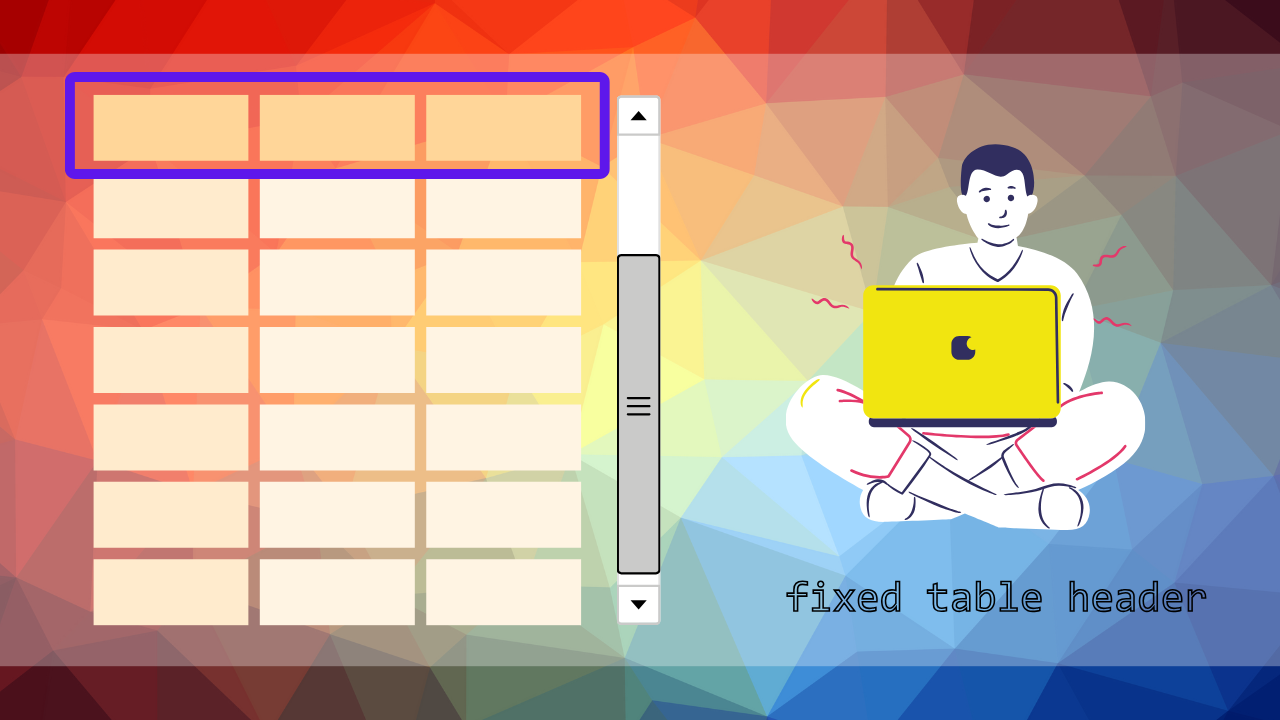
テーブルのデータ量が多くなると、スクロールしているうちにヘッダーが見えなくなり、「今どの列を見ているのか分からない」といった経験はありませんか?特に業務用の管理画面や比較表を扱う場面では、ヘッダーが常に見えるよう固定されていることが、閲覧性や操作性の向上に直結します。しかし、いざ実装しようとすると「CSSだけで実現できるの?」「横スクロールやレスポンシブ対応も必要なんだけど…」と迷ってしまう方も多いのではないでしょうか。
この記事では、「CSSだけでテーブルヘッダーを固定する方法」を中心に、よくあるハマりポイントやレイアウト崩れの対処法、さらに横スクロール・列固定・レスポンシブ対応といった応用パターンまでを丁寧に解説していきます。BootstrapやTailwind CSSなどのフレームワークを使った場合の注意点もカバーしており、シンプルなテーブルから複雑なUIまで対応可能な構成になっています。この記事を読めば、あなたのテーブル表示は一気に見やすく、使いやすくなるはずです。
CSSだけで実現!テーブルヘッダー固定の基本と実装例
大量のデータを含むテーブルでは、ユーザーがスクロール中でも常にヘッダーを確認できることが重要です。従来はJavaScriptを使用する必要がありましたが、現在はCSSのposition: stickyプロパティを活用することで、軽量かつ効率的にテーブルヘッダーを固定できます。
このセクションでは、CSSのみでテーブルヘッダーを固定する基本的な方法から、よくある問題の解決策、複雑なテーブル構造への対応まで、実践的な実装例を交えて詳しく解説します。
テーブルヘッダーを縦スクロールで固定する方法(position: sticky活用)
position: stickyは、要素を通常のドキュメントフローに従って配置しつつ、指定した位置に達したときに固定位置に切り替わる現代的なCSSプロパティです。テーブルヘッダーの固定において、最もシンプルで推奨される実装方法となります。
基本的な実装例
以下は、最もシンプルなテーブルヘッダー固定の実装例です:
<div class="table-container">
  <table class="sticky-table">
    <thead>
      <tr>
        <th>ID</th>
        <th>名前</th>
        <th>メールアドレス</th>
        <th>部署</th>
        <th>入社日</th>
      </tr>
    </thead>
    <tbody>
      <!-- 大量のデータ行 -->
      <tr>
        <td>001</td>
        <td>田中太郎</td>
        <td>tanaka@example.com</td>
        <td>営業部</td>
        <td>2020-04-01</td>
      </tr>
      <!-- さらに多くの行が続く... -->
      <tr>
        <td>002</td>
        <td>佐藤花子</td>
        <td>sato@example.com</td>
        <td>開発部</td>
        <td>2021-03-15</td>
      </tr>
      <!-- 省略: 実際には50〜100行程度のデータ -->
    </tbody>
  </table>
</div>
/* テーブルコンテナの設定 */
.table-container {
width: 100%;
height: 400px; /* 固定高さを指定 */
overflow: auto; /* スクロール可能にする */
border: 1px solid #ddd;
}
/* テーブル本体の設定 */
.sticky-table {
width: 100%;
border-collapse: collapse;
margin: 0;
}
/* ヘッダーの固定設定 */
.sticky-table thead th {
position: sticky;
top: 0; /* 上端からの距離 */
background-color: #f8f9fa;
border-bottom: 2px solid #dee2e6;
padding: 12px;
text-align: left;
font-weight: bold;
z-index: 10; /* 他の要素より前面に表示 */
}
/* セルの基本スタイル */
.sticky-table td {
padding: 12px;
border-bottom: 1px solid #dee2e6;
}
/* 行の背景色(見やすさのため) */
.sticky-table tbody tr:nth-child(even) {
background-color: #f8f9fa;
}
実際の表示
See the Pen Untitled by watashi-xyz (@watashi-xyz) on CodePen.
各プロパティの詳細解説
1. position: stickyの動作原理
- 通常時:要素は通常のドキュメントフローに従って配置される
- スクロール時:
top: 0で指定した位置に達すると、その位置に固定される - 親要素の境界:親要素(テーブルコンテナ)の範囲内でのみ固定される
2. 重要なプロパティ設定
.sticky-table thead th {
    position: sticky;
    top: 0;           /* 固定位置の指定(必須) */
    background-color: #f8f9fa;  /* 背景色の指定(重要) */
    z-index: 10;      /* 重なり順の制御 */
}
3. 親要素の設定
.table-container {
    height: 400px;    /* 固定高さ(必須) */
    overflow: auto;   /* スクロール可能(必須) */
}
ブラウザ対応状況
position: stickyは現在、主要なモダンブラウザで広くサポートされています:
- Chrome: 56以降
- Firefox: 32以降
- Safari: 13以降
- Edge: 16以降
古いブラウザ(IE11など)のサポートが必要な場合は、JavaScriptによる代替実装を検討する必要があります。
実装のポイント
- 背景色の指定は必須:
background-colorを設定しないと、スクロール時に下の行のデータが透けて見えてしまいます。 - z-indexの適切な設定:他の要素(ドロップダウンメニューなど)との重なりを考慮して、適切な値を設定してください。
- 親要素の高さ指定:
heightまたはmax-heightを指定しないと、スクロール領域が作られず、固定効果が発揮されません。
この基本的な実装により、ユーザーは大量のデータをスクロールしながらも、常にヘッダー情報を確認できるようになります。次のセクションでは、この実装が期待通りに動作しない場合の原因と対策について詳しく解説します。
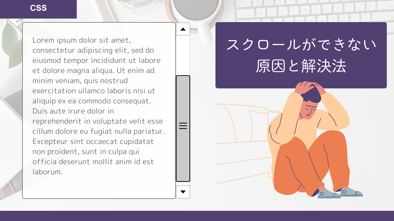
ヘッダー固定が効かない原因と対策(親要素のoverflowやz-indexの注意点)
position: stickyを使用してテーブルヘッダーを固定しようとしても、期待通りに動作しないケースがあります。これらの問題は、多くの場合、親要素のCSS設定や要素の配置に起因しています。ここでは、よくある原因と具体的な解決策を詳しく解説します。
最も一般的な原因と解決策
1. 親要素のoverflowプロパティの問題
最も頻繁に発生する問題は、親要素のoverflow設定です。
/* 問題のあるCSS例 */
.parent-container {
    overflow: hidden; /* これが原因でstickyが効かない */
}

.table-container {
    height: 400px;
    overflow: auto;
}

.sticky-table thead th {
    position: sticky;
    top: 0;
}
解決策:
/* 修正版 */
.parent-container {
    /* overflowプロパティを削除するか、visibleに変更 */
    overflow: visible;
    /* または、overflowを指定する必要がある場合は、
       sticky要素を含む要素階層を見直す */
}

.table-container {
    height: 400px;
    overflow: auto; /* スクロール可能な直接の親要素 */
}
2. 親要素の高さが未指定またはauto
/* 問題のあるCSS例 */
.table-container {
    /* heightが指定されていない */
    overflow: auto;
}
解決策:
/* 修正版 */
.table-container {
    height: 400px;        /* 固定高さ */
    /* または */
    max-height: 400px;    /* 最大高さ */
    overflow: auto;
}
3. z-indexの競合問題
他の要素との重なりで、ヘッダーが隠れてしまう場合があります。
/* 問題のあるCSS例 */
.sticky-table thead th {
    position: sticky;
    top: 0;
    /* z-indexが設定されていない、または値が低い */
}

.some-other-element {
    position: relative;
    z-index: 100; /* より高い値 */
}
解決策:
/* 修正版 */
.sticky-table thead th {
    position: sticky;
    top: 0;
    z-index: 101; /* 他の要素より高い値を設定 */
    background-color: #ffffff; /* 背景色も重要 */
}
実践的なデバッグ方法
問題の特定と解決のための段階的なアプローチを紹介します:
<!DOCTYPE html>
<html lang="ja">
<head>
    <meta charset="UTF-8">
    <meta name="viewport" content="width=device-width, initial-scale=1.0">
    <title>デバッグ用テーブル</title>
    <style>
        /* デバッグ用のボーダー表示 */
        .debug-mode * {
            border: 1px solid red !important;
        }

        /* 正しい実装例 */
        .table-wrapper {
            /* 外側のコンテナ */
            width: 100%;
            padding: 20px;
            /* overflow: hidden; を避ける */
        }

        .table-container {
            /* スクロール可能な直接の親 */
            width: 100%;
            height: 300px; /* 重要:高さを明示的に指定 */
            overflow: auto;
            border: 2px solid #333;

            /* デバッグ用:コンテナの境界を可視化 */
            background-color: #f0f0f0;
        }

        .sticky-table {
            width: 100%;
            border-collapse: collapse;
            margin: 0;
        }

        .sticky-table thead th {
            position: sticky;
            top: 0;
            background-color: #007bff;
            color: white;
            padding: 10px;
            text-align: left;

            /* デバッグ用:固定されているかを確認 */
            border: 3px solid #ff0000;
            z-index: 10;

            /* 背景色が透けないように */
            background-clip: padding-box;
        }

        .sticky-table td {
            padding: 10px;
            border-bottom: 1px solid #ddd;
        }

        .sticky-table tbody tr:nth-child(even) {
            background-color: #f8f9fa;
        }
    </style>
</head>
<body>
    <div class="table-wrapper">
        <h2>デバッグモード付きテーブル</h2>
        <div class="table-container">
            <table class="sticky-table">
                <thead>
                    <tr>
                        <th>列1</th>
                        <th>列2</th>
                        <th>列3</th>
                    </tr>
                </thead>
                <tbody>
                    <!-- 十分な数の行を生成 -->
                    <tr><td>データ1-1</td><td>データ1-2</td><td>データ1-3</td></tr>
                    <tr><td>データ2-1</td><td>データ2-2</td><td>データ2-3</td></tr>
                    <!-- 以下省略... -->
                </tbody>
            </table>
        </div>
    </div>
</body>
</html>
高度なトラブルシューティング
1. 複数のCSS フレームワークとの競合
Bootstrap や他のCSSフレームワークを使用している場合、既存のスタイルが競合することがあります。
/* フレームワークの影響を回避 */
.custom-sticky-table {
    /* 重要度を上げて既存スタイルを上書き */
    position: sticky !important;
    top: 0 !important;
    z-index: 1020 !important; /* Bootstrapのモーダルより高い値 */
}
2. 動的コンテンツでの問題
JavaScriptでテーブルの内容を動的に変更する場合、スタイルの再適用が必要な場合があります。
// 動的コンテンツ更新後にスタイルを強制的に再計算
function refreshStickyHeaders() {
    const stickyElements = document.querySelectorAll('[style*="position: sticky"]');
    stickyElements.forEach(element => {
        const currentDisplay = element.style.display;
        element.style.display = 'none';
        element.offsetHeight; // 強制的に再描画をトリガー
        element.style.display = currentDisplay;
    });
}
これらの対策を適用することで、position: stickyを使用したテーブルヘッダーの固定が正常に動作するようになります。問題が解決しない場合は、ブラウザの開発者ツールを使用して、要素の階層構造とCSS設定を詳しく確認することをお勧めします。
2行以上のヘッダーや複雑なテーブル構造への対応方法
実際の業務システムやデータテーブルでは、単純な1行ヘッダーだけでなく、複数行にわたるヘッダーや、colspan・rowspanを使用した複雑な構造が必要になることがあります。このセクションでは、そのような複雑なテーブル構造でもヘッダーを適切に固定する方法を解説します。
2行ヘッダーの固定実装
以下は、2行ヘッダーを持つテーブルの実装例です:
<div class="table-container">
  <table class="multi-header-table">
    <thead>
      <tr>
        <!-- 1行目:大分類 -->
        <th rowspan="2">ID</th>
        <th rowspan="2">名前</th>
        <th colspan="3">売上情報</th>
        <th colspan="2">評価</th>
      </tr>
      <tr>
        <!-- 2行目:小分類 -->
        <th>Q1</th>
        <th>Q2</th>
        <th>Q3</th>
        <th>自己評価</th>
        <th>上司評価</th>
      </tr>
    </thead>
    <tbody>
      <tr>
        <td>001</td>
        <td>田中太郎</td>
        <td>150万</td>
        <td>200万</td>
        <td>180万</td>
        <td>A</td>
        <td>B</td>
      </tr>
      <tr>
        <td>002</td>
        <td>佐藤花子</td>
        <td>120万</td>
        <td>180万</td>
        <td>220万</td>
        <td>A</td>
        <td>A</td>
      </tr>
      <!-- さらに多くのデータ行... -->
    </tbody>
  </table>
</div>
.table-container {
width: 100%;
height: 300px;
overflow: auto;
border: 1px solid #ddd;
}
.multi-header-table {
width: 100%;
border-collapse: collapse;
margin: 0;
}
/* 重要:すべてのヘッダー行を固定 */
.multi-header-table thead th {
position: sticky;
background-color: #f8f9fa;
border: 1px solid #dee2e6;
padding: 8px 12px;
text-align: center;
font-weight: bold;
z-index: 10;
}
/* 1行目のヘッダー位置 */
.multi-header-table thead tr:nth-child(1) th {
top: 0; /* 最上段に固定 */
}
/* 2行目のヘッダー位置 */
.multi-header-table thead tr:nth-child(2) th {
top: 40px; /* 1行目の高さ分だけ下に配置 */
}
/* データ行のスタイル */
.multi-header-table tbody td {
padding: 8px 12px;
border: 1px solid #dee2e6;
text-align: center;
}
.multi-header-table tbody tr:nth-child(even) {
background-color: #f8f9fa;
}
/* ヘッダーの背景色を強調 */
.multi-header-table thead tr:nth-child(1) th {
background-color: #007bff;
color: white;
}
.multi-header-table thead tr:nth-child(2) th {
background-color: #6c757d;
color: white;
}
実際の表示
See the Pen Untitled by watashi-xyz (@watashi-xyz) on CodePen.
動的な行高さに対応した実装
ヘッダーの行高さが動的に変わる場合に対応できる、より柔軟な実装方法です:
/* CSS変数を使用した動的対応 */
:root {
    --header-row-height: 40px; /* 1行の高さ */
}

.flexible-multi-header-table {
    width: 100%;
    border-collapse: collapse;
}

.flexible-multi-header-table thead th {
    position: sticky;
    background-color: #f8f9fa;
    border: 1px solid #dee2e6;
    padding: 8px 12px;
    text-align: center;
    font-weight: bold;
    z-index: 10;
    height: var(--header-row-height);
    min-height: var(--header-row-height);
}

/* 各行の位置を計算で設定 */
.flexible-multi-header-table thead tr:nth-child(1) th {
    top: 0;
}

.flexible-multi-header-table thead tr:nth-child(2) th {
    top: calc(var(--header-row-height) * 1);
}

.flexible-multi-header-table thead tr:nth-child(3) th {
    top: calc(var(--header-row-height) * 2);
}
複雑なcolspan/rowspan構造への対応
colspanとrowspanを組み合わせた複雑な構造でも、適切に固定できます:
<div class="table-container">
  <table class="complex-structure-table">
    <thead>
      <tr>
        <th rowspan="3">部署</th>
        <th rowspan="3">氏名</th>
        <th colspan="4">2023年度実績</th>
        <th colspan="2">評価</th>
      </tr>
      <tr>
        <th colspan="2">上半期</th>
        <th colspan="2">下半期</th>
        <th rowspan="2">総合</th>
        <th rowspan="2">ランク</th>
      </tr>
      <tr>
        <th>Q1</th>
        <th>Q2</th>
        <th>Q3</th>
        <th>Q4</th>
      </tr>
    </thead>
    <tbody>
      <!-- データ行 -->
      <tr>
        <td>テスト部署</td>
        <td>テスト太郎</td>
        <td>1</td>
        <td>2</td>
        <td>3</td>
        <td>4</td>
        <td>5</td>
        <td>6</td>
      </tr>
      <!-- 以降追加データ -->
    </tbody>
  </table>
</div>
対応するCSS:
.table-container {
  width: 100%;
  height: 300px;
  overflow: auto;
}

.complex-structure-table {
  width: 100%;
  border-collapse: collapse;
}

.complex-structure-table thead th {
  position: sticky;
  background-color: #f8f9fa;
  border: 1px solid #dee2e6;
  padding: 8px 12px;
  text-align: center;
  font-weight: bold;
  z-index: 10;
  height: 35px; /* 固定高さ */
  box-sizing: border-box;
}

/* 3行ヘッダーの位置設定 */
.complex-structure-table thead tr:nth-child(1) th {
  top: 0;
}

.complex-structure-table thead tr:nth-child(2) th {
  top: 35px;
}

.complex-structure-table thead tr:nth-child(3) th {
  top: 70px;
}

/* rowspanを持つセルの背景色調整 */
.complex-structure-table thead th[rowspan] {
  background-color: #007bff;
  color: white;
}
実際の表示
See the Pen Untitled by watashi-xyz (@watashi-xyz) on CodePen.
実装時の注意点とベストプラクティス
1. 行高さの統一
/* 行高さを統一することが重要 */
.multi-header-table thead th {
    height: 40px; /* 明示的な高さ指定 */
    line-height: 40px; /* テキストの垂直中央揃え */
    box-sizing: border-box; /* paddingを含めた高さ計算 */
}
2. z-indexの階層管理
/* 複数行の場合、適切なz-index設定 */
.multi-header-table thead tr:nth-child(1) th {
    z-index: 13; /* 最上段が最も高い値 */
}

.multi-header-table thead tr:nth-child(2) th {
    z-index: 12;
}

.multi-header-table thead tr:nth-child(3) th {
    z-index: 11;
}
3. JavaScriptによる動的な高さ調整
// 動的に行高さを取得して位置を調整
function adjustMultiHeaderPositions() {
    const headerRows = document.querySelectorAll('.multi-header-table thead tr');
    let cumulativeHeight = 0;

    headerRows.forEach((row, index) => {
        const cells = row.querySelectorAll('th');
        cells.forEach(cell => {
            cell.style.top = `${cumulativeHeight}px`;
        });
        cumulativeHeight += row.offsetHeight;
    });
}

// テーブル初期化時に実行
document.addEventListener('DOMContentLoaded', adjustMultiHeaderPositions);
これらの実装により、複雑なテーブル構造でも適切にヘッダーを固定することができます。
重要なのは、各ヘッダー行の高さを正確に把握し、topプロパティで適切な位置を指定することです。また、z-indexの値を適切に設定することで、複数行のヘッダーが正しく重なって表示されるようになります。
横スクロール・縦横対応のテーブルヘッダー固定テクニック
現代のWebアプリケーションでは、大量のデータを含むテーブルを表示する際、縦スクロールだけでなく横スクロールも必要になることが多くあります。さらに、スプレッドシートのように特定の列を固定表示したいという要求も増えています。このセクションでは、CSSを使用して横スクロールと縦スクロールの両方に対応したテーブルヘッダー固定の実装方法を詳しく解説します。
横スクロール+ヘッダー固定を両立するCSSレイアウト術
横スクロールが必要な幅広いテーブルでヘッダーを固定する場合、従来のテーブル表示では限界があります。ここでは、display: blockやoverflow-x: autoを組み合わせた効果的な実装方法を紹介します。
基本的な横スクロール対応実装
<div class="horizontal-scroll-container">
  <table class="horizontal-scroll-table">
    <thead>
      <tr>
        <th class="col-id">ID</th>
        <th class="col-name">氏名</th>
        <th class="col-email">メールアドレス</th>
        <th class="col-data">部署</th>
        <th class="col-data">入社年月</th>
        <th class="col-data">売上(1月)</th>
        <th class="col-data">売上(2月)</th>
        <th class="col-data">売上(3月)</th>
        <th class="col-data">売上(4月)</th>
        <th class="col-data">売上(5月)</th>
        <th class="col-data">売上(6月)</th>
      </tr>
    </thead>
    <tbody>
      <tr>
        <td>001</td>
        <td>田中太郎</td>
        <td>tanaka@example.com</td>
        <td>営業部</td>
        <td>2020-04</td>
        <td>150万</td>
        <td>180万</td>
        <td>200万</td>
        <td>175万</td>
        <td>190万</td>
        <td>210万</td>
      </tr>
      <tr>
        <td>002</td>
        <td>佐藤花子</td>
        <td>sato@example.com</td>
        <td>開発部</td>
        <td>2021-03</td>
        <td>120万</td>
        <td>140万</td>
        <td>160万</td>
        <td>155万</td>
        <td>165万</td>
        <td>180万</td>
      </tr>
      <!-- 追加のデータ行... -->
    </tbody>
  </table>
</div>
.horizontal-scroll-container {
width: 100%;
max-width: 800px; /* 親要素の最大幅 */
height: 400px;
border: 1px solid #ddd;
overflow: auto; /* 縦横両方向のスクロール */
position: relative;
}
.horizontal-scroll-table {
width: 1200px; /* テーブルの実際の幅(親要素より大きく設定) */
border-collapse: collapse;
margin: 0;
table-layout: fixed; /* 列幅を固定 */
}
/* ヘッダーの固定設定 */
.horizontal-scroll-table thead th {
position: sticky;
top: 0;
background-color: #007bff;
color: white;
padding: 12px 8px;
text-align: center;
font-weight: bold;
z-index: 10;
border-right: 1px solid #0056b3;
min-width: 120px; /* 最小列幅 */
}
/* データセルの設定 */
.horizontal-scroll-table tbody td {
padding: 10px 8px;
border-bottom: 1px solid #dee2e6;
border-right: 1px solid #dee2e6;
text-align: center;
min-width: 120px;
white-space: nowrap; /* テキストの改行を防ぐ */
}
.horizontal-scroll-table tbody tr:nth-child(even) {
background-color: #f8f9fa;
}
/* 列幅の個別設定 */
.horizontal-scroll-table .col-id {
width: 80px;
}
.horizontal-scroll-table .col-name {
width: 150px;
}
.horizontal-scroll-table .col-email {
width: 200px;
}
.horizontal-scroll-table .col-data {
width: 120px;
}
実際の表示
See the Pen table-fixed-header-04 by watashi-xyz (@watashi-xyz) on CodePen.
display: blockを使用したより柔軟な実装
従来のテーブル表示では制約が多い場合、display: blockを使用してより柔軟な実装が可能です:
.flexible-table-container {
    width: 100%;
    max-width: 900px;
    height: 350px;
    overflow: auto;
    border: 1px solid #ddd;
    position: relative;
}

.flexible-table {
    display: block; /* テーブルをブロック要素として扱う */
    width: 100%;
    border-collapse: collapse;
}

.flexible-table thead,
.flexible-table tbody {
    display: block; /* thead, tbodyもブロック要素に */
}

.flexible-table thead {
    width: 100%;
    position: sticky;
    top: 0;
    z-index: 10;
}

.flexible-table tbody {
    width: 100%;
    height: 300px; /* 明示的な高さ指定 */
    overflow-y: auto; /* 縦スクロールを有効化 */
}

.flexible-table tr {
    display: flex; /* 行をフレックスボックスとして扱う */
    width: 1400px; /* 実際のテーブル幅 */
    min-width: 100%;
}

.flexible-table th,
.flexible-table td {
    flex: 0 0 auto; /* フレックスアイテムとして固定幅 */
    padding: 10px;
    border-right: 1px solid #dee2e6;
    border-bottom: 1px solid #dee2e6;
    text-align: center;
    white-space: nowrap;
}

/* 各列の幅を個別設定 */
.flexible-table .col-id { width: 80px; }
.flexible-table .col-name { width: 150px; }
.flexible-table .col-email { width: 220px; }
.flexible-table .col-department { width: 100px; }
.flexible-table .col-date { width: 100px; }
.flexible-table .col-sales { width: 110px; }

/* ヘッダーの背景色 */
.flexible-table thead th {
    background-color: #28a745;
    color: white;
    font-weight: bold;
}

/* 行の背景色 */
.flexible-table tbody tr:nth-child(even) {
    background-color: #f8f9fa;
}
実際の表示
See the Pen table-fixed-header-05 by watashi-xyz (@watashi-xyz) on CodePen.
パフォーマンス最適化のポイント
横スクロールテーブルでは、大量のデータを扱う際のパフォーマンスが重要になります:
/* パフォーマンス向上のための設定 */
.optimized-table-container {
    width: 100%;
    height: 400px;
    overflow: auto;

    /* GPUアクセラレーションの有効化 */
    transform: translateZ(0);
    will-change: scroll-position;

    /* スクロールの最適化 */
    -webkit-overflow-scrolling: touch; /* iOS Safari用 */
    scrollbar-width: thin; /* Firefox用 */
}

.optimized-table {
    /* テーブルの描画最適化 */
    contain: layout style paint;

    /* 固定レイアウトでの高速化 */
    table-layout: fixed;
    width: 1500px; /* 固定幅 */
}

.optimized-table thead th {
    position: sticky;
    top: 0;

    /* 固定要素の最適化 */
    contain: layout style paint;
    background-color: #17a2b8;
    color: white;
    z-index: 10;
}
列も一緒に固定!左1〜2列をフリーズさせるCSS+HTML構成
スプレッドシートのように、特定の列(通常は左端の列)を横スクロール時にも固定表示する「フリーズカラム」機能は、ユーザビリティを大幅に向上させます。
1列固定の実装例
<div class="freeze-column-container">
  <table class="freeze-column-table">
    <thead>
      <tr>
        <th class="freeze-col col-id">ID</th>
        <th class="col-name">氏名</th>
        <th class="col-standard">部署</th>
        <th class="col-standard">職位</th>
        <th class="col-standard">1月売上</th>
        <th class="col-standard">2月売上</th>
        <th class="col-standard">3月売上</th>
        <th class="col-standard">4月売上</th>
        <th class="col-standard">5月売上</th>
        <th class="col-standard">6月売上</th>
      </tr>
    </thead>
    <tbody>
      <tr>
        <td class="freeze-col">001</td>
        <td>田中太郎</td>
        <td>営業部</td>
        <td>主任</td>
        <td>150万</td>
        <td>180万</td>
        <td>200万</td>
        <td>175万</td>
        <td>190万</td>
        <td>210万</td>
      </tr>
      <tr>
        <td class="freeze-col">002</td>
        <td>佐藤花子</td>
        <td>開発部</td>
        <td>リーダー</td>
        <td>120万</td>
        <td>140万</td>
        <td>160万</td>
        <td>155万</td>
        <td>165万</td>
        <td>180万</td>
      </tr>
      <!-- 追加のデータ行... -->
    </tbody>
  </table>
</div>
.freeze-column-container {
width: 100%;
max-width: 800px;
height: 400px;
overflow: auto;
border: 1px solid #ddd;
position: relative;
}
.freeze-column-table {
width: 1200px; /* テーブルの実際の幅 */
border-collapse: collapse;
table-layout: fixed;
}
/* ヘッダーの基本設定 */
.freeze-column-table thead th {
position: sticky;
top: 0;
background-color: #6c757d;
color: white;
padding: 12px 8px;
text-align: center;
font-weight: bold;
z-index: 10;
border-right: 1px solid #495057;
}
/* 固定列(1列目)の設定 */
.freeze-column-table .freeze-col {
position: sticky;
left: 0; /* 左端に固定 */
background-color: #e9ecef;
z-index: 5; /* ヘッダーより低い値 */
border-right: 2px solid #6c757d; /* 固定境界線 */
}
/* 固定列のヘッダー(最も高いz-index) */
.freeze-column-table thead th.freeze-col {
z-index: 15; /* ヘッダー+固定列で最高値 */
background-color: #495057;
}
/* データセルの設定 */
.freeze-column-table tbody td {
padding: 10px 8px;
border-bottom: 1px solid #dee2e6;
border-right: 1px solid #dee2e6;
text-align: center;
white-space: nowrap;
}
.freeze-column-table tbody tr:nth-child(even) {
background-color: #f8f9fa;
}
/* 固定列のデータセル */
.freeze-column-table tbody td.freeze-col {
background-color: #f8f9fa;
font-weight: bold;
}
.freeze-column-table tbody tr:nth-child(even) td.freeze-col {
background-color: #e9ecef;
}
/* 列幅の設定 */
.freeze-column-table .col-id {
width: 100px;
}
.freeze-column-table .col-name {
width: 150px;
}
.freeze-column-table .col-standard {
width: 130px;
}
実際の表示
See the Pen Untitled by watashi-xyz (@watashi-xyz) on CodePen.
2列固定の高度な実装
<div class="multi-freeze-container">
  <table class="multi-freeze-table">
    <thead>
      <tr>
        <th class="freeze-col-1 col-id">ID</th>
        <th class="freeze-col-2 col-name">氏名</th>
        <th class="col-standard">部署</th>
        <th class="col-standard">職位</th>
        <th class="col-standard">1月売上</th>
        <th class="col-standard">2月売上</th>
        <th class="col-standard">3月売上</th>
        <th class="col-standard">4月売上</th>
        <th class="col-standard">5月売上</th>
        <th class="col-standard">6月売上</th>
      </tr>
    </thead>
    <tbody>
      <tr>
        <td class="freeze-col-1">001</td>
        <td class="freeze-col-2">田中太郎</td>
        <td>営業部</td>
        <td>主任</td>
        <td>150万</td>
        <td>180万</td>
        <td>200万</td>
        <td>175万</td>
        <td>190万</td>
        <td>210万</td>
      </tr>
      <tr>
        <td class="freeze-col-1">002</td>
        <td class="freeze-col-2">佐藤花子</td>
        <td>開発部</td>
        <td>リーダー</td>
        <td>120万</td>
        <td>140万</td>
        <td>160万</td>
        <td>155万</td>
        <td>165万</td>
        <td>180万</td>
      </tr>
      <!-- 追加のデータ行... -->
    </tbody>
  </table>
</div>
.multi-freeze-container {
width: 100%;
max-width: 900px;
height: 400px;
overflow: auto;
border: 1px solid #ddd;
position: relative;
}
.multi-freeze-table {
width: 1000px;
border-collapse: collapse;
table-layout: fixed;
}
/* ヘッダーの基本設定 */
.multi-freeze-table thead th {
position: sticky;
top: 0;
background-color: #007bff;
color: white;
padding: 12px 8px;
text-align: center;
font-weight: bold;
z-index: 10;
border-right: 1px solid #0056b3;
}
/* 1列目の固定設定 */
.multi-freeze-table .freeze-col-1 {
position: sticky;
left: 0;
background-color: #e7f3ff;
z-index: 5;
border-right: 2px solid #007bff;
box-sizing: border-box;
width: 100px;
}
/* 2列目の固定設定 */
.multi-freeze-table .freeze-col-2 {
position: sticky;
left: 100px; /* 1列目の幅分だけ右に配置 */
background-color: #f0f8ff;
z-index: 5;
border-right: 2px solid #007bff;
}
/* 固定列のヘッダー */
.multi-freeze-table thead th.freeze-col-1,
.multi-freeze-table thead th.freeze-col-2 {
z-index: 15;
background-color: #0056b3;
}
/* データセルの背景色調整 */
.multi-freeze-table tbody td.freeze-col-1 {
background-color: #e7f3ff;
font-weight: bold;
}
.multi-freeze-table tbody td.freeze-col-2 {
background-color: #f0f8ff;
font-weight: 600;
}
/* 偶数行の背景色 */
.multi-freeze-table tbody tr:nth-child(even) td.freeze-col-1 {
background-color: #d1ecf1;
}
.multi-freeze-table tbody tr:nth-child(even) td.freeze-col-2 {
background-color: #e2f0ff;
}
実際の表示
See the Pen Untitled by watashi-xyz (@watashi-xyz) on CodePen.
JavaScript併用でのパフォーマンス最適化
大量のデータを扱う場合、JavaScriptと組み合わせることで更なる最適化が可能です:
// 固定列の動的調整
function optimizeFreezeColumns() {
    const table = document.querySelector('.multi-freeze-table');
    const freezeCol2Elements = document.querySelectorAll('.freeze-col-2');

    // 1列目の実際の幅を取得
    const col1Width = document.querySelector('.freeze-col-1').offsetWidth;

    // 2列目の位置を動的に調整
    freezeCol2Elements.forEach(element => {
        element.style.left = `${col1Width}px`;
    });
}

// ウィンドウリサイズ時の対応
window.addEventListener('resize', optimizeFreezeColumns);
document.addEventListener('DOMContentLoaded', optimizeFreezeColumns);

// スクロールパフォーマンスの最適化
let ticking = false;

function updateScrollPosition() {
    const container = document.querySelector('.multi-freeze-container');
    const scrollLeft = container.scrollLeft;

    // 固定列の影の表示/非表示
    if (scrollLeft > 0) {
        container.classList.add('has-horizontal-scroll');
    } else {
        container.classList.remove('has-horizontal-scroll');
    }

    ticking = false;
}

document.querySelector('.multi-freeze-container').addEventListener('scroll', () => {
    if (!ticking) {
        requestAnimationFrame(updateScrollPosition);
        ticking = true;
    }
});
レスポンシブでも崩れない!スマホ・タブレット対応の最適レイアウト
モバイルデバイスでの大きなテーブル表示は特に challenging です。ここでは、レスポンシブデザインに対応した実装方法を紹介します。
メディアクエリを活用したレスポンシブ実装
/* デスクトップ版のベーススタイル */
.responsive-table-container {
    width: 100%;
    height: 400px;
    overflow: auto;
    border: 1px solid #ddd;
}

.responsive-table {
    width: 100%;
    min-width: 800px; /* 最小幅を設定 */
    border-collapse: collapse;
    table-layout: fixed;
}

.responsive-table thead th {
    position: sticky;
    top: 0;
    background-color: #28a745;
    color: white;
    padding: 12px 8px;
    text-align: center;
    font-weight: bold;
    z-index: 10;
    border-right: 1px solid #1e7e34;
}

.responsive-table tbody td {
    padding: 10px 8px;
    border-bottom: 1px solid #dee2e6;
    border-right: 1px solid #dee2e6;
    text-align: center;
    white-space: nowrap;
}

/* タブレット対応(768px以下) */
@media (max-width: 768px) {
    .responsive-table-container {
        height: 350px;
    }

    .responsive-table {
        min-width: 600px; /* 最小幅を調整 */
    }

    .responsive-table thead th,
    .responsive-table tbody td {
        padding: 8px 6px;
        font-size: 14px;
    }

    /* 重要でない列を非表示 */
    .responsive-table .hide-mobile {
        display: none;
    }
}

/* スマートフォン対応(480px以下) */
@media (max-width: 480px) {
    .responsive-table-container {
        height: 300px;
    }

    .responsive-table {
        min-width: 400px;
    }

    .responsive-table thead th,
    .responsive-table tbody td {
        padding: 6px 4px;
        font-size: 12px;
    }

    /* さらに多くの列を非表示 */
    .responsive-table .hide-small {
        display: none;
    }
}
カード形式への変換実装
非常に小さな画面では、テーブルをカード形式に変換する方法も効果的です:
<div class="responsive-data-container">
    <!-- デスクトップ版テーブル -->
    <div class="desktop-table">
        <table class="standard-table">
            <thead>
                <tr>
                    <th>ID</th>
                    <th>氏名</th>
                    <th>部署</th>
                    <th>メール</th>
                    <th>売上</th>
                </tr>
            </thead>
            <tbody>
                <tr>
                    <td>001</td>
                    <td>田中太郎</td>
                    <td>営業部</td>
                    <td>tanaka@example.com</td>
                    <td>150万</td>
                </tr>
                <!-- 他のデータ... -->
            </tbody>
        </table>
    </div>

    <!-- モバイル版カード -->
    <div class="mobile-cards">
        <div class="data-card">
            <div class="card-header">
                <span class="card-id">001</span>
                <span class="card-name">田中太郎</span>
            </div>
            <div class="card-body">
                <div class="card-item">
                    <label>部署:</label>
                    <span>営業部</span>
                </div>
                <div class="card-item">
                    <label>メール:</label>
                    <span>tanaka@example.com</span>
                </div>
                <div class="card-item">
                    <label>売上:</label>
                    <span>150万</span>
                </div>
            </div>
        </div>
        <!-- 他のカード... -->
    </div>
</div>
対応するCSS:
/* デスクトップ版テーブル */
.desktop-table {
    display: block;
}

.mobile-cards {
    display: none;
}

/* モバイル版カード */
@media (max-width: 600px) {
    .desktop-table {
        display: none;
    }

    .mobile-cards {
        display: block;
        padding: 10px;
        height: 400px;
        overflow-y: auto;
    }

    .data-card {
        background: white;
        border: 1px solid #ddd;
        border-radius: 8px;
        margin-bottom: 10px;
        padding: 15px;
        box-shadow: 0 2px 4px rgba(0,0,0,0.1);
    }

    .card-header {
        display: flex;
        justify-content: space-between;
        align-items: center;
        margin-bottom: 10px;
        padding-bottom: 10px;
        border-bottom: 1px solid #eee;
    }

    .card-id {
        background-color: #007bff;
        color: white;
        padding: 4px 8px;
        border-radius: 4px;
        font-size: 12px;
        font-weight: bold;
    }

    .card-name {
        font-weight: bold;
        font-size: 16px;
    }

    .card-item {
        display: flex;
        justify-content: space-between;
        margin-bottom: 5px;
    }

    .card-item label {
        font-weight: 600;
        color: #666;
        min-width: 60px;
    }

    .card-item span {
        text-align: right;
        flex: 1;
    }
}
実際の表示
See the Pen table-fixed-header-08 by watashi-xyz (@watashi-xyz) on CodePen.
タッチデバイス最適化
/* タッチデバイス向けの最適化 */
.touch-optimized-table {
    width: 100%;
    border-collapse: collapse;
}

.touch-optimized-table thead th {
    position: sticky;
    top: 0;
    background-color: #17a2b8;
    color: white;
    padding: 15px 10px; /* タッチしやすい大きさ */
    text-align: center;
    font-weight: bold;
    z-index: 10;
    min-height: 44px; /* Appleのタッチターゲットサイズ推奨値 */
}

.touch-optimized-table tbody td {
    padding: 12px 10px;
    border-bottom: 1px solid #dee2e6;
    border-right: 1px solid #dee2e6;
    text-align: center;
    min-height: 44px;
    vertical-align: middle;
}

/* スクロールバーの見た目を改善 */
.touch-optimized-container {
    width: 100%;
    height: 400px;
    overflow: auto;
    border: 1px solid #ddd;

    /* iOS Safari用のスムーススクロール */
    -webkit-overflow-scrolling: touch;

    /* スクロールバーのカスタマイズ */
    scrollbar-width: thin;
    scrollbar-color: #888 #f1f1f1;
}

.touch-optimized-container::-webkit-scrollbar {
    width: 8px;
    height: 8px;
}

.touch-optimized-container::-webkit-scrollbar-track {
    background: #f1f1f1;
}

.touch-optimized-container::-webkit-scrollbar-thumb {
    background: #888;
    border-radius: 4px;
}

.touch-optimized-container::-webkit-scrollbar-thumb:hover {
    background: #555;
}
これらの実装により、デスクトップからモバイルまで、あらゆるデバイスで快適にテーブルを利用できるようになります。
重要なのは、各デバイスの特性を理解し、適切な表示方法を選択することです。テーブルの複雑さとデータの重要度に応じて、列の非表示化、カード形式への変換、タッチ操作の最適化などを組み合わせることで、優れたユーザーエクスペリエンスを提供できます。
フレームワーク別ヘッダー固定テクニックと応用
Bootstrapでヘッダー固定テーブルを作る具体的な手順と注意点
Bootstrapを使用したプロジェクトでは、既存のテーブルコンポーネントを活用しながらヘッダー固定を実装できます。Bootstrap 5ではtable-responsiveクラスとposition: stickyを組み合わせることで、効率的にヘッダー固定テーブルを構築できます。

まず、基本的なBootstrapテーブルの構造を確認しましょう:
<div class="table-responsive" style="height: 400px; overflow-y: auto;">
  <table class="table table-striped table-hover">
    <thead class="table-dark sticky-top">
      <tr>
        <th scope="col">ID</th>
        <th scope="col">顧客名</th>
        <th scope="col">メールアドレス</th>
        <th scope="col">登録日</th>
        <th scope="col">ステータス</th>
      </tr>
    </thead>
    <tbody>
      <tr>
        <td>001</td>
        <td>山田太郎</td>
        <td>yamada@example.com</td>
        <td>2024-01-15</td>
        <td><span class="badge bg-success">アクティブ</span></td>
      </tr>
      <!-- 大量のデータ行 -->
    </tbody>
  </table>
</div>
Bootstrapでのヘッダー固定に必要なカスタムCSSを追加します:
/* Bootstrap用のカスタムCSS */
.table-responsive {
  border-radius: 0.375rem;
  border: 1px solid #dee2e6;
}

.sticky-top {
  position: sticky;
  top: 0;
  z-index: 1020; /* Bootstrapのz-indexスケールに合わせる */
}

/* Bootstrap 5のテーブルヘッダーの背景色を確実に適用 */
.table-dark.sticky-top th {
  background-color: #212529 !important;
  border-color: #32383e !important;
}

/* ヘッダーのボーダー調整 */
.table-responsive .table thead th {
  border-bottom-width: 2px;
  vertical-align: bottom;
}

/* スクロール時のヘッダーシャドウ効果 */
.table-responsive .sticky-top {
  box-shadow: 0 2px 4px rgba(0,0,0,0.1);
}
Bootstrap 4とBootstrap 5の違いに注意が必要です。Bootstrap 4ではsticky-topクラスは存在しないため、以下のようにカスタムCSSで対応します:
/* Bootstrap 4用の追加CSS */
.table-sticky-header thead th {
  position: sticky;
  top: 0;
  z-index: 1030;
  background-color: #343a40;
  color: #fff;
}
MUI(Material-UI)やTailwind CSSでのヘッダー固定実装例
MUI(Material-UI)を使用している場合、TableContainerコンポーネントとstickyHeaderプロパティを組み合わせることで、簡潔にヘッダー固定テーブルを実装できます。

import React from 'react';
import {
  Table,
  TableBody,
  TableCell,
  TableContainer,
  TableHead,
  TableRow,
  Paper,
  styled
} from '@mui/material';

const StyledTableContainer = styled(TableContainer)(({ theme }) => ({
  maxHeight: 400,
  '& .MuiTableHead-root': {
    '& .MuiTableCell-root': {
      backgroundColor: theme.palette.primary.main,
      color: theme.palette.primary.contrastText,
      fontWeight: 600,
      fontSize: '0.875rem',
      position: 'sticky',
      top: 0,
      zIndex: 100,
    }
  }
}));

const StickyHeaderTable = ({ data }) => {
  return (
    <StyledTableContainer component={Paper}>
      <Table stickyHeader aria-label="sticky header table">
        <TableHead>
          <TableRow>
            <TableCell>商品名</TableCell>
            <TableCell align="right">価格</TableCell>
            <TableCell align="right">在庫</TableCell>
            <TableCell>カテゴリ</TableCell>
          </TableRow>
        </TableHead>
        <TableBody>
          {data.map((row, index) => (
            <TableRow key={index} hover>
              <TableCell>{row.name}</TableCell>
              <TableCell align="right">{row.price}</TableCell>
              <TableCell align="right">{row.stock}</TableCell>
              <TableCell>{row.category}</TableCell>
            </TableRow>
          ))}
        </TableBody>
      </Table>
    </StyledTableContainer>
  );
};
Tailwind CSSを使用している場合は、ユーティリティクラスを組み合わせてヘッダー固定を実装します:
<div class="h-96 overflow-y-auto border border-gray-200 rounded-lg">
  <table class="w-full table-auto">
    <thead class="bg-gray-50 sticky top-0 z-10">
      <tr>
        <th class="px-6 py-3 text-left text-xs font-medium text-gray-500 uppercase tracking-wider border-b-2 border-gray-200">
          商品名
        </th>
        <th class="px-6 py-3 text-left text-xs font-medium text-gray-500 uppercase tracking-wider border-b-2 border-gray-200">
          価格
        </th>
        <th class="px-6 py-3 text-left text-xs font-medium text-gray-500 uppercase tracking-wider border-b-2 border-gray-200">
          在庫
        </th>
        <th class="px-6 py-3 text-left text-xs font-medium text-gray-500 uppercase tracking-wider border-b-2 border-gray-200">
          カテゴリ
        </th>
      </tr>
    </thead>
    <tbody class="bg-white divide-y divide-gray-200">
      <tr class="hover:bg-gray-50">
        <td class="px-6 py-4 whitespace-nowrap text-sm text-gray-900">商品A</td>
        <td class="px-6 py-4 whitespace-nowrap text-sm text-gray-900">¥1,000</td>
        <td class="px-6 py-4 whitespace-nowrap text-sm text-gray-900">50</td>
        <td class="px-6 py-4 whitespace-nowrap text-sm text-gray-900">家電</td>
      </tr>
      <!-- 他のデータ行 -->
    </tbody>
  </table>
</div>
Tailwind CSSでより複雑なヘッダー固定を実装する場合の追加CSS:
/* Tailwind CSSの@layerディレクティブを使用 */
@layer components {
  .table-sticky-header {
    @apply sticky top-0 z-10 bg-gray-50;
    box-shadow: 0 2px 4px rgba(0, 0, 0, 0.1);
  }

  .table-sticky-header th {
    @apply bg-gray-50 backdrop-blur-sm;
  }
}


jQuery・JavaScriptを使う場合とCSSのみで実装する場合の違いと選び方
CSS のposition: stickyとJavaScript(jQuery含む)を使用したヘッダー固定には、それぞれ明確な特徴と適用場面があります。適切な選択をするため、両者の違いを詳しく解説します。
CSSのみで実装する場合のメリット:
- パフォーマンスの優位性:ブラウザの最適化されたレンダリングエンジンを活用
- 実装の簡潔性:少ないコードで実現可能
- メンテナンス性:JavaScriptの依存関係やバージョン管理が不要
- アクセシビリティ:スクリーンリーダーでの読み上げに影響しない
JavaScriptを使用する場合のメリット:
- 複雑な動的操作:テーブルの行の追加・削除、ソート機能との連携
- 細かなカスタマイズ:スクロール位置に応じた独自の動作
- レガシーブラウザ対応:古いブラウザでの
position: sticky非対応への対処 - 高度な機能:仮想スクロール、無限スクロールとの組み合わせ
選択基準の具体例:
CSS のみで十分なケース:
- 静的なテーブルデータの表示
- シンプルなヘッダー固定のみが必要
- モダンブラウザのみをサポート
- パフォーマンスを最優先に考慮
JavaScript が必要なケース:
// 例:動的なテーブルソート機能付きヘッダー固定
$(document).ready(function() {
    let $table = $('#data-table');
    let $headerClone = $table.find('thead').clone();

    // スクロール時のヘッダー固定とソート機能の両立
    $table.on('scroll', function() {
        let scrollTop = $(this).scrollTop();
        if (scrollTop > 50) {
            $headerClone.addClass('fixed-header');
        } else {
            $headerClone.removeClass('fixed-header');
        }
    });

    // ソート機能
    $table.find('th[data-sort]').on('click', function() {
        let sortBy = $(this).data('sort');
        sortTableData(sortBy);
        updateStickyHeader(); // ヘッダーの状態を更新
    });
});
実装方法の比較表:
| 項目 | CSS only | JavaScript使用 |
|---|---|---|
| 実装難易度 | 低 | 中〜高 |
| パフォーマンス | 高 | 中(最適化次第) |
| カスタマイズ性 | 限定的 | 高 |
| ブラウザサポート | モダンブラウザ | 全ブラウザ |
| 保守性 | 高 | 中 |
現在のウェブ制作においては、CSSのみでの実装を第一選択肢とし、以下の場合のみJavaScriptの使用を検討することを推奨します:
- IE11以下のサポートが必須の場合
- 複雑な動的テーブル操作が必要な場合
- 既存のJavaScriptテーブルライブラリとの統合が必要な場合
- 特殊なスクロール動作やアニメーションが必要な場合
ほとんどのプロジェクトでは、position: stickyを使用したCSSのみの実装で十分な機能を提供でき、よりシンプルで保守性の高いコードを実現できます。
よくある質問(FAQ)
-
大量データでパフォーマンスが心配です。何か対策はありますか?
-
大量のデータを含むテーブルでヘッダー固定を実装する際は、以下の最適化手法を組み合わせることでパフォーマンスを向上させることができます。
1. CSSアニメーションの最適化
.sticky-header-table thead th {
  position: sticky;
  top: 0;
  /* GPU加速を活用してスムーズなスクロールを実現 */
  transform: translateZ(0);
  will-change: transform;
  /* 不要なアニメーションを無効化 */
  transition: none;
}

/* スクロール時のパフォーマンス向上 */
.table-container {
  /* スクロール最適化 */
  scroll-behavior: auto;
  /* iOS でのスクロール最適化 */
  -webkit-overflow-scrolling: touch;
}
2. 仮想スクロール(Virtual Scrolling)の検討
大量データ(10,000行以上)の場合は、仮想スクロールライブラリの使用を検討してください:
// React Virtual を使用した例
import { FixedSizeList as List } from 'react-window';

const VirtualizedTable = ({ data }) => {
  const Row = ({ index, style }) => (
    <div style={style} className="table-row">
      <div className="cell">{data[index].name}</div>
      <div className="cell">{data[index].price}</div>
      <div className="cell">{data[index].stock}</div>
    </div>
  );

  return (
    <div className="virtualized-table">
      <div className="sticky-header">
        <div className="cell">商品名</div>
        <div className="cell">価格</div>
        <div className="cell">在庫</div>
      </div>
      <List
        height={400}
        itemCount={data.length}
        itemSize={50}
        itemData={data}
      >
        {Row}
      </List>
    </div>
  );
};
3. パフォーマンス監視の実装
// スクロールパフォーマンスの監視
const observeScrollPerformance = () => {
  let lastScrollTime = 0;

  document.querySelector('.table-container').addEventListener('scroll', () => {
    const now = performance.now();
    if (now - lastScrollTime > 16) { // 60FPS以下の場合
      console.warn('スクロールパフォーマンスが低下しています');
    }
    lastScrollTime = now;
  });
};
-
テーブルのソート機能とヘッダー固定を両立できますか?
-
はい、可能です。CSSでのヘッダー固定とJavaScriptによるソート機能は問題なく組み合わせることができます。
基本的な実装例:
<div class="table-container">
  <table class="sortable-sticky-table">
    <thead>
      <tr>
        <th data-sort="name" class="sortable">
          商品名
          <span class="sort-indicator">↕</span>
        </th>
        <th data-sort="price" class="sortable">
          価格
          <span class="sort-indicator">↕</span>
        </th>
        <th data-sort="stock" class="sortable">
          在庫
          <span class="sort-indicator">↕</span>
        </th>
      </tr>
    </thead>
    <tbody id="table-body">
      <!-- データ行 -->
    </tbody>
  </table>
</div>
CSS(ヘッダー固定 + ソート表示):
.sortable-sticky-table thead th {
  position: sticky;
  top: 0;
  background-color: #f8f9fa;
  z-index: 10;
  cursor: pointer;
  user-select: none;
  transition: background-color 0.2s ease;
}

.sortable-sticky-table thead th:hover {
  background-color: #e9ecef;
}

.sortable-sticky-table thead th.sorted-asc .sort-indicator::after {
  content: '↑';
  color: #007bff;
}

.sortable-sticky-table thead th.sorted-desc .sort-indicator::after {
  content: '↓';
  color: #007bff;
}

.sort-indicator {
  margin-left: 8px;
  font-size: 12px;
  opacity: 0.5;
}
JavaScript(ソート機能):
class SortableTable {
  constructor(tableSelector) {
    this.table = document.querySelector(tableSelector);
    this.tbody = this.table.querySelector('tbody');
    this.headers = this.table.querySelectorAll('th.sortable');
    this.data = [];
    this.currentSort = { column: null, direction: null };

    this.init();
  }

  init() {
    this.headers.forEach(header => {
      header.addEventListener('click', () => {
        const column = header.dataset.sort;
        this.sortTable(column);
      });
    });
  }

  sortTable(column) {
    const direction = this.currentSort.column === column &&
                     this.currentSort.direction === 'asc' ? 'desc' : 'asc';

    // データを取得してソート
    const rows = Array.from(this.tbody.querySelectorAll('tr'));
    const sortedRows = rows.sort((a, b) => {
      const aValue = this.getCellValue(a, column);
      const bValue = this.getCellValue(b, column);

      if (direction === 'asc') {
        return aValue.localeCompare(bValue, 'ja', { numeric: true });
      } else {
        return bValue.localeCompare(aValue, 'ja', { numeric: true });
      }
    });

    // ソート後の行をテーブルに再挿入
    sortedRows.forEach(row => this.tbody.appendChild(row));

    // ヘッダーの表示を更新
    this.updateSortIndicators(column, direction);
    this.currentSort = { column, direction };
  }

  getCellValue(row, column) {
    const columnIndex = Array.from(this.headers).findIndex(
      h => h.dataset.sort === column
    );
    return row.cells[columnIndex].textContent.trim();
  }

  updateSortIndicators(sortedColumn, direction) {
    this.headers.forEach(header => {
      header.classList.remove('sorted-asc', 'sorted-desc');
      if (header.dataset.sort === sortedColumn) {
        header.classList.add(`sorted-${direction}`);
      }
    });
  }
}

// 初期化
document.addEventListener('DOMContentLoaded', () => {
  new SortableTable('.sortable-sticky-table');
});
-
印刷時にヘッダーを各ページに固定表示したいのですが?
-
印刷時のヘッダー固定は、
@media printを使用して実現できます。ただし、ブラウザによって対応状況が異なるため、複数のアプローチを組み合わせることが重要です。基本的な印刷用CSS:
@media print {
  /* 印刷時のページ設定 */
  @page {
    size: A4;
    margin: 1cm;
  }

  /* テーブル全体の設定 */
  .printable-table {
    width: 100%;
    border-collapse: collapse;
    page-break-inside: auto;
  }

  /* ヘッダーを各ページに表示 */
  .printable-table thead {
    display: table-header-group;
  }

  .printable-table tbody {
    display: table-row-group;
  }

  /* ヘッダー行のスタイル */
  .printable-table thead th {
    background-color: #f8f9fa !important;
    border: 1px solid #000;
    padding: 8px;
    font-weight: bold;
    /* 印刷時はstickyを無効化 */
    position: static;
  }

  /* データ行のスタイル */
  .printable-table tbody td {
    border: 1px solid #000;
    padding: 6px;
    page-break-inside: avoid;
  }

  /* テーブル行の改ページ制御 */
  .printable-table tr {
    page-break-inside: avoid;
    page-break-after: auto;
  }

  /* 不要な要素を非表示 */
  .no-print {
    display: none !important;
  }

  /* テーブルコンテナのスタイル調整 */
  .table-container {
    height: auto !important;
    overflow: visible !important;
    border: none !important;
    box-shadow: none !important;
  }
}
より確実な印刷対応のための追加設定:
@media print {
  /* Chrome/Safari用の追加設定 */
  .printable-table {
    -webkit-print-color-adjust: exact;
    print-color-adjust: exact;
  }

  /* 大きなテーブルの分割表示 */
  .printable-table {
    table-layout: fixed;
  }

  /* 列幅の調整 */
  .printable-table th,
  .printable-table td {
    word-wrap: break-word;
    max-width: 100px;
  }

  /* フッター情報の追加 */
  .print-footer {
    position: fixed;
    bottom: 0;
    left: 0;
    right: 0;
    text-align: center;
    font-size: 12px;
    border-top: 1px solid #000;
    padding: 5px;
  }
}
HTML構造の例:
<div class="table-container">
  <table class="sticky-header-table printable-table">
    <thead>
      <tr>
        <th>商品名</th>
        <th>価格</th>
        <th>在庫</th>
        <th>カテゴリ</th>
      </tr>
    </thead>
    <tbody>
      <!-- データ行 -->
    </tbody>
  </table>

  <!-- 印刷用のフッター -->
  <div class="print-footer no-print">
    印刷日: <span id="print-date"></span>
  </div>
</div>

<!-- 印刷ボタン -->
<button onclick="window.print()" class="no-print">
  印刷
</button>
JavaScript での印刷制御:
// 印刷前の処理
window.addEventListener('beforeprint', () => {
  // 印刷日の設定
  document.getElementById('print-date').textContent =
    new Date().toLocaleDateString('ja-JP');

  // 印刷用のクラスを追加
  document.body.classList.add('printing');
});

// 印刷後の処理
window.addEventListener('afterprint', () => {
  document.body.classList.remove('printing');
});
注意点:
- 各ブラウザで印刷プレビューを確認してテストすることが重要
- 複雑なテーブルレイアウトの場合は、印刷専用のシンプルなテーブルを用意することも検討
display: table-header-groupは古いブラウザでは対応していない場合があるため、フォールバック対策も実装する
まとめ
本記事では、CSSのposition: stickyを使用したテーブルヘッダー固定の実装方法について、基本的な手法から複雑な応用例まで幅広く解説しました。JavaScriptを使わずにCSSだけで実現できるヘッダー固定は、パフォーマンスが良く、メンテナンスも容易な優れた手法です。
現代のWeb制作において、テーブルヘッダー固定は単なる見た目の改善ではなく、大量データを扱うWebアプリケーションにおける重要なUX向上施策といえるでしょう。特に、管理画面やダッシュボード、データ分析ツールなど、業務系システムでは必須の機能となっています。
実装時に最も重要なのは、ブラウザの互換性とパフォーマンスのバランスを考慮することです。position: stickyは主要なモダンブラウザで広くサポートされており、IE11以下を除けば安心して使用できます。レガシーブラウザのサポートが必要な場合のみ、JavaScriptによる代替手段を検討すればよいでしょう。
また、単純なヘッダー固定だけでなく、横スクロールとの組み合わせや、特定の列の固定、2行ヘッダーなど、より複雑な要件にも対応できる柔軟性があることも、この手法の大きな魅力です。
今後のプロジェクトでテーブルヘッダー固定を実装する際は、まずCSSのposition: stickyでの実装を検討し、必要に応じて本記事で紹介した応用技術を組み合わせてみてください。ユーザーにとって使いやすく、開発者にとってもメンテナンスしやすい、優れたテーブルUIを実現できるはずです。