CSSで要素を重ねる際に、z-indexが効かない、思った通りの重なり順にならない、複数のCSSライブラリを使うとスタイルが競合してしまう…そんな経験はありませんか?従来のCSS設計では、詳細度の競争や!importantの乱用によって、コードがどんどん複雑になってしまいがちです。特に大規模なプロジェクトやチーム開発では、CSS設計の破綻は深刻な問題となります。
そこで注目されているのが、CSSカスケードレイヤー(@layer)です。この革新的な機能を使えば、z-indexに頼らずに要素の重なり順を明確に制御でき、保守性の高いCSS設計を実現できます。「css レイヤー 重ねる」技術をマスターすることで、これまでのCSS設計の課題を根本から解決できるのです。
本記事を読み終える頃には、CSS設計に対する考え方が大きく変わり、より効率的で保守性の高いスタイルシートを作成できるようになるでしょう。
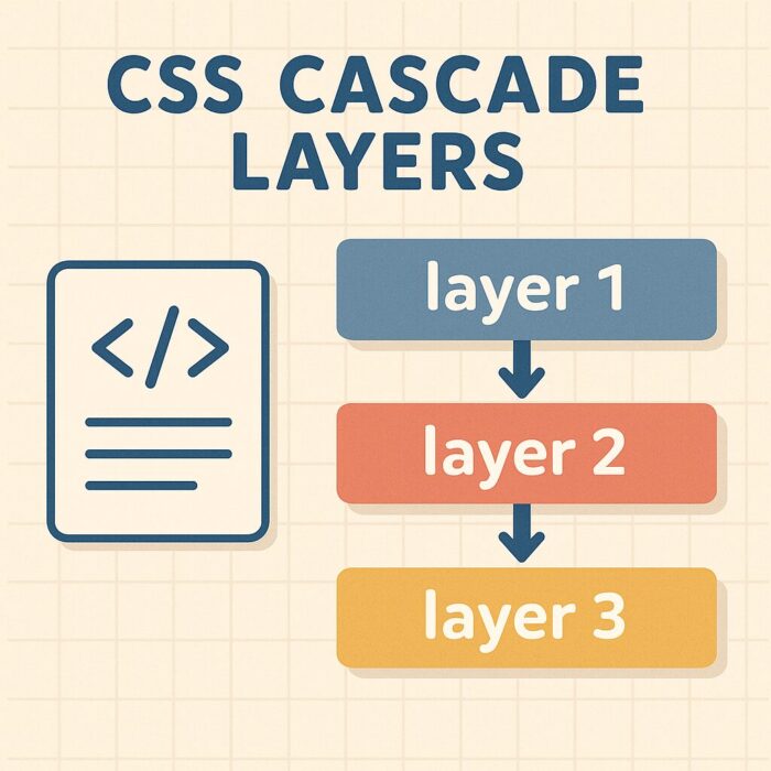
CSSカスケードレイヤー(@layer)で実現する要素の重ね合わせ入門
CSSカスケードレイヤー(@layer)とは?基本とメリット
CSSカスケードレイヤー(CSS Cascade Layers) は、CSS設計における革新的な機能として2022年に主要ブラウザで実装された比較的新しい仕様です。従来のカスケード(cascade)の優先順位を開発者が明示的にコントロールできるようになり、CSSの保守性と可読性を大幅に向上させることができます。

カスケードレイヤーの基本概念
カスケードレイヤーは、@layerルールを使用してCSSスタイルを論理的なグループに分割し、それぞれのグループに優先順位を与える仕組みです。これにより、従来のCSS詳細度(Specificity)による予期しない挙動を回避し、より予測可能なスタイル適用が可能になります。
/* カスケードレイヤーの基本的な定義 */
@layer reset, base, components, utilities;

@layer reset {
  * {
    margin: 0;
    padding: 0;
    box-sizing: border-box;
  }
}

@layer base {
  body {
    font-family: 'Arial', sans-serif;
    line-height: 1.6;
    color: #333;
  }
}

@layer components {
  .button {
    padding: 10px 20px;
    border: none;
    border-radius: 4px;
    cursor: pointer;
  }
}
カスケードレイヤーの主要なメリット
1. 優先順位の明確化
従来のCSS設計では、セレクタの詳細度や記述順序によってスタイルの優先順位が決まるため、意図しない挙動が発生することがありました。カスケードレイヤーを使用することで、レイヤーの宣言順序によって優先順位が明確に定義されます。
2. CSS設計の構造化
大規模なプロジェクトにおいて、CSSを論理的なグループに分割することで、コードの整理と保守性が向上します。例えば、リセットCSS、ベーススタイル、コンポーネント、ユーティリティなど、役割ごとにレイヤーを分けることができます。
3. !importantの乱用防止
従来、スタイルの優先順位を強制的に上げるために!importantが頻繁に使用されていましたが、カスケードレイヤーにより、より構造的なアプローチでスタイルの優先順位を管理できるようになります。
/* 従来の問題のあるアプローチ */
.header {
  background-color: blue !important; /* 強制的に優先 */
}

/* カスケードレイヤーを使った改善されたアプローチ */
@layer base, theme;

@layer base {
  .header {
    background-color: white;
  }
}

@layer theme {
  .header {
    background-color: blue; /* !importantなしで優先される */
  }
}
css cascade layersの実用性
css cascade layersは特に以下のような場面で威力を発揮します:
- 大規模なWebアプリケーション開発:複数の開発者が関わるプロジェクトで、CSS設計の一貫性を保ちたい場合
- CSSフレームワークとの併用:Bootstrap、Tailwind CSSなどのフレームワークと独自スタイルを組み合わせる際の競合回避
- レガシーコードのリファクタリング:既存のCSSコードを段階的に整理し、保守性を向上させたい場合
css cascade layersの書き方とサンプルコード
css cascade layersの実装には、主に3つの書き方があります。それぞれの特徴と使用場面を詳しく解説していきます。
1. 無名レイヤー(Anonymous Layers)
最もシンプルな形式で、レイヤー名を指定せずに使用します。主に特定のスタイルブロックを他のスタイルより低い優先度に設定したい場合に使用されます。
/* 無名レイヤーの例 */
@layer {
  /* このレイヤー内のスタイルは優先度が低くなる */
  .container {
    max-width: 1200px;
    margin: 0 auto;
  }

  .card {
    border: 1px solid #ddd;
    padding: 20px;
    border-radius: 8px;
  }
}

/* 通常のスタイル(無名レイヤーより優先される) */
.card {
  background-color: #f9f9f9; /* このスタイルが適用される */
}
2. 名前付きレイヤー(Named Layers)
レイヤーに明示的な名前を付けることで、より構造的なCSS設計が可能になります。これが最も実用的で推奨される方法です。
/* レイヤーの宣言(優先順位を定義) */
@layer reset, base, layout, components, utilities;

/* reset レイヤー */
@layer reset {
  *, *::before, *::after {
    box-sizing: border-box;
  }

  body, h1, h2, h3, p {
    margin: 0;
    padding: 0;
  }
}

/* base レイヤー */
@layer base {
  body {
    font-family: -apple-system, BlinkMacSystemFont, 'Segoe UI', sans-serif;
    line-height: 1.5;
    color: #2d3748;
    background-color: #ffffff;
  }

  h1, h2, h3 {
    font-weight: 600;
    line-height: 1.25;
  }
}

/* layout レイヤー */
@layer layout {
  .container {
    max-width: 1200px;
    margin: 0 auto;
    padding: 0 16px;
  }

  .grid {
    display: grid;
    gap: 24px;
  }

  .flex {
    display: flex;
    align-items: center;
  }
}

/* components レイヤー */
@layer components {
  .btn {
    display: inline-flex;
    align-items: center;
    justify-content: center;
    padding: 12px 24px;
    border: none;
    border-radius: 6px;
    font-size: 14px;
    font-weight: 500;
    cursor: pointer;
    transition: all 0.2s ease;
  }

  .btn-primary {
    background-color: #3182ce;
    color: white;
  }

  .btn-primary:hover {
    background-color: #2c5aa0;
  }
}

/* utilities レイヤー(最高優先度) */
@layer utilities {
  .text-center { text-align: center !important; }
  .hidden { display: none !important; }
  .mt-4 { margin-top: 16px !important; }
}
3. インポート時のレイヤー指定
外部CSSファイルを特定のレイヤーに割り当てることも可能です。これは特にCSSフレームワークを使用する際に有効です。
/* 外部ファイルをレイヤーに割り当て */
@import url('normalize.css') layer(reset);
@import url('bootstrap.min.css') layer(framework);
@import url('custom-components.css') layer(components);

/* レイヤーの優先順位を明示的に定義 */
@layer reset, framework, components, utilities;

/* カスタムスタイルを追加 */
@layer utilities {
  .custom-utility {
    position: relative;
    z-index: 100;
  }
}
実践的なカスケードレイヤー設計パターン
モダンなWeb開発において推奨される7層構造のレイヤー設計をご紹介します:
/* 推奨レイヤー構造の定義 */
@layer
  reset,        /* ブラウザのデフォルトスタイルリセット */
  base,         /* 基本的なHTML要素のスタイル */
  layout,       /* レイアウト関連(グリッド、フレックス等) */
  components,   /* 再利用可能なコンポーネント */
  pages,        /* ページ固有のスタイル */
  themes,       /* テーマ・カラーバリエーション */
  utilities;    /* ユーティリティクラス */

/* 実装例 */
@layer pages {
  .home-hero {
    background: linear-gradient(135deg, #667eea 0%, #764ba2 100%);
    padding: 80px 0;
    text-align: center;
    color: white;
  }

  .about-section {
    padding: 60px 0;
    background-color: #f8f9fa;
  }
}

@layer themes {
  .dark-theme {
    --bg-color: #1a202c;
    --text-color: #e2e8f0;
    --border-color: #2d3748;
  }

  .light-theme {
    --bg-color: #ffffff;
    --text-color: #2d3748;
    --border-color: #e2e8f0;
  }
}
このようにカスケード レイヤーを活用することで、従来のCSS設計の課題を解決し、より保守しやすく予測可能なスタイルシートを作成することができます。
カスケードレイヤーと従来のz-indexの違い
Web制作において要素の重なり順を制御する方法として、従来からz-indexプロパティが広く使用されてきました。しかし、カスケードレイヤーの登場により、より構造的で保守しやすいアプローチが可能になりました。ここでは両者の違いと使い分けについて詳しく解説します。
z-indexの基本的な仕組みと課題
z-indexは、要素の重なり順(スタッキング順序)を制御するCSSプロパティです。positionプロパティがstatic以外に設定された要素に対して有効で、値が大きいほど前面に表示されます。
/* 従来のz-indexによる重なり制御 */
.modal-backdrop {
  position: fixed;
  top: 0;
  left: 0;
  width: 100%;
  height: 100%;
  background-color: rgba(0, 0, 0, 0.5);
  z-index: 1000; /* 背景レイヤー */
}

.modal-content {
  position: fixed;
  top: 50%;
  left: 50%;
  transform: translate(-50%, -50%);
  background-color: white;
  padding: 30px;
  border-radius: 8px;
  z-index: 1001; /* モーダル本体 */
}

.tooltip {
  position: absolute;
  z-index: 1002; /* ツールチップ */
}

.dropdown-menu {
  position: absolute;
  z-index: 1003; /* ドロップダウン */
}
z-indexの主な課題:
- 数値の管理が困難:プロジェクトが大規模になると、どの値を使用すべきかわからなくなる
- スタッキングコンテキストの複雑さ:親要素のz-indexが子要素に影響を与える予期しない挙動
- グローバルな影響:一つのコンポーネントでの変更が他の部分に影響を与える可能性
スタッキングコンテキスト
スタッキングコンテキスト(Stacking Context)は、ウェブページ上の要素を仮想的なZ軸(奥行き方向)に沿って並べるための仕組み。「要素の重なり順を管理するための独立した空間」であり、複雑なレイアウトや重なりを実現するために重要な概念
カスケードレイヤーによる新しいアプローチ
カスケードレイヤーを使用することで、より論理的で保守しやすい重なり制御が可能になります。
/* カスケードレイヤーによる重なり制御 */
@layer base, components, overlays, notifications;

@layer base {
  /* 基本的なページ要素 */
  .page-header {
    position: relative;
    background-color: #ffffff;
    box-shadow: 0 2px 4px rgba(0,0,0,0.1);
  }

  .main-content {
    position: relative;
    min-height: 100vh;
  }
}

@layer components {
  /* 通常のコンポーネント */
  .card {
    position: relative;
    background-color: white;
    border-radius: 8px;
    box-shadow: 0 1px 3px rgba(0,0,0,0.1);
  }

  .dropdown {
    position: relative;
  }

  .dropdown-menu {
    position: absolute;
    top: 100%;
    left: 0;
    background-color: white;
    box-shadow: 0 4px 6px rgba(0,0,0,0.1);
    /* z-indexを使わずにレイヤー順序で制御 */
  }
}

@layer overlays {
  /* オーバーレイ系の要素 */
  .modal-backdrop {
    position: fixed;
    top: 0;
    left: 0;
    width: 100%;
    height: 100%;
    background-color: rgba(0, 0, 0, 0.5);
  }

  .modal {
    position: fixed;
    top: 50%;
    left: 50%;
    transform: translate(-50%, -50%);
    background-color: white;
    border-radius: 12px;
    padding: 24px;
  }
}

@layer notifications {
  /* 最前面に表示される通知系 */
  .toast-notification {
    position: fixed;
    top: 20px;
    right: 20px;
    background-color: #10b981;
    color: white;
    padding: 16px;
    border-radius: 8px;
  }

  .tooltip {
    position: absolute;
    background-color: #1f2937;
    color: white;
    padding: 8px 12px;
    border-radius: 4px;
    font-size: 14px;
  }
}
ハイブリッドアプローチ:両者の組み合わせ
実際のプロジェクトでは、カスケードレイヤーとz-indexを組み合わせて使用することで、最適な結果を得ることができます。
/* レイヤー内でのz-index使用例 */
@layer overlays {
  .modal-backdrop {
    position: fixed;
    top: 0;
    left: 0;
    width: 100%;
    height: 100%;
    background-color: rgba(0, 0, 0, 0.5);
    z-index: 1; /* レイヤー内での相対的な順序 */
  }

  .modal-content {
    position: fixed;
    top: 50%;
    left: 50%;
    transform: translate(-50%, -50%);
    background-color: white;
    z-index: 2; /* モーダル内容を背景より前面に */
  }

  .modal-close-button {
    position: absolute;
    top: 16px;
    right: 16px;
    z-index: 3; /* 閉じるボタンを最前面に */
  }
}
実践的な使い分けガイドライン
カスケードレイヤーを使用する場面:
- CSS設計全体の構造化
- 異なる責務を持つスタイルグループの優先順位管理
- 外部ライブラリとの競合回避
- 大規模プロジェクトでの保守性向上
z-indexを使用する場面:
- 同一レイヤー内での細かな重なり順制御
- 動的な要素の重なり制御(JavaScript連携)
- レガシーブラウザサポートが必要な場合
- 単純なプロジェクトでの部分的な重なり制御
この組み合わせにより、css レイヤー 重ねる際の柔軟性と保守性を両立することができ、より効率的なCSS設計が実現できます。
▼対応ブラウザの確認(Can I Use)


CSSで要素を重ねる・階層を管理する実践テクニック
Web制作において、要素の重ね合わせと階層管理は避けて通れない重要なスキルです。モーダルダイアログ、ドロップダウンメニュー、ツールチップなど、現代のWebサイトには様々な要素が重なり合って表示される場面が数多く存在します。ここでは、CSSで要素を効果的に重ねるための実践的なテクニックを詳しく解説していきます。

position・z-index・flex・gridを使った要素の重ね方
要素を重ねる際に最も基本となるのがpositionプロパティとz-indexの組み合わせです。しかし、FlexboxやCSS Gridといった現代的なレイアウト手法でも要素の重ね合わせを実現できます。それぞれの特徴と使い分けを理解することが、効率的なCSS設計への第一歩となります。
positionとz-indexによる基本的な重ね合わせ
最も一般的な要素の重ね方は、positionプロパティで要素を配置し、z-indexで重なり順を制御する方法です。
/* 基本的な重ね合わせのサンプル */
.container {
  position: relative;
  width: 300px;
  height: 200px;
  border: 2px solid #333;
}

/* 背景要素 */
.background-element {
  position: absolute;
  top: 20px;
  left: 20px;
  width: 200px;
  height: 100px;
  background: linear-gradient(45deg, #ff6b6b, #feca57);
  z-index: 1; /* 最下層 */
}

/* 中間要素 */
.middle-element {
  position: absolute;
  top: 60px;
  left: 60px;
  width: 150px;
  height: 80px;
  background: rgba(74, 144, 226, 0.8);
  z-index: 2; /* 中間層 */
  border-radius: 8px;
}

/* 前面要素 */
.front-element {
  position: absolute;
  top: 100px;
  left: 100px;
  width: 100px;
  height: 60px;
  background: #2d3436;
  color: white;
  z-index: 3; /* 最前面 */
  display: flex;
  align-items: center;
  justify-content: center;
  border-radius: 4px;
  font-weight: bold;
}
このコードでは、3つの要素を階層的に重ねています。z-indexの値が大きいほど前面に表示され、視覚的な階層構造を作り出せます。
スタッキングコンテキストを意識した設計
z-indexを使用する際に理解しておくべき重要な概念が「スタッキングコンテキスト」です。これは要素の重なり順を決定する範囲のようなもので、新しいスタッキングコンテキストが作られると、その内部でのz-indexの値は外部に影響しません。
/* スタッキングコンテキストの例 */
.parent-context {
  position: relative;
  z-index: 1;
  /* 新しいスタッキングコンテキストを作成 */
}

.child-high-z {
  position: absolute;
  z-index: 999;
  /* 親のスタッキングコンテキスト内でのみ有効 */
  background: #e17055;
  padding: 10px;
  border-radius: 4px;
}

.separate-element {
  position: absolute;
  z-index: 2;
  /* 親のスタッキングコンテキストより前面に表示 */
  background: #00b894;
  padding: 15px;
  border-radius: 4px;
  color: white;
}
Flexboxを活用した重ね合わせテクニック
Flexboxでも要素の重ね合わせは可能です。特に、動的なコンテンツの重ね合わせや、レスポンシブ対応が必要な場合に威力を発揮します。
/* Flexboxによる重ね合わせ */
.flex-overlay-container {
  display: flex;
  position: relative;
  width: 100%;
  min-height: 300px;
  background: #f8f9fa;
  border-radius: 8px;
  overflow: hidden;
}

/* メインコンテンツ */
.main-content {
  flex: 1;
  padding: 20px;
  background: linear-gradient(135deg, #667eea 0%, #764ba2 100%);
  color: white;
  display: flex;
  flex-direction: column;
  justify-content: center;
}

/* オーバーレイ要素 */
.flex-overlay {
  position: absolute;
  top: 0;
  left: 0;
  right: 0;
  bottom: 0;
  background: rgba(0, 0, 0, 0.7);
  display: flex;
  align-items: center;
  justify-content: center;
  opacity: 0;
  transition: opacity 0.3s ease;
  z-index: 10;
}

.flex-overlay:hover {
  opacity: 1;
}

.overlay-content {
  background: white;
  padding: 30px;
  border-radius: 12px;
  box-shadow: 0 10px 30px rgba(0, 0, 0, 0.3);
  text-align: center;
  transform: translateY(20px);
  transition: transform 0.3s ease;
}

.flex-overlay:hover .overlay-content {
  transform: translateY(0);
}
CSS Gridでの階層的レイアウト
CSS Gridを使用すると、複雑なレイアウトの中で要素を重ね合わせることができます。同じグリッドエリアに複数の要素を配置することで、自然な重ね合わせを実現できます。
/* CSS Gridによる重ね合わせ */
.grid-overlay-container {
  display: grid;
  grid-template-columns: 1fr 1fr 1fr;
  grid-template-rows: 1fr 1fr;
  gap: 20px;
  width: 100%;
  height: 400px;
  padding: 20px;
  background: #f1f2f6;
  border-radius: 8px;
}

/* 背景画像要素 */
.grid-background {
  grid-column: 1 / 4;
  grid-row: 1 / 3;
  background: url('data:image/svg+xml,<svg xmlns="<http://www.w3.org/2000/svg>" viewBox="0 0 100 100"><circle cx="50" cy="50" r="40" fill="%23ddd"/></svg>') center/cover;
  border-radius: 12px;
  z-index: 1;
}

/* メインコンテンツ */
.grid-main-content {
  grid-column: 1 / 3;
  grid-row: 1 / 2;
  background: rgba(255, 255, 255, 0.95);
  padding: 30px;
  border-radius: 8px;
  z-index: 2;
  display: flex;
  flex-direction: column;
  justify-content: center;
  box-shadow: 0 4px 15px rgba(0, 0, 0, 0.1);
}

/* サイドバー要素 */
.grid-sidebar {
  grid-column: 3 / 4;
  grid-row: 1 / 3;
  background: #2d3436;
  color: white;
  padding: 20px;
  border-radius: 8px;
  z-index: 3;
  display: flex;
  flex-direction: column;
  justify-content: space-between;
}
CSS階層構造の書き方と設計のコツ
効果的なCSS階層構造を構築するためには、単に要素を重ねるだけでなく、保守性と可読性を考慮した設計が必要です。ここでは、実際のプロジェクトで使える階層構造の書き方とコツを詳しく解説します。
z-indexの値を体系的に管理する
z-indexの値を適当に設定してしまうと、後から調整が困難になります。体系的な管理方法を導入することで、保守性の高いコードを書くことができます。
/* z-indexの体系的管理例 */
:root {
  /* z-indexの基準値を定義 */
  --z-index-base: 1;
  --z-index-dropdown: 100;
  --z-index-sticky: 200;
  --z-index-modal-backdrop: 900;
  --z-index-modal: 1000;
  --z-index-tooltip: 1100;
  --z-index-toast: 1200;
  --z-index-loading: 9999;
}

/* 基本レイヤー */
.content-base {
  z-index: var(--z-index-base);
}

/* ドロップダウンメニュー */
.dropdown-menu {
  position: absolute;
  z-index: var(--z-index-dropdown);
  background: white;
  border: 1px solid #e0e0e0;
  border-radius: 4px;
  box-shadow: 0 4px 12px rgba(0, 0, 0, 0.15);
  min-width: 200px;
}

/* スティッキーヘッダー */
.sticky-header {
  position: sticky;
  top: 0;
  z-index: var(--z-index-sticky);
  background: white;
  border-bottom: 1px solid #e0e0e0;
  padding: 10px 20px;
}

/* モーダルの背景 */
.modal-backdrop {
  position: fixed;
  top: 0;
  left: 0;
  right: 0;
  bottom: 0;
  background: rgba(0, 0, 0, 0.5);
  z-index: var(--z-index-modal-backdrop);
  display: flex;
  align-items: center;
  justify-content: center;
}

/* モーダル本体 */
.modal {
  position: relative;
  z-index: var(--z-index-modal);
  background: white;
  border-radius: 8px;
  padding: 30px;
  max-width: 500px;
  width: 90%;
  box-shadow: 0 10px 40px rgba(0, 0, 0, 0.2);
}
BEM記法を活用した階層構造
BEM(Block Element Modifier)記法を使用することで、CSSの階層構造を明確に表現できます。
/* BEM記法による階層構造の例 */
.card {
  position: relative;
  background: white;
  border-radius: 8px;
  overflow: hidden;
  box-shadow: 0 2px 10px rgba(0, 0, 0, 0.1);
  transition: transform 0.2s ease, box-shadow 0.2s ease;
}

.card:hover {
  transform: translateY(-2px);
  box-shadow: 0 4px 20px rgba(0, 0, 0, 0.15);
}

/* カード内の画像(背景レイヤー) */
.card__image {
  position: relative;
  width: 100%;
  height: 200px;
  background-size: cover;
  background-position: center;
  z-index: 1;
}

/* 画像上のオーバーレイ */
.card__image-overlay {
  position: absolute;
  top: 0;
  left: 0;
  right: 0;
  bottom: 0;
  background: linear-gradient(to bottom, transparent 0%, rgba(0, 0, 0, 0.7) 100%);
  z-index: 2;
}

/* カードのコンテンツ */
.card__content {
  position: relative;
  padding: 20px;
  z-index: 3;
}

/* カードのタイトル */
.card__title {
  font-size: 1.2em;
  font-weight: bold;
  margin-bottom: 10px;
  color: #2d3436;
}

/* カードの説明文 */
.card__description {
  color: #636e72;
  line-height: 1.6;
  margin-bottom: 15px;
}

/* アクションボタン */
.card__actions {
  display: flex;
  justify-content: space-between;
  align-items: center;
}

/* バッジ(最前面要素) */
.card__badge {
  position: absolute;
  top: 15px;
  right: 15px;
  background: #00b894;
  color: white;
  padding: 5px 12px;
  border-radius: 20px;
  font-size: 0.8em;
  font-weight: bold;
  z-index: 10;
  /* カード内で最前面に表示 */
}

.card__badge--urgent {
  background: #e17055;
  animation: pulse 2s infinite;
}

@keyframes pulse {
  0% { transform: scale(1); }
  50% { transform: scale(1.05); }
  100% { transform: scale(1); }
}
コンポーネント指向のCSS階層設計
現代のフロントエンド開発では、コンポーネント指向の設計が重要です。再利用可能なコンポーネントとして階層構造を設計することで、保守性と拡張性を向上させることができます。
/* ナビゲーションコンポーネントの階層設計 */
.navigation {
  position: sticky;
  top: 0;
  z-index: var(--z-index-sticky);
  background: white;
  border-bottom: 1px solid #e0e0e0;
  padding: 0 20px;
}

.navigation__container {
  display: flex;
  align-items: center;
  justify-content: space-between;
  max-width: 1200px;
  margin: 0 auto;
  height: 60px;
}

.navigation__logo {
  font-size: 1.5em;
  font-weight: bold;
  color: #2d3436;
  text-decoration: none;
}

.navigation__menu {
  display: flex;
  list-style: none;
  margin: 0;
  padding: 0;
  gap: 30px;
}

.navigation__item {
  position: relative;
}

.navigation__link {
  display: block;
  padding: 15px 0;
  color: #636e72;
  text-decoration: none;
  transition: color 0.2s ease;
}

.navigation__link:hover {
  color: #2d3436;
}

/* ドロップダウンサブメニュー */
.navigation__submenu {
  position: absolute;
  top: 100%;
  left: 0;
  background: white;
  border: 1px solid #e0e0e0;
  border-radius: 4px;
  box-shadow: 0 4px 12px rgba(0, 0, 0, 0.15);
  min-width: 200px;
  opacity: 0;
  visibility: hidden;
  transform: translateY(-10px);
  transition: all 0.2s ease;
  z-index: var(--z-index-dropdown);
}

.navigation__item:hover .navigation__submenu {
  opacity: 1;
  visibility: visible;
  transform: translateY(0);
}

.navigation__submenu-item {
  border-bottom: 1px solid #f1f2f6;
}

.navigation__submenu-item:last-child {
  border-bottom: none;
}

.navigation__submenu-link {
  display: block;
  padding: 12px 20px;
  color: #636e72;
  text-decoration: none;
  transition: background-color 0.2s ease;
}

.navigation__submenu-link:hover {
  background-color: #f8f9fa;
  color: #2d3436;
}
レスポンシブ対応で崩れない重ね合わせレイアウト
モバイルファーストの現代において、レスポンシブ対応は必須の技術です。要素の重ね合わせにおいても、様々な画面サイズで適切に表示されるよう配慮する必要があります。
メディアクエリを活用した階層調整
画面サイズに応じてz-indexの値や要素の配置を調整することで、最適なユーザー体験を提供できます。
/* レスポンシブ対応の重ね合わせレイアウト */
.responsive-layout {
  position: relative;
  display: grid;
  grid-template-columns: 1fr 300px;
  gap: 20px;
  min-height: 100vh;
  padding: 20px;
}

/* メインコンテンツエリア */
.main-content {
  background: white;
  border-radius: 8px;
  padding: 30px;
  box-shadow: 0 2px 10px rgba(0, 0, 0, 0.1);
  z-index: 1;
}

/* サイドバー */
.sidebar {
  background: #f8f9fa;
  border-radius: 8px;
  padding: 20px;
  z-index: 2;
  transition: transform 0.3s ease;
}

/* フローティングアクションボタン */
.floating-action {
  position: fixed;
  bottom: 30px;
  right: 30px;
  width: 60px;
  height: 60px;
  background: #00b894;
  border: none;
  border-radius: 50%;
  color: white;
  font-size: 24px;
  cursor: pointer;
  box-shadow: 0 4px 20px rgba(0, 184, 148, 0.3);
  z-index: var(--z-index-tooltip);
  transition: all 0.3s ease;
}

.floating-action:hover {
  transform: scale(1.1);
  box-shadow: 0 6px 25px rgba(0, 184, 148, 0.4);
}

/* タブレット用調整 */
@media (max-width: 1024px) {
  .responsive-layout {
    grid-template-columns: 1fr;
    gap: 15px;
    padding: 15px;
  }

  .sidebar {
    order: -1; /* サイドバーを上に移動 */
  }

  .floating-action {
    bottom: 20px;
    right: 20px;
    width: 50px;
    height: 50px;
    font-size: 20px;
  }
}

/* スマートフォン用調整 */
@media (max-width: 768px) {
  .responsive-layout {
    padding: 10px;
    gap: 10px;
  }

  .main-content {
    padding: 20px;
  }

  .sidebar {
    padding: 15px;
  }

  /* モバイルでは重ね合わせを簡素化 */
  .mobile-stack {
    position: relative;
    z-index: auto; /* スタッキングコンテキストをリセット */
  }

  /* フローティングボタンを小さく */
  .floating-action {
    width: 45px;
    height: 45px;
    bottom: 15px;
    right: 15px;
    font-size: 18px;
  }
}

/* 極小画面用調整 */
@media (max-width: 480px) {
  .responsive-layout {
    padding: 5px;
  }

  .main-content,
  .sidebar {
    border-radius: 4px;
    padding: 15px;
  }

  /* z-indexの値を調整してパフォーマンスを向上 */
  .main-content { z-index: 1; }
  .sidebar { z-index: 1; }
  .floating-action { z-index: 10; }
}
画面幅に応じた要素の表示切り替え
レスポンシブデザインでは、画面サイズに応じて要素の表示・非表示を切り替えることも重要です。
/* 画面サイズ別の要素制御 */
.adaptive-overlay {
  position: relative;
  background: linear-gradient(135deg, #667eea 0%, #764ba2 100%);
  border-radius: 12px;
  padding: 40px;
  color: white;
  min-height: 300px;
  display: flex;
  align-items: center;
  justify-content: center;
}

/* デスクトップ用オーバーレイ */
.desktop-overlay {
  position: absolute;
  top: 20px;
  right: 20px;
  background: rgba(255, 255, 255, 0.9);
  color: #2d3436;
  padding: 20px;
  border-radius: 8px;
  max-width: 250px;
  z-index: 5;
  box-shadow: 0 4px 15px rgba(0, 0, 0, 0.1);
}

/* モバイル用オーバーレイは非表示 */
.mobile-overlay {
  display: none;
}

/* タブレット以下でのレイアウト調整 */
@media (max-width: 1024px) {
  .adaptive-overlay {
    padding: 30px;
    min-height: 250px;
  }

  .desktop-overlay {
    top: 15px;
    right: 15px;
    padding: 15px;
    max-width: 200px;
  }
}

/* スマートフォンでの表示切り替え */
@media (max-width: 768px) {
  .adaptive-overlay {
    padding: 20px;
    min-height: 200px;
    flex-direction: column;
    text-align: center;
  }

  /* デスクトップ用を非表示 */
  .desktop-overlay {
    display: none;
  }

  /* モバイル用を表示 */
  .mobile-overlay {
    display: block;
    position: static;
    background: rgba(255, 255, 255, 0.1);
    backdrop-filter: blur(10px);
    border: 1px solid rgba(255, 255, 255, 0.2);
    color: white;
    padding: 15px;
    border-radius: 8px;
    margin-top: 20px;
    text-align: left;
  }
}

/* 極小画面での最終調整 */
@media (max-width: 480px) {
  .adaptive-overlay {
    padding: 15px;
    min-height: 150px;
  }

  .mobile-overlay {
    padding: 12px;
    margin-top: 15px;
  }
}
パフォーマンスを考慮したレスポンシブ実装
レスポンシブ対応の重ね合わせレイアウトでは、パフォーマンスへの配慮も重要です。不要な再描画を避け、スムーズなユーザー体験を提供するテクニックを紹介します。
/* パフォーマンス最適化のためのCSS */
.optimized-layer {
  /* ハードウェアアクセラレーションを有効化 */
  transform: translateZ(0);
  /* または will-change を使用 */
  will-change: transform, opacity;

  /* 不要な再描画を避けるため、positionは慎重に使用 */
  position: relative;
  z-index: 1;

  /* トランジションは必要最小限に */
  transition: transform 0.2s ease-out, opacity 0.2s ease-out;
}

/* 大きな画面でのみ複雑なエフェクトを適用 */
@media (min-width: 1024px) and (prefers-reduced-motion: no-preference) {
  .optimized-layer {
    transition: transform 0.3s cubic-bezier(0.4, 0, 0.2, 1),
                opacity 0.3s ease-out,
                box-shadow 0.3s ease-out;
  }

  .optimized-layer:hover {
    transform: translateY(-4px) translateZ(0);
    box-shadow: 0 8px 25px rgba(0, 0, 0, 0.15);
  }
}

/* 小さな画面では動きを簡素化 */
@media (max-width: 1023px) {
  .optimized-layer {
    /* 不要なトランジションを削除 */
    transition: opacity 0.2s ease-out;
  }

  .optimized-layer:hover {
    /* 重い変形は避ける */
    opacity: 0.9;
  }
}

/* 省電力モード対応 */
@media (prefers-reduced-motion: reduce) {
  .optimized-layer {
    transition: none;
  }

  .optimized-layer:hover {
    transform: none;
    box-shadow: none;
  }
}
これらの実践テクニックを組み合わせることで、どのようなデバイスでも美しく機能的な重ね合わせレイアウトを実現できます。次のセクションでは、さらに高度なカスケードレイヤーの応用について詳しく見ていきましょう。
現場で役立つ!カスケードレイヤー応用とトラブル解決
カスケードレイヤーでCSS設計を整理する方法
カスケードレイヤーは、大規模なプロジェクトや複数人での開発において、CSS設計を劇的に改善できる強力な機能です。従来のCSS設計では、詳細度の競争や!importantの乱用によってコードの保守性が低下しがちでしたが、css cascade layersを活用することで、これらの問題を根本から解決できます。
レイヤーベース設計の基本戦略
効果的なカスケードレイヤー設計では、以下のような階層構造を推奨します:
/* レイヤーの順序を最初に定義 */
@layer reset, base, layout, components, utilities, overrides;

/* 1. リセット・ノーマライズ層 */
@layer reset {
  * {
    margin: 0;
    padding: 0;
    box-sizing: border-box;
  }

  html {
    line-height: 1.6;
  }
}

/* 2. ベーススタイル層 */
@layer base {
  body {
    font-family: -apple-system, BlinkMacSystemFont, 'Segoe UI', sans-serif;
    color: #333;
    background: #fff;
  }

  h1, h2, h3, h4, h5, h6 {
    font-weight: 700;
    line-height: 1.2;
  }

  a {
    color: #0066cc;
    text-decoration: none;
  }
}

/* 3. レイアウト層 */
@layer layout {
  .container {
    max-width: 1200px;
    margin: 0 auto;
    padding: 0 20px;
  }

  .grid {
    display: grid;
    gap: 1rem;
  }

  .flex {
    display: flex;
    align-items: center;
  }
}

/* 4. コンポーネント層 */
@layer components {
  .btn {
    padding: 0.75rem 1.5rem;
    border: none;
    border-radius: 0.375rem;
    cursor: pointer;
    font-weight: 600;
    transition: all 0.2s ease;
  }

  .btn--primary {
    background: #3b82f6;
    color: white;
  }

  .btn--primary:hover {
    background: #2563eb;
  }

  .card {
    background: white;
    border-radius: 0.5rem;
    box-shadow: 0 4px 6px -1px rgba(0, 0, 0, 0.1);
    overflow: hidden;
  }
}

/* 5. ユーティリティ層 */
@layer utilities {
  .text-center { text-align: center; }
  .text-right { text-align: right; }
  .mt-4 { margin-top: 1rem; }
  .mb-4 { margin-bottom: 1rem; }
  .hidden { display: none; }
  .visible { display: block; }
}

/* 6. オーバーライド層(緊急時のみ使用) */
@layer overrides {
  .important-text {
    color: #dc2626 !important;
    font-weight: bold !important;
  }
}
チーム開発でのレイヤー管理
複数人でのCSS開発では、カスケード レイヤーの命名規則と責任分担を明確にすることが重要です:
/* プロジェクト全体のレイヤー構造を定義 */
@layer
  vendor,           /* サードパーティライブラリ */
  framework,        /* CSSフレームワーク(Bootstrap等) */
  design-system,    /* デザインシステムの基本要素 */
  layout,          /* レイアウト関連 */
  components,      /* UIコンポーネント */
  pages,           /* ページ固有のスタイル */
  themes,          /* テーマやバリエーション */
  utilities,       /* ユーティリティクラス */
  debug;           /* デバッグ用(開発時のみ) */

/* ベンダープレフィックスが必要な場合の例 */
@layer vendor {
  /* Bootstrap や Material-UI などの外部CSS */
  @import url('<https://cdn.jsdelivr.net/npm/bootstrap@5.3.0/dist/css/bootstrap.min.css>');
}

/* フレームワーク層でのカスタマイズ */
@layer framework {
  .btn {
    /* Bootstrapのボタンスタイルを上書き */
    border-radius: 0.25rem;
    font-weight: 500;
  }
}

/* デザインシステム層 */
@layer design-system {
  :root {
    --primary-color: #2563eb;
    --secondary-color: #64748b;
    --success-color: #16a34a;
    --warning-color: #d97706;
    --danger-color: #dc2626;

    --font-size-sm: 0.875rem;
    --font-size-base: 1rem;
    --font-size-lg: 1.125rem;
    --font-size-xl: 1.25rem;

    --spacing-xs: 0.25rem;
    --spacing-sm: 0.5rem;
    --spacing-md: 1rem;
    --spacing-lg: 1.5rem;
    --spacing-xl: 2rem;
  }

  .color-primary { color: var(--primary-color); }
  .bg-primary { background-color: var(--primary-color); }

  .text-sm { font-size: var(--font-size-sm); }
  .text-lg { font-size: var(--font-size-lg); }
}
「css レイヤー 一番上」にする実践テクニック
Web制作において「css レイヤー 一番上」に要素を配置したいケースは頻繁に発生します。モーダルウィンドウ、ドロップダウンメニュー、トーストメッセージなど、他の全ての要素よりも前面に表示する必要がある要素の実装方法を詳しく解説します。
z-indexを使わない最優先表示の実現
カスケードレイヤーを使用すれば、z-indexに頼らずに要素の表示優先度を制御できます:
/* レイヤーの優先順位を設定(後に書いたものが上位) */
@layer base, components, overlays, critical;

/* 基本的なコンテンツ */
@layer base {
  .content {
    position: relative;
    background: #f8fafc;
    padding: 2rem;
  }
}

/* 通常のコンポーネント */
@layer components {
  .dropdown {
    position: absolute;
    top: 100%;
    left: 0;
    background: white;
    border: 1px solid #e2e8f0;
    border-radius: 0.375rem;
    box-shadow: 0 10px 15px -3px rgba(0, 0, 0, 0.1);
    min-width: 12rem;
  }

  .tooltip {
    position: absolute;
    background: #1f2937;
    color: white;
    padding: 0.5rem 0.75rem;
    border-radius: 0.25rem;
    font-size: 0.875rem;
    white-space: nowrap;
  }
}

/* オーバーレイ要素(モーダル、通知など) */
@layer overlays {
  .modal-backdrop {
    position: fixed;
    top: 0;
    left: 0;
    width: 100%;
    height: 100%;
    background: rgba(0, 0, 0, 0.5);
    /* z-indexを指定しなくても他の要素より上に表示される */
  }

  .modal {
    position: fixed;
    top: 50%;
    left: 50%;
    transform: translate(-50%, -50%);
    background: white;
    border-radius: 0.5rem;
    box-shadow: 0 25px 50px -12px rgba(0, 0, 0, 0.25);
    max-width: 28rem;
    width: 90%;
  }

  .toast {
    position: fixed;
    top: 1rem;
    right: 1rem;
    background: white;
    border: 1px solid #e5e7eb;
    border-radius: 0.375rem;
    box-shadow: 0 10px 15px -3px rgba(0, 0, 0, 0.1);
    padding: 1rem;
    min-width: 20rem;
  }
}

/* 緊急時の最優先表示 */
@layer critical {
  .system-alert {
    position: fixed;
    top: 0;
    left: 0;
    width: 100%;
    background: #dc2626;
    color: white;
    text-align: center;
    padding: 0.75rem;
    font-weight: 600;
    /* どんな要素よりも確実に上に表示される */
  }

  .loading-overlay {
    position: fixed;
    top: 0;
    left: 0;
    width: 100%;
    height: 100%;
    background: rgba(255, 255, 255, 0.9);
    display: flex;
    align-items: center;
    justify-content: center;
    font-size: 1.125rem;
  }
}
動的な最優先表示の制御
JavaScriptと組み合わせて、状況に応じて要素を「css レイヤー 一番上」に表示する方法:
/* 動的レイヤー制御用のスタイル */
@layer base, dynamic-high, dynamic-critical;

@layer base {
  .notification {
    position: fixed;
    top: 1rem;
    right: 1rem;
    background: #3b82f6;
    color: white;
    padding: 1rem 1.5rem;
    border-radius: 0.375rem;
    transform: translateX(100%);
    transition: transform 0.3s ease;
  }

  .notification.show {
    transform: translateX(0);
  }
}

@layer dynamic-high {
  .notification.priority-high {
    background: #f59e0b;
    box-shadow: 0 0 0 3px rgba(245, 158, 11, 0.3);
  }
}

@layer dynamic-critical {
  .notification.priority-critical {
    background: #dc2626;
    box-shadow: 0 0 0 3px rgba(220, 38, 38, 0.3);
    animation: pulse 2s infinite;
  }

  @keyframes pulse {
    0%, 100% { box-shadow: 0 0 0 3px rgba(220, 38, 38, 0.3); }
    50% { box-shadow: 0 0 0 8px rgba(220, 38, 38, 0.1); }
  }
}
// JavaScript での動的制御例
function showNotification(message, priority = 'normal') {
  const notification = document.createElement('div');
  notification.className = 'notification show';
  notification.textContent = message;

  // 優先度に応じてクラスを追加
  if (priority === 'high') {
    notification.classList.add('priority-high');
  } else if (priority === 'critical') {
    notification.classList.add('priority-critical');
  }

  document.body.appendChild(notification);

  // 3秒後に自動で削除
  setTimeout(() => {
    notification.classList.remove('show');
    setTimeout(() => notification.remove(), 300);
  }, 3000);
}

// 使用例
showNotification('通常の通知メッセージ');
showNotification('重要な警告です', 'high');
showNotification('緊急システムアラート', 'critical');
よくあるトラブルとデバッグ方法・ベストプラクティス
カスケードレイヤーの実装では、従来のCSS設計とは異なる考え方が必要です。ここでは、現場でよく遭遇するトラブルとその解決方法、さらにcss 階層 書き方のベストプラクティスを詳しく解説します。
頻出トラブル1:レイヤーの順序が期待通りにならない
問題の症状:
/* 期待:componentsレイヤーがbaseレイヤーより上位になる */
@layer components {
  .button { background: blue; }
}

@layer base {
  .button { background: red; } /* こちらが適用されてしまう */
}
解決方法:
/* 解決策:レイヤーの順序を明示的に定義 */
@layer base, components, utilities;

@layer base {
  .button {
    background: red;
    padding: 0.5rem 1rem;
    border: none;
    border-radius: 0.25rem;
  }
}

@layer components {
  .button {
    background: blue; /* 正しく適用される */
    color: white;
    font-weight: 600;
  }
}

@layer utilities {
  .button.emergency {
    background: crimson; /* 最優先で適用される */
  }
}
頻出トラブル2:既存のCSSとの競合
問題の症状: 既存のプロジェクトにカスケードレイヤーを導入すると、既存のスタイルが意図せず上書きされる。
解決方法:
/* 段階的移行のための設計 */
@layer legacy, modern;

/* 既存のCSS(レイヤー化されていない)は最高優先度を持つ */
.old-component {
  background: yellow;
  /* このスタイルは残る */
}

/* レガシーレイヤーで既存スタイルを徐々に移行 */
@layer legacy {
  .old-component {
    /* 既存のスタイルを段階的にレイヤー内に移動 */
    padding: 1rem;
    border: 1px solid #ccc;
  }
}

/* 新しいスタイルはmodernレイヤーに */
@layer modern {
  .new-component {
    background: linear-gradient(135deg, #667eea 0%, #764ba2 100%);
    color: white;
    padding: 1rem 2rem;
    border-radius: 0.5rem;
    box-shadow: 0 4px 15px rgba(0, 0, 0, 0.1);
  }
}
頻出トラブル3:メディアクエリとの組み合わせ
問題の症状: レスポンシブデザインでカスケードレイヤーが期待通りに動作しない。
解決方法:
/* レスポンシブ対応のレイヤー設計 */
@layer base, layout, components;

@layer base {
  .container {
    width: 100%;
    padding: 0 1rem;
  }
}

@layer layout {
  /* デスクトップファーストのアプローチ */
  .grid {
    display: grid;
    grid-template-columns: repeat(3, 1fr);
    gap: 2rem;
  }

  /* メディアクエリ内でもレイヤーを維持 */
  @media (max-width: 768px) {
    .grid {
      grid-template-columns: 1fr;
      gap: 1rem;
    }
  }
}

@layer components {
  .card {
    background: white;
    border-radius: 0.5rem;
    box-shadow: 0 2px 10px rgba(0, 0, 0, 0.1);
    overflow: hidden;
  }

  @media (max-width: 480px) {
    .card {
      border-radius: 0;
      box-shadow: none;
      border-bottom: 1px solid #e5e7eb;
    }
  }
}
デバッグとトラブルシューティングのテクニック
1. ブラウザ開発者ツールでのレイヤー確認:
/* デバッグ用のレイヤー表示 */
@layer debug {
  * {
    outline: 1px solid red;
  }

  [class*="layer-"] {
    position: relative;
  }

  [class*="layer-"]:before {
    content: attr(class);
    position: absolute;
    top: -1.5rem;
    left: 0;
    background: rgba(255, 0, 0, 0.8);
    color: white;
    font-size: 0.75rem;
    padding: 0.25rem 0.5rem;
    white-space: nowrap;
    z-index: 9999;
  }
}
2. レイヤーの状態を可視化するCSS:
@layer visualization {
  /* 各レイヤーに異なる背景色を適用してデバッグ */
  [data-layer="base"] { background: rgba(255, 0, 0, 0.1); }
  [data-layer="layout"] { background: rgba(0, 255, 0, 0.1); }
  [data-layer="components"] { background: rgba(0, 0, 255, 0.1); }
  [data-layer="utilities"] { background: rgba(255, 255, 0, 0.1); }
}
パフォーマンス最適化のベストプラクティス
1. レイヤーの適切な分割:
/* 良い例:機能別にレイヤーを分割 */
@layer
  reset,           /* 50行程度 */
  base,           /* 200行程度 */
  layout,         /* 150行程度 */
  components,     /* 500行程度 */
  utilities;      /* 100行程度 */

/* 悪い例:過度に細分化されたレイヤー */
@layer
  reset, normalize, base-typography, base-colors,
  layout-grid, layout-flex, layout-position,
  button-base, button-variants, button-states,
  /* ...多すぎるレイヤー分割 */;
2. 条件付きレイヤー読み込み:
/* 必要な場合のみレイヤーを読み込み */
@layer print {
  @media print {
    .no-print { display: none; }
    .print-only { display: block; }

    body {
      font-size: 12pt;
      line-height: 1.4;
    }

    .page-break {
      page-break-before: always;
    }
  }
}

@layer dark-theme {
  @media (prefers-color-scheme: dark) {
    :root {
      --bg-color: #1f2937;
      --text-color: #f9fafb;
      --border-color: #374151;
    }

    body {
      background: var(--bg-color);
      color: var(--text-color);
    }

    .card {
      background: #374151;
      border-color: var(--border-color);
    }
  }
}
これらの実践的なテクニックとトラブルシューティング方法を活用することで、css レイヤー 重ねる際の問題を効率的に解決し、保守性の高いCSS設計を実現できます。カスケードレイヤーは学習コストがありますが、一度マスターすれば従来のCSS設計の課題を根本的に解決できる強力な機能です。
よくある質問(FAQ)
-
z-indexを設定しても要素が重ならないのはなぜですか? -
z-indexが効くには、positionなどの条件が必要です。z-indexは、要素に「スタッキングコンテキスト」が発生している場合に有効です。次のような条件を満たしていないと、z-indexを設定しても効果がありません。/* 有効な例 */ .positioned { position: relative; /* or absolute, fixed, sticky */ z-index: 10; }よくあるミス:
position: staticのまま(これはデフォルトで、z-indexが無効)- 親要素にz-indexがあり、子要素同士が同じスタッキングコンテキスト内にない
チェックポイント:
- 要素の
positionがrelative,absolute,fixed,stickyのいずれかになっているか - スタッキングコンテキストを作っている親要素がないか
詳しくは MDNのスタッキングコンテキスト解説 も参考にしてください。
-
「CSSレイヤー一番上にする」にはどう書けばいい?
-
z-indexの値を高くし、競合要素のz-indexとの関係を確認しましょう。
最も単純な方法は、対象の要素に対して以下のように書くことです:
.on-top {
  position: relative;
  z-index: 9999;
}
注意点:
- 同じスタッキングコンテキスト内でしか比較されません
- 親要素のz-indexに依存する場合があるため、親要素にもz-indexの設定が必要なことがあります
また、CSSカスケードレイヤー(@layer)を使って定義順でスタイルを制御する場合は、z-indexだけでは解決しないケースもあるため、スタイルの宣言順やレイヤーの優先順位にも注意しましょう。
-
@layerを使うとz-indexは無効になるの? -
無効にはなりませんが、
@layerの順序によってスタイルが上書きされないことがあります。@layerはCSSのカスケードの優先順位に影響を与えるもので、**スタイルの適用順(宣言順)**を制御する機能です。@layer base { .box { z-index: 1; } } @layer components { .box { z-index: 100; } }この場合、
componentsレイヤーがbaseより後に宣言されていれば、z-index:100が有効になりますが、順序が逆だと、z-index:1の方が勝つこともあります。解決策:
@layerの宣言順を意識する- レイヤー名の順序を明示的に指定する
@layer base, components;
-
カスケードレイヤーと従来のCSS設計、どっちを使うべき?
-
A. チーム開発や設計の複雑度によって使い分けるのがベストです。
- 小規模サイトや個人開発: 従来のCSS設計(BEM+z-index)で十分
- 中〜大規模サイトやチーム開発:
@layerを導入し、設計意図に沿ってスタイルを段階的に分離
ベストプラクティス:
- まずは
base,layout,components,utilitiesなどのレイヤーに分けてみる - 保守性を意識しながらz-indexを限定的に使うことで、重なりのトラブルを減らす
-
flexやgridを使うと要素が重なりにくい気がしますが…? -
A. それぞれのレイアウト方式においては、重なりは意図的に制御する必要があります。
たとえば、
display: flexやdisplay: gridを使用した場合、要素の重なりは次のように制御します:.flex-container { display: flex; position: relative; } .child { position: absolute; /* または relative */ z-index: 10; }ポイント:
flexやgridでは通常、要素は水平方向・垂直方向に配置されるため、重ねるにはpositionとz-indexを使うgridではgrid-areaを重ねて設定することで、レイヤーを構築できる
まとめ
本記事では、css レイヤー 重ねる技術について、基礎から実践まで幅広く解説してきました。CSSカスケードレイヤー(@layer)は、従来のCSS設計における課題を根本的に解決する革新的な機能です。
カスケードレイヤーを活用することで、以下の重要なメリットを得られます:
- 詳細度の競争からの解放:z-indexや!importantに頼らない明確な優先順位制御
- 保守性の向上:レイヤー構造による論理的なCSS設計
- チーム開発の効率化:役割分担と責任範囲の明確化
- スケーラブルな設計:大規模プロジェクトでも破綻しないCSS構造
従来の方法では、css 階層 書き方に悩まされがちでしたが、css cascade layersを使用することで、これらの問題を elegantに解決できるようになります。
実際の開発現場では、以下の点を意識したほうがよいでしょう:
- レイヤーの順序定義:
@layer reset, base, components, utilities;のような明示的な順序宣言 - 適切なレイヤー分割:機能別の論理的な分割(過度な細分化は避ける)
- 既存プロジェクトとの共存:段階的な移行戦略の立案
- レスポンシブ対応:メディアクエリ内でもレイヤー構造を維持
- デバッグ手法の確立:開発者ツールを活用した効率的なトラブルシューティング
特に「css レイヤー 一番上」に要素を表示したい場合は、z-indexに依存せずにレイヤーの優先順位で制御する方法が有効です。
カスケードレイヤーは、CSS設計の新しいスタンダードになる可能性を秘めています。従来のBEMやFLOCSSといった設計手法と組み合わせることで、さらに強固で保守性の高いCSS設計が実現できるでしょう。
また、CSSフレームワークやライブラリとの統合も進んでおり、今後のWeb開発において必須のスキルになることが予想されます。特に、複数のCSSライブラリを組み合わせる際の競合問題を解決する手段として、カスケード レイヤーの重要性はますます高まっていくと考えられます。
CSS設計に悩んでいる開発者の方々にとって、カスケードレイヤーは強力な武器になります。最初は学習コストを感じるかもしれませんが、一度習得すれば従来のCSS設計の制約から解放され、より柔軟で保守性の高いスタイルシートを作成できるようになります。
ぜひ、小さなプロジェクトから始めて、カスケードレイヤーの威力を実感してみてください。

