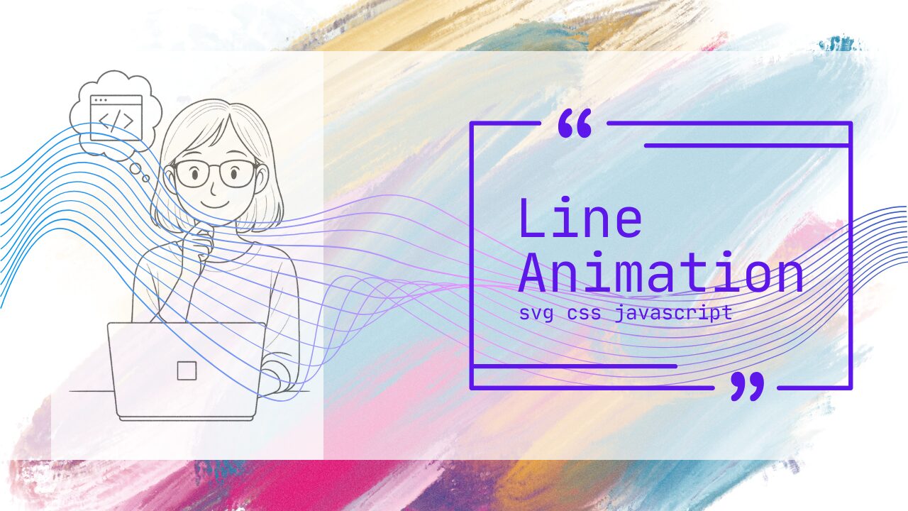
Webサイトやポートフォリオを見ていて、線がスッと描かれていくような動きを見たことはありませんか?
あの「線が動くアニメーション」は、視覚的な美しさだけでなく、ユーザーの視線誘導やブランド演出にも効果的な表現です。
しかし、いざ自分のサイトに取り入れようと思うと「どう実装するの?」「CSSだけでできるの?」「SVGやJavaScriptの知識が必要?」と、手が止まってしまう方も多いのではないでしょうか。
本記事では、デザイン性と実装のしやすさを両立した「線が動くアニメーション」の作り方を、初心者にもわかりやすく丁寧に解説します。
SVG・CSS・JavaScriptそれぞれの手法を比較しながら、実際にコピペで使えるコード例や現場で役立つ最適化のポイントまでを網羅。
さらに、スクロール連動やフェードイン演出など、実際のWeb制作で使える応用テクニックも紹介します。
コードをコピペして試すだけで「動く線の魔法」があなたのWebサイトにも実現できます。
「デザインをもっと印象的にしたい」「動きを取り入れてUXを向上させたい」と感じている方は、この記事を読むことでその第一歩を確実に踏み出せるはずです。
格安ドメイン取得サービス─ムームードメイン─
線が動くアニメーションの基本と実装方法
線が動くアニメーションは、Webサイトに洗練された印象を与え、ユーザーの視線を自然に誘導できる強力な演出手法です。このセクションでは、SVGとCSSを中心に、線を「描く」アニメーションの実装方法を基礎から応用まで解説します。
SVGとCSSで線を「描く」アニメーションを実現する手順
線が徐々に描かれていくアニメーションは、SVGのpath要素とCSSアニメーションを組み合わせることで実現できます。基本的な実装手順は以下の通りです。
1. SVGのpath要素を作成する
まず、アニメーションさせたい線をSVGのpath要素として定義します。Adobe IllustratorやFigmaなどのデザインツールで作成したパスをエクスポートするか、手動でコーディングします。
<svg width="400" height="200" viewBox="0 0 400 200">
  <path
    class="line-animation"
    d="M 10 100 Q 100 10, 200 100 T 390 100"
    stroke="#3498db"
    stroke-width="3"
    fill="none"
  />
</svg>この例では、ベジェ曲線(Q命令)を使った滑らかな波線を定義しています。fill="none"により、線のみが表示されます。
2. CSSで線の長さを制御する
線を「描く」アニメーションの核心は、線の表示部分を徐々に伸ばしていくことです。初期状態では線を非表示にし、アニメーションで表示させます。
.line-animation {
  stroke-dasharray: 1000;
  stroke-dashoffset: 1000;
  animation: draw-line 2s ease-in-out forwards;
}

@keyframes draw-line {
  to {
    stroke-dashoffset: 0;
  }
}
3. アニメーションのタイミングを調整する
animation-delayやanimation-durationを調整することで、複数の線を順番に描画したり、ユーザーの操作に応じてアニメーションを開始したりできます。
.line-animation-1 {
  animation-delay: 0s;
}

.line-animation-2 {
  animation-delay: 0.5s;
}

.line-animation-3 {
  animation-delay: 1s;
}
実際の表示
See the Pen line-move-animation-01 by watashi-xyz (@watashi-xyz) on CodePen.
国内シェアNo.1のエックスサーバーが提供するVPSサーバー『XServer VPS』
SVGのstroke-dasharray・stroke-dashoffsetで描線する方法と実例
線が動くアニメーションの仕組みを理解するには、stroke-dasharrayとstroke-dashoffsetという2つのSVGプロパティの働きを知ることが不可欠です。
stroke-dasharrayの役割
stroke-dasharrayは、線を破線パターンに変換するプロパティです。値として「実線部分の長さ」と「空白部分の長さ」を指定します。
/* 10pxの実線、5pxの空白を繰り返す */
stroke-dasharray: 10 5;

/* 線全体の長さと同じ値を指定すると、1本の実線になる */
stroke-dasharray: 1000;
stroke-dashoffsetの役割
stroke-dashoffsetは、破線パターンの開始位置をずらすプロパティです。正の値を指定すると、パターンが後方にシフトします。
/* パターンを1000px後方にシフト → 線が見えなくなる */
stroke-dashoffset: 1000;

/* 0にすると元の位置に戻る → 線が表示される */
stroke-dashoffset: 0;
描線アニメーションの仕組み
この2つのプロパティを組み合わせることで、線が「描かれる」効果を実現します。
stroke-dasharrayに線の全長と同じ値を設定(例: 1000)stroke-dashoffsetにも同じ値を設定(線が完全に隠れる)- アニメーションで
stroke-dashoffsetを0に変化させる(線が徐々に現れる)
実例: ロゴの描画アニメーション
<svg width="300" height="100" viewBox="0 0 300 100">
  <path
    class="logo-path"
    d="M 20 50 L 80 50 L 80 20 M 80 50 L 80 80 M 100 20 L 100 80 L 140 80 M 160 80 L 160 20 Q 200 20, 200 50 Q 200 80, 160 80"
    stroke="#2c3e50"
    stroke-width="4"
    fill="none"
    stroke-linecap="round"
    stroke-linejoin="round"
  />
</svg>
.logo-path {
  stroke-dasharray: 800;
  stroke-dashoffset: 800;
  animation: draw-logo 3s ease-out forwards;
}

@keyframes draw-logo {
  to {
    stroke-dashoffset: 0;
  }
}
線の長さを正確に取得する方法
stroke-dasharrayとstroke-dashoffsetに設定する値は、パスの全長に合わせる必要があります。JavaScriptで正確な長さを取得できます。
const path = document.querySelector('.logo-path');
const pathLength = path.getTotalLength();

// 取得した長さをCSSカスタムプロパティに設定
path.style.setProperty('--path-length', pathLength);
.logo-path {
  stroke-dasharray: var(--path-length);
  stroke-dashoffset: var(--path-length);
  animation: draw-logo 10s ease-out forwards;
}
実際の表示
See the Pen line-move-animation-02 by watashi-xyz (@watashi-xyz) on CodePen.
あわせて読みたい


JavaScriptで線の動きをコントロールする基礎と応用
CSSアニメーションだけでは実現が難しい、インタラクティブな線の動きはJavaScriptで制御します。ユーザーの操作やスクロール位置に応じて、線の描画状態を動的に変更できます。
基礎: クリックで線を描画する
<svg width="400" height="200" viewBox="0 0 400 200">
  <path
    id="interactive-line"
    d="M 10 100 L 390 100"
    stroke="#e74c3c"
    stroke-width="4"
    fill="none"
  />
</svg>
<button id="draw-btn">線を描く</button>
const line = document.getElementById('interactive-line');
const button = document.getElementById('draw-btn');
const length = line.getTotalLength();

// 初期状態: 線を非表示
line.style.strokeDasharray = length;
line.style.strokeDashoffset = length;

button.addEventListener('click', () => {
  line.style.transition = 'stroke-dashoffset 2s ease-in-out';
  line.style.strokeDashoffset = '0';
});
実際の表示
See the Pen Untitled by watashi-xyz (@watashi-xyz) on CodePen.
応用: スクロール量に応じた線の描画
スクロール位置に連動して線が伸びる演出は、視覚的なフィードバックとして効果的です。
const line = document.getElementById('scroll-line');
const length = line.getTotalLength();

// 初期設定
line.style.strokeDasharray = length;
line.style.strokeDashoffset = length;

window.addEventListener('scroll', () => {
  // スクロール率を計算(0〜1)
  const scrollPercentage = window.scrollY / (document.documentElement.scrollHeight - window.innerHeight);

  // 線の描画量を更新
  const drawLength = length * scrollPercentage;
  line.style.strokeDashoffset = length - drawLength;
});
実際の表示
See the Pen Untitled by watashi-xyz (@watashi-xyz) on CodePen.
応用: 複数の線を順次描画する
複数の線要素を順番に描画することで、複雑な図形やイラストを段階的に表示できます。
const lines = document.querySelectorAll('.sequential-line');

lines.forEach((line, index) => {
  const length = line.getTotalLength();

  // 初期設定
  line.style.strokeDasharray = length;
  line.style.strokeDashoffset = length;

  // 順次アニメーション(各線0.5秒遅延)
  setTimeout(() => {
    line.style.transition = 'stroke-dashoffset 1.5s ease-in-out';
    line.style.strokeDashoffset = '0';
  }, index * 500);
});
応用: GSAPを使った高度な制御
GSAPライブラリを使用すると、より複雑なタイミング制御やイージング、逆再生などが簡単に実装できます。
<div class="svg-container">
  <svg viewBox="0 0 500 200">
    <path class="advanced-line" d="M 10 100 Q 150 0 250 100 T 490 100" id="myLine" />
  </svg>
</div>
body {
height: 300vh; /* スクロールを発生させるために十分な高さを設定 */
margin: 0;
padding: 0;
display: flex;
flex-direction: column;
align-items: center;
}
.svg-container {
width: 80%;
height: 50vh; /* SVGが表示される領域 */
margin-top: 50vh; /* スクロール開始位置を調整 */
}
/* SVGパスのスタイル設定 */
.advanced-line {
fill: none; /* 塗りつぶしなし */
stroke: #4caf50; /* 線の色 */
stroke-width: 5; /* 線の太さ */
stroke-linecap: round; /* 線の端を丸く */
}
gsap.registerPlugin(ScrollTrigger);

// アニメーションの対象となる要素を取得
const line = document.querySelector(".advanced-line");

// GSAPアニメーションの実行
if (line) {
  // GSAPアニメーションに必要な線の全長を取得
  const length = line.getTotalLength();

  // 初期設定: 線の描画を隠すために、stroke-dasharrayとstroke-dashoffsetを全長に設定
  gsap.set(line, { strokeDasharray: length });

  // GSAP from() アニメーションの設定
  // 開始: 線の描画が完全にオフセットされた状態 (線が見えない状態)
  // 終了: strokeDashoffset: 0 (線が完全に描画された状態)
  gsap.from(line, {
    strokeDashoffset: length, // **getTotalLength() の値**
    duration: 2,
    ease: "power2.inOut",
    scrollTrigger: {
      trigger: ".svg-container", // より確実なトリガーとして親要素を指定
      start: "top 80%",
      end: "bottom 20%",
      scrub: true // スクロールに完全同期 (from のため、0から1への変化)
      // markers: true // デバッグ用
    }
  });
}
実際の表示
See the Pen line-move-animation-06 by watashi-xyz (@watashi-xyz) on CodePen.
パフォーマンスの最適化
JavaScriptで線を制御する際は、スクロールイベントなどの頻繁に発火するイベントに注意が必要です。requestAnimationFrameを使って描画を最適化しましょう。
let ticking = false;

window.addEventListener('scroll', () => {
  if (!ticking) {
    window.requestAnimationFrame(() => {
      updateLineProgress();
      ticking = false;
    });
    ticking = true;
  }
});

function updateLineProgress() {
  const scrollPercentage = window.scrollY / (document.documentElement.scrollHeight - window.innerHeight);
  const drawLength = length * scrollPercentage;
  line.style.strokeDashoffset = length - drawLength;
}
これらの基本技術を組み合わせることで、Webサイトに動的で魅力的な線のアニメーションを実装できます。次のセクションでは、スクロールやインタラクションと連動したより高度な演出方法を解説します。
スクロール・インタラクションに連動した線アニメーションの応用
線のアニメーションをスクロールやユーザーのインタラクションと連動させることで、Webサイトに没入感のある体験を提供できます。このセクションでは、実践的な応用テクニックとその実装方法を詳しく解説します。

スクロール連動・スクロールトリガーで線が伸びる演出の実装法
スクロールに応じて線が伸びる演出は、ストーリーテリングやプログレスインジケーターとして効果的です。実装方法は大きく分けて「純粋なJavaScript」と「ライブラリ使用」の2つのアプローチがあります。
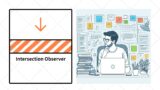
Intersection Observer APIを使った実装
Intersection Observer APIを使用すると、要素が画面に入ったタイミングで効率的にアニメーションをトリガーできます。
<svg class="scroll-svg" width="100%" height="400" viewBox="0 0 800 400">
  <path
    class="scroll-line"
    d="M 50 200 Q 200 50, 400 200 T 750 200"
    stroke="#3498db"
    stroke-width="4"
    fill="none"
  />
</svg>
const scrollLine = document.querySelector('.scroll-line');
const length = scrollLine.getTotalLength();

// 初期状態
scrollLine.style.strokeDasharray = length;
scrollLine.style.strokeDashoffset = length;
scrollLine.style.transition = 'stroke-dashoffset 1.5s ease-out';

// Intersection Observerの設定
const observer = new IntersectionObserver((entries) => {
  entries.forEach(entry => {
    if (entry.isIntersecting) {
      // 画面に入ったら線を描画
      scrollLine.style.strokeDashoffset = '0';
    } else {
      // 画面外に出たらリセット(オプション)
      scrollLine.style.strokeDashoffset = length;
    }
  });
}, {
  threshold: 0.3 // 要素の30%が見えたらトリガー
});

observer.observe(document.querySelector('.scroll-svg'));
実際の表示
See the Pen Untitled by watashi-xyz (@watashi-xyz) on CodePen.
スクロール量に完全同期する実装
スクロール位置に応じてリアルタイムに線の描画量を変化させる方法です。
const scrollLine = document.querySelector('.progress-line');
const length = scrollLine.getTotalLength();

// 初期設定
scrollLine.style.strokeDasharray = length;
scrollLine.style.strokeDashoffset = length;

// スクロール要素の範囲を定義
const scrollElement = document.querySelector('.scroll-section');

function updateLineOnScroll() {
  const rect = scrollElement.getBoundingClientRect();
  const windowHeight = window.innerHeight;

  // 要素が画面内にある割合を計算
  const start = rect.top - windowHeight;
  const end = rect.bottom;
  const total = end - start;
  const progress = Math.max(0, Math.min(1, -start / total));

  // 線の描画量を更新
  const draw = length * progress;
  scrollLine.style.strokeDashoffset = length - draw;
}

let ticking = false;
window.addEventListener('scroll', () => {
  if (!ticking) {
    window.requestAnimationFrame(() => {
      updateLineOnScroll();
      ticking = false;
    });
    ticking = true;
  }
});

// 初回実行
updateLineOnScroll();
実際の表示
See the Pen line-move-animation-08 by watashi-xyz (@watashi-xyz) on CodePen.
GSAP ScrollTriggerを使った実装
GSAPのScrollTriggerプラグインを使用すると、より直感的で柔軟なスクロールアニメーションが実装できます。
<!-- GSAPとScrollTriggerプラグインの読み込み -->
<script src="<https://cdnjs.cloudflare.com/ajax/libs/gsap/3.12.0/gsap.min.js>"></script>
<script src="<https://cdnjs.cloudflare.com/ajax/libs/gsap/3.12.0/ScrollTrigger.min.js>"></script>
gsap.registerPlugin(ScrollTrigger);

const line = document.querySelector('.gsap-line');
const length = line.getTotalLength();

// 初期設定
line.style.strokeDasharray = length;
line.style.strokeDashoffset = length;

// ScrollTriggerアニメーション
gsap.to(line, {
  strokeDashoffset: 0,
  ease: 'none',
  scrollTrigger: {
    trigger: '.gsap-line',
    start: 'top 80%',    // 要素の上端が画面の80%位置に来たら開始
    end: 'bottom 20%',   // 要素の下端が画面の20%位置に来たら終了
    scrub: 1,            // スクロールに同期(数値は遅延時間)
    markers: false       // デバッグ用マーカー(開発時はtrue)
  }
});
複数の線を段階的に描画する応用例
const lines = document.querySelectorAll('.stagger-line');

lines.forEach((line, index) => {
  const length = line.getTotalLength();
  line.style.strokeDasharray = length;
  line.style.strokeDashoffset = length;

  gsap.to(line, {
    strokeDashoffset: 0,
    scrollTrigger: {
      trigger: line,
      start: 'top 85%',
      end: 'bottom 30%',
      scrub: 1
    },
    delay: index * 0.2 // 各線を少しずつ遅延させる
  });
});
コストパフォーマンスに優れた高性能なレンタルサーバー
【Hostinger】
ボーダー枠線・斜めや曲線が動くアニメーション表現の具体例
線のアニメーションは直線だけでなく、ボーダー枠や複雑な曲線にも応用できます。
四角形のボーダーが順番に描画されるアニメーション
<svg width="400" height="300" viewBox="0 0 400 300">
  <rect
    class="border-rect"
    x="50"
    y="50"
    width="300"
    height="200"
    stroke="#e74c3c"
    stroke-width="3"
    fill="none"
  />
</svg>
.border-rect {
  stroke-dasharray: 1000;
  stroke-dashoffset: 1000;
  animation: draw-border 3s ease-in-out forwards;
}

@keyframes draw-border {
  to {
    stroke-dashoffset: 0;
  }
}
実際の表示
See the Pen line-move-animation-09 by watashi-xyz (@watashi-xyz) on CodePen.
ボーダーが角から順に描画される演出
より洗練された効果として、四角形の各辺を個別に制御する方法があります。
<svg width="400" height="300" viewBox="0 0 400 300" class="box-container">
  <line class="border-line top" x1="50" y1="50" x2="350" y2="50" stroke="#9b59b6" stroke-width="3"/>
  <line class="border-line right" x1="350" y1="50" x2="350" y2="250" stroke="#9b59b6" stroke-width="3"/>
  <line class="border-line bottom" x1="350" y1="250" x2="50" y2="250" stroke="#9b59b6" stroke-width="3"/>
  <line class="border-line left" x1="50" y1="250" x2="50" y2="50" stroke="#9b59b6" stroke-width="3"/>
</svg>
const borderLines = document.querySelectorAll('.border-line');
borderLines.forEach((line, index) => {
const length = line.getTotalLength();
line.style.strokeDasharray = length;
line.style.strokeDashoffset = length;
// 各辺を0.3秒ずつ遅延させて順番に描画
setTimeout(() => {
line.style.transition = 'stroke-dashoffset 0.8s ease-out';
line.style.strokeDashoffset = '0';
}, index * 300);
});
実際の表示
See the Pen line-move-animation-10 by watashi-xyz (@watashi-xyz) on CodePen.
斜めの線が交差するアニメーション
<svg width="500" height="500" viewBox="0 0 500 500">
  <path
    class="diagonal-line-1"
    d="M 50 50 L 450 450"
    stroke="#1abc9c"
    stroke-width="4"
    fill="none"
  />
  <path
    class="diagonal-line-2"
    d="M 450 50 L 50 450"
    stroke="#1abc9c"
    stroke-width="4"
    fill="none"
  />
</svg>
.diagonal-line-1,
.diagonal-line-2 {
  stroke-dasharray: 600;
  stroke-dashoffset: 600;
}

.diagonal-line-1 {
  animation: draw-diagonal 1.5s ease-out forwards;
}

.diagonal-line-2 {
  animation: draw-diagonal 1.5s ease-out 0.3s forwards;
}

@keyframes draw-diagonal {
  to {
    stroke-dashoffset: 0;
  }
}
実際の表示
See the Pen Untitled by watashi-xyz (@watashi-xyz) on CodePen.
ベジェ曲線を使った波線・曲線アニメーション
<svg width="800" height="200" viewBox="0 0 800 200">
  <path
    class="wave-line"
    d="M 0 100 Q 100 20, 200 100 T 400 100 T 600 100 T 800 100"
    stroke="#f39c12"
    stroke-width="3"
    fill="none"
  />
</svg>
const waveLine = document.querySelector('.wave-line');
const length = waveLine.getTotalLength();
waveLine.style.strokeDasharray = length;
waveLine.style.strokeDashoffset = length;
// スクロールで波線が流れるように描画
gsap.to(waveLine, {
strokeDashoffset: 0,
duration: 2,
ease: 'power2.out',
scrollTrigger: {
trigger: '.wave-line',
start: 'top 70%',
toggleActions: 'play none none reverse'
}
});
実際の表示
See the Pen Untitled by watashi-xyz (@watashi-xyz) on CodePen.
円形・らせん状の線アニメーション
<svg width="300" height="300" viewBox="0 0 300 300">
  <circle
    class="circle-line"
    cx="150"
    cy="150"
    r="100"
    stroke="#e67e22"
    stroke-width="4"
    fill="none"
  />
</svg>
.circle-line {
  stroke-dasharray: 628; /* 2πr ≈ 628 */
  stroke-dashoffset: 628;
  animation: draw-circle 2s ease-in-out forwards;
  transform-origin: center;
  /* 12時の位置から開始するために回転 */
  transform: rotate(-90deg);
}

@keyframes draw-circle {
  to {
    stroke-dashoffset: 0;
  }
}
実際の表示
See the Pen Untitled by watashi-xyz (@watashi-xyz) on CodePen.

線の動きに合わせて文字や画像がフェードインする演出の作り方
線のアニメーションと他の要素を連動させることで、より印象的な演出が可能になります。
線の描画完了後にテキストをフェードイン
<div class="animation-container">
  <svg width="600" height="100" viewBox="0 0 600 100">
    <path
      class="underline"
      d="M 50 80 L 550 80"
      stroke="#2980b9"
      stroke-width="3"
      fill="none"
    />
  </svg>
  <h2 class="fade-in-text">美しいアニメーション</h2>
</div>
.animation-container {
  position: relative;
}

.fade-in-text {
  opacity: 0;
  transform: translateY(20px);
  animation: fade-in 0.8s ease-out 1.5s forwards; /* 線の後にフェードイン */
}

.underline {
  stroke-dasharray: 500;
  stroke-dashoffset: 500;
  animation: draw-line 1.5s ease-out forwards;
}

@keyframes draw-line {
  to {
    stroke-dashoffset: 0;
  }
}

@keyframes fade-in {
  to {
    opacity: 1;
    transform: translateY(0);
  }
}
実際の表示
See the Pen line-move-animation-15 by watashi-xyz (@watashi-xyz) on CodePen.
JavaScriptで線の進行度に合わせて動的にフェードイン
const line = document.querySelector('.animated-line');
const text = document.querySelector('.sync-text');
const length = line.getTotalLength();

line.style.strokeDasharray = length;
line.style.strokeDashoffset = length;

// アニメーションの進行度を監視
let progress = 0;
const duration = 2000; // 2秒
const startTime = Date.now();

function animate() {
  const elapsed = Date.now() - startTime;
  progress = Math.min(elapsed / duration, 1);

  // 線の描画
  line.style.strokeDashoffset = length * (1 - progress);

  // テキストの透明度を線の進行度に同期
  text.style.opacity = progress;
  text.style.transform = `translateY(${20 * (1 - progress)}px)`;

  if (progress < 1) {
    requestAnimationFrame(animate);
  }
}

// Intersection Observerでトリガー
const observer = new IntersectionObserver((entries) => {
  entries.forEach(entry => {
    if (entry.isIntersecting) {
      animate();
      observer.unobserve(entry.target);
    }
  });
}, { threshold: 0.5 });

observer.observe(line);
実際の表示
See the Pen Untitled by watashi-xyz (@watashi-xyz) on CodePen.
複数要素を連鎖的にアニメーションさせる
<div class="cascade-container">
  <svg width="400" height="200" viewBox="0 0 400 200">
    <path class="cascade-line" d="M 50 100 L 350 100" stroke="#16a085" stroke-width="3" fill="none"/>
  </svg>
  <div class="cascade-item item-1">コンテンツ1</div>
  <div class="cascade-item item-2">コンテンツ2</div>
  <div class="cascade-item item-3">コンテンツ3</div>
</div>
// GSAPでタイムライン制御
const tl = gsap.timeline({
scrollTrigger: {
trigger: '.cascade-container',
start: 'top 70%'
}
});
// 線を描画
tl.fromTo('.cascade-line',
{
strokeDashoffset: 300
},
{
strokeDashoffset: 0,
duration: 1.5,
ease: 'power2.out'
}
);
// 線の描画後、各アイテムを順次表示
tl.fromTo('.cascade-item',
{
opacity: 0,
y: 30
},
{
opacity: 1,
y: 0,
duration: 0.6,
stagger: 0.2, // 各要素を0.2秒ずつ遅延
ease: 'back.out(1.7)'
},
'-=0.5' // 線の描画終了0.5秒前から開始
);
実際の表示
See the Pen line-move-animation-17 by watashi-xyz (@watashi-xyz) on CodePen.
線の進行に合わせて画像を表示
<div class="image-reveal-container">
  <svg width="100%" height="400" viewBox="0 0 800 400">
    <defs>
      <clipPath id="line-clip">
        <rect class="clip-rect" x="0" y="0" width="0" height="400"/>
      </clipPath>
    </defs>
    <image
      href="https://picsum.photos/800/400/"
      width="800"
      height="400"
      clip-path="url(#line-clip)"
    />
  </svg>
  <svg class="overlay-line" width="100%" height="400" viewBox="0 0 800 400">
    <line class="reveal-line" x1="0" y1="200" x2="800" y2="200" stroke="#fff" stroke-width="4"/>
  </svg>
</div>
const clipRect = document.querySelector('.clip-rect');
const revealLine = document.querySelector('.reveal-line');
const lineLength = revealLine.getTotalLength();
revealLine.style.strokeDasharray = lineLength;
revealLine.style.strokeDashoffset = lineLength;
gsap.timeline({
scrollTrigger: {
trigger: '.image-reveal-container',
start: 'top 60%',
end: 'bottom 40%',
scrub: 1
}
})
.to(revealLine, {
strokeDashoffset: 0,
ease: 'none'
}, 0)
.to(clipRect, {
attr: { width: 800 },
ease: 'none'
}, 0);
実際の表示
See the Pen line-move-animation-18 by watashi-xyz (@watashi-xyz) on CodePen.
これらのテクニックを組み合わせることで、ユーザーの注目を引き、コンテンツへの没入感を高める洗練されたアニメーション演出を実現できます。次のセクションでは、実際のWeb制作現場での活用事例とパフォーマンス最適化について解説します。
Web制作現場での活用事例と最適化ノウハウ
線のアニメーションを実際のプロジェクトで活用する際には、適切な技術選択とパフォーマンス最適化が不可欠です。このセクションでは、実務での具体的な活用事例と、制作現場で役立つ最適化テクニックを解説します。
ローディング画面・トランジション演出に使える線アニメーション事例
線のアニメーションは、ローディング画面やページ遷移の演出として優れた視覚的フィードバックを提供します。
円形プログレスバー型ローディング
読み込み進行度を視覚的に表現する円形のローディングアニメーションです。
<div class="loading-container">
  <svg width="200" height="200" viewBox="0 0 200 200">
    <circle
      class="progress-ring-bg"
      cx="100"
      cy="100"
      r="80"
      stroke="#ecf0f1"
      stroke-width="10"
      fill="none"
    />
    <circle
      class="progress-ring"
      cx="100"
      cy="100"
      r="80"
      stroke="#3498db"
      stroke-width="10"
      fill="none"
      transform="rotate(-90 100 100)"
    />
  </svg>
  <div class="progress-text">0%</div>
</div>
.loading-container {
  position: relative;
  display: inline-block;
}

.progress-ring {
  stroke-dasharray: 502.65; /* 2πr = 2 × π × 80 */
  stroke-dashoffset: 502.65;
  transition: stroke-dashoffset 0.3s ease;
  stroke-linecap: round;
}

.progress-text {
  position: absolute;
  top: 50%;
  left: 50%;
  transform: translate(-50%, -50%);
  font-size: 24px;
  font-weight: bold;
  color: #2c3e50;
}
const progressRing = document.querySelector('.progress-ring');
const progressText = document.querySelector('.progress-text');
const circumference = 502.65;

function setProgress(percent) {
  const offset = circumference - (percent / 100) * circumference;
  progressRing.style.strokeDashoffset = offset;
  progressText.textContent = `${Math.round(percent)}%`;
}

// 実際の読み込み進行度を反映
let progress = 0;
const loadingInterval = setInterval(() => {
  progress += Math.random() * 15;
  if (progress >= 100) {
    progress = 100;
    clearInterval(loadingInterval);
    // ローディング完了後の処理
    setTimeout(() => {
      document.querySelector('.loading-container').classList.add('complete');
    }, 300);
  }
  setProgress(progress);
}, 200);
実際の表示
See the Pen Untitled by watashi-xyz (@watashi-xyz) on CodePen.
線が集まってロゴを形成するローディング演出
複数の線が中心に集まり、ロゴやアイコンを形成する印象的な演出です。
<svg class="logo-loading" width="300" height="300" viewBox="0 0 300 300">
  <line class="converge-line line-1" x1="150" y1="0" x2="150" y2="150" stroke="#e74c3c" stroke-width="3"/>
  <line class="converge-line line-2" x1="300" y1="150" x2="150" y2="150" stroke="#3498db" stroke-width="3"/>
  <line class="converge-line line-3" x1="150" y1="300" x2="150" y2="150" stroke="#f39c12" stroke-width="3"/>
  <line class="converge-line line-4" x1="0" y1="150" x2="150" y2="150" stroke="#2ecc71" stroke-width="3"/>
</svg>
.converge-line {
  stroke-dasharray: 150;
  stroke-dashoffset: 150;
  animation: converge 1.5s ease-in-out infinite;
}

.converge-line.line-2 {
  animation-delay: 0.2s;
}

.converge-line.line-3 {
  animation-delay: 0.4s;
}

.converge-line.line-4 {
  animation-delay: 0.6s;
}

@keyframes converge {
  0%, 100% {
    stroke-dashoffset: 150;
  }
  50% {
    stroke-dashoffset: 0;
  }
}
実際の表示
See the Pen Untitled by watashi-xyz (@watashi-xyz) on CodePen.
ページトランジション用のワイプ演出
ページ遷移時に線が画面を覆うように広がるトランジション効果です。
<div class="page-transition">
  <svg width="100%" height="100%" viewBox="0 0 100 100" preserveAspectRatio="none">
    <path
      class="transition-path"
      d="M 0 0 L 100 0 L 100 100 L 0 100 Z"
      fill="#2c3e50"
    />
  </svg>
</div>
.page-transition {
position: fixed;
top: 0;
left: 0;
width: 100%;
height: 100%;
pointer-events: none;
z-index: 9999;
}
.transition-path {
stroke: #2c3e50;
stroke-width: 0;
fill: #2c3e50;
stroke-dasharray: 400;
stroke-dashoffset: 400;
}
.page-transition.active .transition-path {
animation: page-wipe 0.8s ease-in-out forwards;
}
@keyframes page-wipe {
0% {
stroke-dashoffset: 400;
fill-opacity: 0;
}
50% {
stroke-dashoffset: 0;
fill-opacity: 0;
}
100% {
stroke-dashoffset: 0;
fill-opacity: 1;
}
}
// ページ遷移のトリガー
function transitionToPage(url) {
  const transition = document.querySelector('.page-transition');
  transition.classList.add('active');

  setTimeout(() => {
    window.location.href = url;
  }, 800);
}

// リンクに適用
document.querySelectorAll('a.transition-link').forEach(link => {
  link.addEventListener('click', (e) => {
    e.preventDefault();
    transitionToPage(link.href);
  });
});
スケルトンスクリーン風のコンテンツローディング
コンテンツの枠線が順番に描画され、その後に内容がフェードインする演出です。
<div class="content-skeleton">
  <svg class="skeleton-svg" width="100%" height="300" viewBox="0 0 600 300">
    <rect class="skeleton-rect" x="20" y="20" width="560" height="80" rx="8" stroke="#bdc3c7" stroke-width="2" fill="none"/>
    <rect class="skeleton-rect" x="20" y="120" width="560" height="80" rx="8" stroke="#bdc3c7" stroke-width="2" fill="none"/>
    <rect class="skeleton-rect" x="20" y="220" width="560" height="60" rx="8" stroke="#bdc3c7" stroke-width="2" fill="none"/>
  </svg>
  <div class="content-items">
    <div class="content-item">実際のコンテンツ1</div>
    <div class="content-item">実際のコンテンツ2</div>
    <div class="content-item">実際のコンテンツ3</div>
  </div>
</div>
const skeletonRects = document.querySelectorAll('.skeleton-rect');
const contentItems = document.querySelectorAll('.content-item');
skeletonRects.forEach((rect, index) => {
const length = rect.getTotalLength();
rect.style.strokeDasharray = length;
rect.style.strokeDashoffset = length;
// 順番に描画
gsap.to(rect, {
strokeDashoffset: 0,
duration: 0.8,
delay: index * 0.3,
ease: 'power2.out',
onComplete: () => {
// 描画完了後にコンテンツを表示
gsap.to(contentItems[index], {
opacity: 1,
y: 0,
duration: 0.5
});
}
});
});
実際の表示
See the Pen line-move-animation-21 by watashi-xyz (@watashi-xyz) on CodePen.
専門的な知識不要!誰でも簡単に使える『XWRITE(エックスライト)』
SVG・Canvas・CSS―パフォーマンス比較と最適な選択ポイント
線のアニメーションを実装する際、SVG、Canvas、CSSのどれを選ぶべきかは、プロジェクトの要件によって異なります。それぞれの特性を理解し、適切に選択しましょう。
技術別の特性比較表
| 特性 | SVG | Canvas | CSS |
|---|---|---|---|
| DOM操作 | 可能(各要素がDOMノード) | 不可(ピクセルベース) | 可能(限定的) |
| スケーラビリティ | 完全(ベクター) | 解像度依存 | 完全 |
| アニメーション制御 | CSS/JS両対応 | JS必須 | CSS主体 |
| 複雑度の上限 | 中程度 | 非常に高い | 低い |
| パフォーマンス | 要素数で変動 | 高速・安定 | 最軽量 |
| インタラクティブ性 | 高い | 手動実装必要 | 低い |
SVGを選ぶべきケース
ロゴやアイコンの描画アニメーション
- ベクターデータなのでどの解像度でも鮮明
- デザインツールからのエクスポートが容易
- CSS/JavaScriptで柔軟に制御可能
// SVGが最適な例: ロゴの描画
const logo = document.querySelector('.logo-path');
const length = logo.getTotalLength();

gsap.fromTo(logo,
  { strokeDashoffset: length },
  {
    strokeDashoffset: 0,
    duration: 2,
    ease: 'power2.inOut'
  }
);
インタラクティブな線の演出
- ホバーやクリックでの反応
- 個別の要素への操作が必要
少数〜中程度の要素数(目安: 100要素以下)
- 各pathがDOMノードとして存在
- それぞれに個別のアニメーションを適用可能
Canvasを選ぶべきケース
大量の線を描画する場合(数百〜数千本)
- パーティクルエフェクト
- データビジュアライゼーション
// Canvasが最適な例: パーティクルシステム
const canvas = document.getElementById('particle-canvas');
const ctx = canvas.getContext('2d');
const particles = [];

class Particle {
  constructor(x, y) {
    this.x = x;
    this.y = y;
    this.vx = Math.random() * 2 - 1;
    this.vy = Math.random() * 2 - 1;
  }

  update() {
    this.x += this.vx;
    this.y += this.vy;
  }

  draw() {
    ctx.beginPath();
    ctx.moveTo(this.x, this.y);
    ctx.lineTo(this.x + this.vx * 10, this.y + this.vy * 10);
    ctx.strokeStyle = 'rgba(52, 152, 219, 0.5)';
    ctx.lineWidth = 2;
    ctx.stroke();
  }
}

// 1000個のパーティクルでも滑らか
for (let i = 0; i < 1000; i++) {
  particles.push(new Particle(
    Math.random() * canvas.width,
    Math.random() * canvas.height
  ));
}

function animate() {
  ctx.clearRect(0, 0, canvas.width, canvas.height);
  particles.forEach(p => {
    p.update();
    p.draw();
  });
  requestAnimationFrame(animate);
}
animate();
リアルタイムで動的に生成される線
- ユーザーの入力に応じた描画
- 複雑な物理演算を伴う動き
ピクセルレベルの制御が必要
- グラデーションや特殊効果
- 画像処理との組み合わせ
CSSのみを選ぶべきケース
シンプルなUI要素のアニメーション
- ボーダーのホバーエフェクト
- ボタンの下線アニメーション
/* CSSが最適な例: ボタンの下線 */
.button-underline {
  position: relative;
  padding-bottom: 8px;
}

.button-underline::after {
  content: '';
  position: absolute;
  bottom: 0;
  left: 0;
  width: 0;
  height: 2px;
  background: #3498db;
  transition: width 0.3s ease;
}

.button-underline:hover::after {
  width: 100%;
}
軽量性が最重要
- JavaScriptの読み込みを避けたい
- モバイルファーストの設計
単純な繰り返しアニメーション
- ローディングスピナー
- 点滅効果
パフォーマンス最適化の実践テクニック
// SVGのパフォーマンス最適化
// 1. will-changeプロパティの活用
const animatedLines = document.querySelectorAll('.animated-line');
animatedLines.forEach(line => {
  line.style.willChange = 'stroke-dashoffset';
});
// 2. アニメーション完了後にwill-changeを解除
line.addEventListener('animationend', () => {
line.style.willChange = 'auto';
});// 3. 大量のSVG要素はSymbolで再利用
<svg style="display: none;">
<symbol id="line-shape" viewBox="0 0 100 100">
<path d="M 10 50 L 90 50"/>
</symbol>
</svg>
<svg><use href="#line-shape"/></svg>// 4. 画面外の要素はアニメーションを停止
const observerForPerformance = new IntersectionObserver((entries) => {
entries.forEach(entry => {
if (entry.isIntersecting) {
entry.target.style.animationPlayState = 'running';
} else {
entry.target.style.animationPlayState = 'paused';
}
});
});
軽量・レスポンシブ対応とブラウザ互換性を高める技術・Tips
実務での安定した動作を保証するため、レスポンシブ対応とブラウザ互換性は重要な考慮事項です。
レスポンシブSVGの実装
<!-- viewBoxを使ったスケーラブルなSVG -->
<svg
  class="responsive-svg"
  viewBox="0 0 800 400"
  preserveAspectRatio="xMidYMid meet"
>
  <path
    class="responsive-line"
    d="M 50 200 Q 400 50, 750 200"
    stroke="#3498db"
    stroke-width="4"
    fill="none"
  />
</svg>
.responsive-svg {
width: 100%;
height: auto;
max-width: 800px;
}
/* レスポンシブ対応: 線の太さを調整 */
@media (max-width: 768px) {
.responsive-line {
stroke-width: 2;
}
}
@media (max-width: 480px) {
.responsive-line {
stroke-width: 1.5;
}
}実際の表示
See the Pen Untitled by watashi-xyz (@watashi-xyz) on CodePen.
デバイス幅に応じたアニメーション制御
// モバイルではアニメーションを簡略化
function getAnimationDuration() {
  const width = window.innerWidth;
  if (width < 480) return 1; // モバイル: 1秒
  if (width < 768) return 1.5; // タブレット: 1.5秒
  return 2; // デスクトップ: 2秒
}

gsap.to('.adaptive-line', {
  strokeDashoffset: 0,
  duration: getAnimationDuration(),
  ease: 'power2.out'
});

// リサイズ時の対応
let resizeTimer;
window.addEventListener('resize', () => {
  clearTimeout(resizeTimer);
  resizeTimer = setTimeout(() => {
    // SVGのpathLengthを再計算
    updatePathLengths();
  }, 250);
});
ブラウザ互換性対応
// 1. getTotalLength()のフォールバック
function getPathLength(path) {
  if (path.getTotalLength) {
    return path.getTotalLength();
  }
  // フォールバック: 概算値を返す
  return 1000;
}

// 2. CSS Custom Propertiesのサポート確認
function supportsCustomProperties() {
  return window.CSS && CSS.supports('color', 'var(--test)');
}

if (supportsCustomProperties()) {
  // CSS変数を使用
  document.documentElement.style.setProperty('--line-length', pathLength);
} else {
  // インラインスタイルで直接設定
  line.style.strokeDasharray = pathLength;
}

// 3. Intersection Observerのポリフィル確認
if ('IntersectionObserver' in window) {
  // Intersection Observerを使用
  const observer = new IntersectionObserver(callback);
} else {
  // フォールバック: スクロールイベントを使用
  window.addEventListener('scroll', handleScrollFallback);
}
軽量化のためのベストプラクティス
// 1. SVGの最適化(SVGO相当の処理)
// - 不要な属性を削除
// - 小数点以下を丸める
// - pathデータを短縮

// 2. 遅延読み込み
const lazyLines = document.querySelectorAll('.lazy-line');
const lazyObserver = new IntersectionObserver((entries) => {
  entries.forEach(entry => {
    if (entry.isIntersecting) {
      const line = entry.target;
      // 初回表示時のみアニメーションを初期化
      initLineAnimation(line);
      lazyObserver.unobserve(line);
    }
  });
}, {
  rootMargin: '100px' // 画面に入る100px前に準備
});

lazyLines.forEach(line => lazyObserver.observe(line));

// 3. 不要なアニメーションの削除
// prefers-reduced-motionメディアクエリの考慮
const prefersReducedMotion = window.matchMedia('(prefers-reduced-motion: reduce)');

if (prefersReducedMotion.matches) {
  // アニメーションを無効化または簡略化
  document.querySelectorAll('.animated-line').forEach(line => {
    line.style.animation = 'none';
    line.style.strokeDashoffset = '0';
  });
}
デバッグとテストのTips
// パフォーマンスモニタリング
const performanceObserver = new PerformanceObserver((list) => {
  for (const entry of list.getEntries()) {
    if (entry.duration > 16.67) { // 60fps以下
      console.warn('アニメーションのフレーム落ち検出:', entry);
    }
  }
});
performanceObserver.observe({ entryTypes: ['measure'] });

// アニメーション開始前
performance.mark('animation-start');

// アニメーション実行
animateLine();

// アニメーション終了後
performance.mark('animation-end');
performance.measure('line-animation', 'animation-start', 'animation-end');
これらの最適化テクニックを適切に適用することで、どのデバイス・ブラウザでも快適に動作する線のアニメーションを実装できます。技術選択、パフォーマンス、互換性のバランスを考慮しながら、プロジェクトの要件に最適な手法を選びましょう。
月額99円から。容量最大1TB!ブログ作成におすすめのWordPressテーマ「Cocoon」も簡単インストール
よくある質問(FAQ)
線が動くアニメーションの実装において、よく寄せられる質問とその解決方法をまとめました。
-
stroke-dasharrayとstroke-dashoffsetの値はどう決めればいいですか?
-
最も正確な方法は、JavaScriptの
getTotalLength()メソッドを使ってパスの全長を取得することです。const path = document.querySelector('.your-path'); const length = path.getTotalLength(); console.log('パスの長さ:', length); // CSSに反映 path.style.strokeDasharray = length; path.style.strokeDashoffset = length;具体的な手順:
- ブラウザの開発者ツールでコンソールを開く
- 上記コードを実行して長さを確認
- その値をCSSに設定
.your-path {
  stroke-dasharray: 1247.3; /* 取得した実際の値 */
  stroke-dashoffset: 1247.3;
  animation: draw 2s forwards;
}
デザインツールで作成したSVGの場合、複雑なパスは予測が難しいため、必ずこの方法で実測することをおすすめします。
-
線のアニメーションが途中で途切れたり、正しく描画されません
-
主な原因は以下の3つです。
原因1: stroke-dasharrayの値が不正確
パスの全長より短い値を設定していると、線が途切れて見えます。
// 解決方法: 実際の長さより少し大きめの値を設定
const length = path.getTotalLength();
path.style.strokeDasharray = length + 10; // 余裕を持たせる
path.style.strokeDashoffset = length + 10;
原因2: SVGのviewBoxが適切に設定されていない
<!-- ❌ 悪い例: viewBoxが小さすぎる -->
<svg viewBox="0 0 100 100">
  <path d="M 0 0 L 500 500" /> <!-- パスがviewBoxをはみ出す -->
</svg>

<!-- ✅ 良い例: パス全体を含むviewBox -->
<svg viewBox="0 0 600 600">
  <path d="M 50 50 L 550 550" />
</svg>
原因3: 複数のpathが含まれている
複数のpath要素がある場合、それぞれに個別に長さを設定する必要があります。
// 複数パスの対応
document.querySelectorAll('.animated-path').forEach(path => {
  const length = path.getTotalLength();
  path.style.strokeDasharray = length;
  path.style.strokeDashoffset = length;
});
-
モバイルで線のアニメーションが重くなります。軽量化する方法は?
-
モバイルデバイスでのパフォーマンス最適化には、以下の対策が効果的です。
対策1: アニメーションの簡略化
// デバイスに応じてアニメーションを調整
const isMobile = window.innerWidth < 768;

if (isMobile) {
  // モバイル: 即座に表示(アニメーションなし)
  line.style.strokeDashoffset = '0';
  line.style.transition = 'none';
} else {
  // デスクトップ: 通常のアニメーション
  line.style.transition = 'stroke-dashoffset 2s ease-out';
  line.style.strokeDashoffset = '0';
}
対策2: Intersection Observerで画面外の要素を制御
const observer = new IntersectionObserver((entries) => {
  entries.forEach(entry => {
    if (entry.isIntersecting) {
      entry.target.classList.add('animate');
    } else {
      // 画面外に出たらアニメーションを停止
      entry.target.classList.remove('animate');
    }
  });
}, {
  rootMargin: '50px' // 少し早めに準備
});
対策3: will-changeの適切な使用
/* アニメーション直前にのみ適用 */
.line-animation.ready {
  will-change: stroke-dashoffset;
}

.line-animation.complete {
  will-change: auto; /* アニメーション後は解除 */
}
対策4: 複雑なSVGの単純化
パスの座標精度を下げて軽量化
Adobe IllustratorやFigmaのエクスポート設定で小数点以下を1桁に制限する
-
スクロールに完全同期させると、動きがカクカクします
-
スクロールイベントの最適化が必要です。
解決方法1: requestAnimationFrameの活用
let ticking = false;
let lastScrollY = 0;

function updateAnimation() {
  const scrollY = window.scrollY;
  // スクロール量から進行度を計算
  const progress = Math.min(scrollY / 1000, 1);

  line.style.strokeDashoffset = length * (1 - progress);
  ticking = false;
}

window.addEventListener('scroll', () => {
  lastScrollY = window.scrollY;

  if (!ticking) {
    requestAnimationFrame(updateAnimation);
    ticking = true;
  }
});
解決方法2: throttle(間引き)処理の実装
// シンプルなthrottle関数
function throttle(func, delay) {
  let lastCall = 0;
  return function(...args) {
    const now = new Date().getTime();
    if (now - lastCall < delay) return;
    lastCall = now;
    return func(...args);
  };
}

// スクロールイベントを間引く(16ms = 約60fps)
window.addEventListener('scroll', throttle(() => {
  updateLineProgress();
}, 16));
解決方法3: GSAP ScrollTriggerの使用(推奨)
// GSAPは内部で最適化されているため、滑らかに動作
gsap.to('.smooth-line', {
  strokeDashoffset: 0,
  ease: 'none',
  scrollTrigger: {
    trigger: '.smooth-line',
    start: 'top 80%',
    end: 'bottom 20%',
    scrub: 0.5 // 少し遅延させて滑らかに
  }
});
-
複数の線を順番にアニメーションさせる方法は?
-
複数の線を連鎖的にアニメーションさせる方法は複数あります。
方法1: CSSのanimation-delayを使用
.line-1 { animation-delay: 0s; }
.line-2 { animation-delay: 0.5s; }
.line-3 { animation-delay: 1s; }
.line-4 { animation-delay: 1.5s; }

.sequential-line {
  stroke-dasharray: 500;
  stroke-dashoffset: 500;
  animation: draw 1s ease-out forwards;
}
方法2: JavaScriptで動的に制御
const lines = document.querySelectorAll('.sequential-line');
const delay = 300; // 各線の遅延時間(ms)

lines.forEach((line, index) => {
  const length = line.getTotalLength();
  line.style.strokeDasharray = length;
  line.style.strokeDashoffset = length;

  setTimeout(() => {
    line.style.transition = 'stroke-dashoffset 0.8s ease-out';
    line.style.strokeDashoffset = '0';
  }, index * delay);
});
方法3: GSAP Timelineで精密制御
const tl = gsap.timeline();

document.querySelectorAll('.timeline-line').forEach((line, index) => {
  const length = line.getTotalLength();

  tl.fromTo(line,
    { strokeDashoffset: length },
    {
      strokeDashoffset: 0,
      duration: 0.8,
      ease: 'power2.out'
    },
    index * 0.3 // 各線の開始タイミング
  );
});
-
線のアニメーションをループさせるには?
-
用途に応じて、いくつかの実装方法があります。
方法1: CSSでシンプルなループ
.loop-line {
  stroke-dasharray: 800;
  stroke-dashoffset: 800;
  animation: draw-loop 2s ease-in-out infinite;
}

@keyframes draw-loop {
  0%, 100% {
    stroke-dashoffset: 800;
  }
  50% {
    stroke-dashoffset: 0;
  }
}
方法2: 連続的に流れるループ
.flowing-line {
  stroke-dasharray: 20 10; /* 実線20px、空白10px */
  animation: flow 1s linear infinite;
}

@keyframes flow {
  to {
    stroke-dashoffset: -30; /* dasharray合計値のマイナス */
  }
}
方法3: JavaScriptで逆再生を含むループ
function animateLineLoop() {
  const line = document.querySelector('.reverse-loop-line');
  const length = line.getTotalLength();

  // 描画
  gsap.to(line, {
    strokeDashoffset: 0,
    duration: 1.5,
    ease: 'power2.inOut',
    onComplete: () => {
      // 消去
      gsap.to(line, {
        strokeDashoffset: -length, // マイナス値で逆方向
        duration: 1.5,
        ease: 'power2.inOut',
        onComplete: animateLineLoop // 再度実行
      });
    }
  });
}

animateLineLoop();
-
デザインツールで作ったSVGが正しくアニメーションしません
-
デザインツールからエクスポートしたSVGには、不要な要素や属性が含まれていることがあります。
対処法1: SVGの構造を確認
<!-- ❌ 悪い例: グループや変換が入っている -->
<svg>
  <g transform="translate(10, 20)">
    <g>
      <path d="..." />
    </g>
  </g>
</svg>

<!-- ✅ 良い例: シンプルな構造 -->
<svg viewBox="0 0 400 200">
  <path d="..." stroke="#333" stroke-width="2" fill="none"/>
</svg>
対処法2: SVGO等で最適化
オンラインツール(SVGOMG)やCLIツールでSVGを最適化します。
# SVGOコマンドラインツール
npm install -g svgo
svgo input.svg -o output.svg
対処法3: 手動で不要な属性を削除
<!-- アニメーション前 -->
<path
  d="M 10 50 L 390 50"
  stroke="#3498db"
  stroke-width="3"
  fill="none"
  id="line-1"  <!-- 必要な属性のみ残す -->
  class="animated-line"
  <!-- style, transform等の不要属性は削除 -->
/>
-
曲線や複雑な形状でもアニメーションできますか?
-
はい、どんな形状でも同じ手法でアニメーション可能です。
ベジェ曲線の例:
<svg width="600" height="300" viewBox="0 0 600 300">
  <path
    class="bezier-line"
    d="M 50 150 C 150 50, 250 50, 350 150 S 550 250, 550 150"
    stroke="#e74c3c"
    stroke-width="3"
    fill="none"
  />
</svg>
曲線でも直線と全く同じコードでアニメーションできます。
getTotalLength()が自動的に曲線の長さを計算してくれます。複雑なイラストの例:
// 複数のpathで構成される複雑な図形
const paths = document.querySelectorAll('.illustration-path');

paths.forEach((path, index) => {
  const length = path.getTotalLength();
  path.style.strokeDasharray = length;
  path.style.strokeDashoffset = length;

  gsap.to(path, {
    strokeDashoffset: 0,
    duration: 1.5,
    delay: index * 0.2,
    ease: 'power2.out'
  });
});
-
アニメーションのパフォーマンスをテストする方法は?
-
ブラウザの開発者ツールを活用して、パフォーマンスを計測できます。
方法1: Chromeのパフォーマンスタブ
- Chrome DevToolsを開く(F12)
- Performanceタブを選択
- 記録ボタンを押してページをスクロール
- FPS、CPU使用率、レンダリング時間を確認
方法2: FPS Meterの表示
// シンプルなFPSカウンター
let fps = 0;
let lastTime = performance.now();
let frames = 0;

function measureFPS() {
  frames++;
  const currentTime = performance.now();

  if (currentTime >= lastTime + 1000) {
    fps = Math.round((frames * 1000) / (currentTime - lastTime));
    console.log('FPS:', fps);
    frames = 0;
    lastTime = currentTime;
  }

  requestAnimationFrame(measureFPS);
}

measureFPS();
方法3: パフォーマンスAPI
// アニメーションのパフォーマンス計測
performance.mark('animation-start');

// アニメーション実行
animateLine().then(() => {
  performance.mark('animation-end');
  performance.measure(
    'line-animation-duration',
    'animation-start',
    'animation-end'
  );

  const measure = performance.getEntriesByName('line-animation-duration')[0];
  console.log('アニメーション時間:', measure.duration, 'ms');
});
パフォーマンス目標:
- FPS: 60を維持(16.67ms/フレーム)
- モバイル: 最低でも30fps以上
- アニメーション中のCPU使用率: 70%以下

まとめ
線が動くアニメーションは、Webサイトに洗練された印象を与え、ユーザーの視線を自然に誘導できる強力な演出手法です。この記事では、SVGとCSSを中心とした基本的な実装方法から、スクロール連動やインタラクティブな応用、そして実務で必要となる最適化テクニックまで、幅広く解説してきました。
実装の際は、まず基本的なCSSアニメーションから始めて、必要に応じてJavaScriptやライブラリを組み合わせていくアプローチがおすすめです。特に初めて実装する方は、単純な直線のアニメーションでstroke-dasharrayとstroke-dashoffsetの動作を体感してから、より複雑な演出に挑戦すると理解が深まります。
また、実務では見た目の美しさだけでなく、軽量性やブラウザ互換性、アクセシビリティへの配慮も重要です。prefers-reduced-motionメディアクエリを使ったアニメーション無効化の実装や、画面外の要素のアニメーション停止など、ユーザー体験を損なわない配慮を忘れないようにしましょう。
線のアニメーションは、ローディング画面、トランジション演出、スクロールインジケーター、ロゴの描画など、様々な場面で活用できます。この記事で紹介した技術とテクニックを応用して、ユーザーの心に残る魅力的なWebサイトを制作してください。
あわせて読みたい


